
Research
2025 Report: Destructive Malware in Open Source Packages
Destructive malware is rising across open source registries, using delays and kill switches to wipe code, break builds, and disrupt CI/CD.
By Kush Pandya - Dec 24, 2025
afc163-test-package
Advanced tools
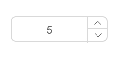
input number ui component for react


var InputNumber = require('rc-input-number');
var React = require('react');
var ReactDOM = require('react-dom');
ReactDOM.render(<InputNumber defaultValue={19}/>, container);
npm install
npm start
http://127.0.0.1:8000/examples/
online example: http://react-component.github.io/input-number/examples/
| name | type | default | description |
|---|---|---|---|
| prefixCls | string | rc-input-number | Specifies the class prefix |
| min | Number | Specifies the minimum value | |
| onClick | |||
| placeholder | string | ||
| max | Number | Specifies the maximum value | |
| step | Number or String | 1 | Specifies the legal number intervals |
| precision | Number | Specifies the precision length of value | |
| disabled | Boolean | false | Specifies that an InputNumber should be disabled |
| focusOnUpDown | Boolean | true | whether focus input when click up or down button |
| required | Boolean | false | Specifies that an InputNumber is required |
| autoFocus | Boolean | false | Specifies that an InputNumber should automatically get focus when the page loads |
| readOnly | Boolean | false | Specifies that an InputNumber is read only |
| name | String | Specifies the name of an InputNumber | |
| id | String | Specifies the id of an InputNumber | |
| value | Number | Specifies the value of an InputNumber | |
| defaultValue | Number | Specifies the defaultValue of an InputNumber | |
| onChange | Function | Called when value of an InputNumber changed | |
| onPressEnter | Function | The callback function that is triggered when Enter key is pressed. | |
| onFocus | Function | Called when an element gets focus | |
| style | Object | root style. such as {width:100} | |
| upHandler | React.Node | custom the up step element | |
| downHandler | React.Node | custom the down step element | |
| formatter | (value: number|string): displayValue: string | Specifies the format of the value presented | |
| parser | (displayValue: string) => value: number | `input => input.replace(/[^\w\.-]*/g, '')` | Specifies the value extracted from formatter |
| pattern | string | Specifies a regex pattern to be added to the input number element - useful for forcing iOS to open the number pad instead of the normal keyboard (supply a regex of "\d*" to do this) or form validation | |
| decimalSeparator | string | Specifies the decimal separator | |
| inputMode | string | Specifies the inputmode of input |
step10 * step0.1 * stepnpm test
npm run chrome-test
npm run coverage
open coverage/ dir
rc-input-number is released under the MIT license.
FAQs
React input-number component
We found that afc163-test-package demonstrated a not healthy version release cadence and project activity because the last version was released a year ago. It has 1 open source maintainer collaborating on the project.
Did you know?

Socket for GitHub automatically highlights issues in each pull request and monitors the health of all your open source dependencies. Discover the contents of your packages and block harmful activity before you install or update your dependencies.
Research
Destructive malware is rising across open source registries, using delays and kill switches to wipe code, break builds, and disrupt CI/CD.

Security News
Socket CTO Ahmad Nassri shares practical AI coding techniques, tools, and team workflows, plus what still feels noisy and why shipping remains human-led.

Research
/Security News
A five-month operation turned 27 npm packages into durable hosting for browser-run lures that mimic document-sharing portals and Microsoft sign-in, targeting 25 organizations across manufacturing, industrial automation, plastics, and healthcare for credential theft.