Security News
CISA Rebuffs Funding Concerns as CVE Foundation Draws Criticism
CISA denies CVE funding issues amid backlash over a new CVE foundation formed by board members, raising concerns about transparency and program governance.
akar-icons-web-components
Advanced tools
AkarIcons Web Components is a non-official Web Components wrapper for the amazing AkarIcons.
Also a handy icon framework for dynamically customizable icons.
![]()
stroke-width and line-style ON THE FLY? 🤯Read more about the design philosophies in this article! 📄
<script src="https://cdn.jsdelivr.net/npm/akar-icons-web-components" type="module"></script>

<body>
  <akar-icon name="bicycle">
</body>
And voilà, the icon is ready.
Play around with the CodePen.
Note on the top right corner of the CodePen, there is a dropdown menu. Open and have fun with it.
Value for the
namefield can be copied from AkarIcons homepage without theai-prefix, eg.arrow-left
Everything the menu changes, is simply attributes for the <akar-icon> tag.
So <akar-icon name="air" size="50"> will be rendered as a 50px ✕ 50px AkarIcons air icon.
Attributes
| Attribute | Type | Css Var | Default |
|---|---|---|---|
name | string | (Required) | |
size | number | --size | 24 |
color | string | color | "inherit" |
stroke | number | --stroke | 1 |
cap | enum | --cap | "round" |
join | enum | --join | "round" |
Try the following examples:
<akar-icon name="bicycle" size="50" cap="butt" join="miter"/> </akar-icon>
<akar-icon name="air" stroke="2" style="transform: scaleX(-1)"/> </akar-icon>
Or set a universal style for all <akar-icon>s:
<style>
  akar-icon {
    --cap: butt;
  }
</style>
And yes, it's that simple! 😇
0.1/0.2 Sep 19, 2021. First commit!git clone git@github.com:awmleer/akar-icons-web-components.git
yarn run start
MIT License, Copyright © 2021-present @awmleer and @John-Theo.
FAQs
Akar icons as web components.
The npm package akar-icons-web-components receives a total of 138 weekly downloads. As such, akar-icons-web-components popularity was classified as not popular.
We found that akar-icons-web-components demonstrated a not healthy version release cadence and project activity because the last version was released a year ago. It has 2 open source maintainers collaborating on the project.
Did you know?

Socket for GitHub automatically highlights issues in each pull request and monitors the health of all your open source dependencies. Discover the contents of your packages and block harmful activity before you install or update your dependencies.

Security News
CISA denies CVE funding issues amid backlash over a new CVE foundation formed by board members, raising concerns about transparency and program governance.

Product
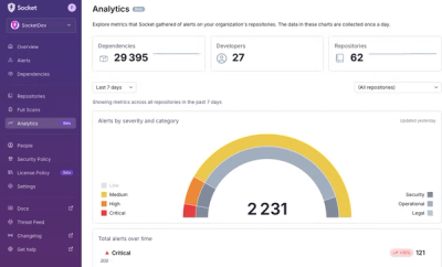
We’re excited to announce a powerful new capability in Socket: historical data and enhanced analytics.

Product
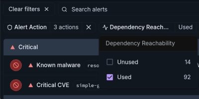
Module Reachability filters out unreachable CVEs so you can focus on vulnerabilities that actually matter to your application.