Research
Security News
Lazarus Strikes npm Again with New Wave of Malicious Packages
The Socket Research Team has discovered six new malicious npm packages linked to North Korea’s Lazarus Group, designed to steal credentials and deploy backdoors.
alert-toast-react-native
Advanced tools
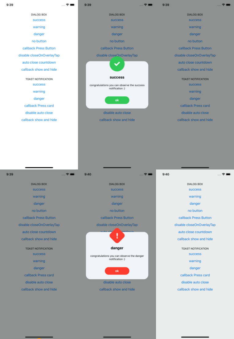
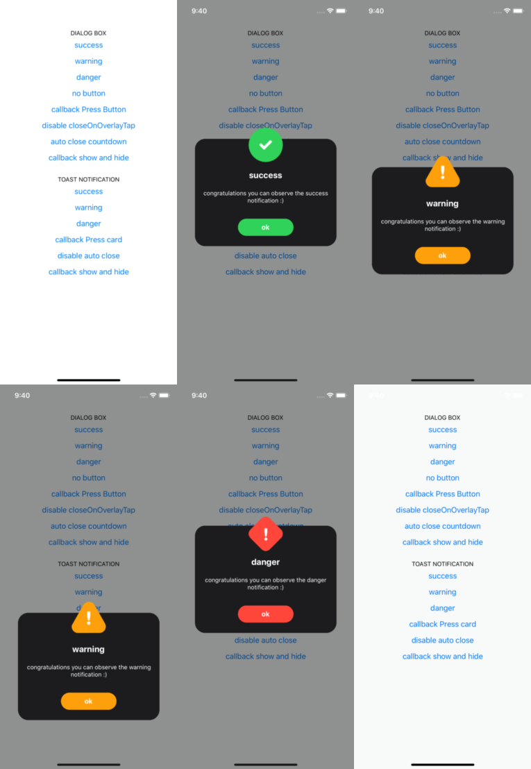
| Theme Light | Theme Dark |
|---|---|
 |  |
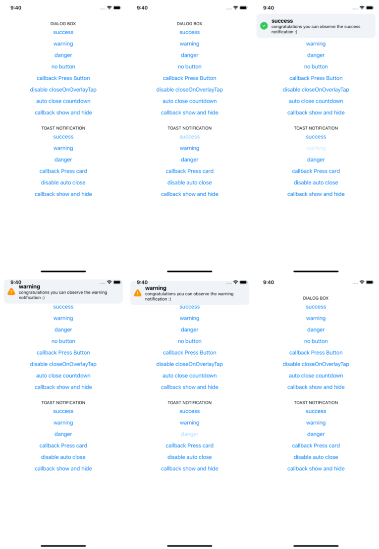
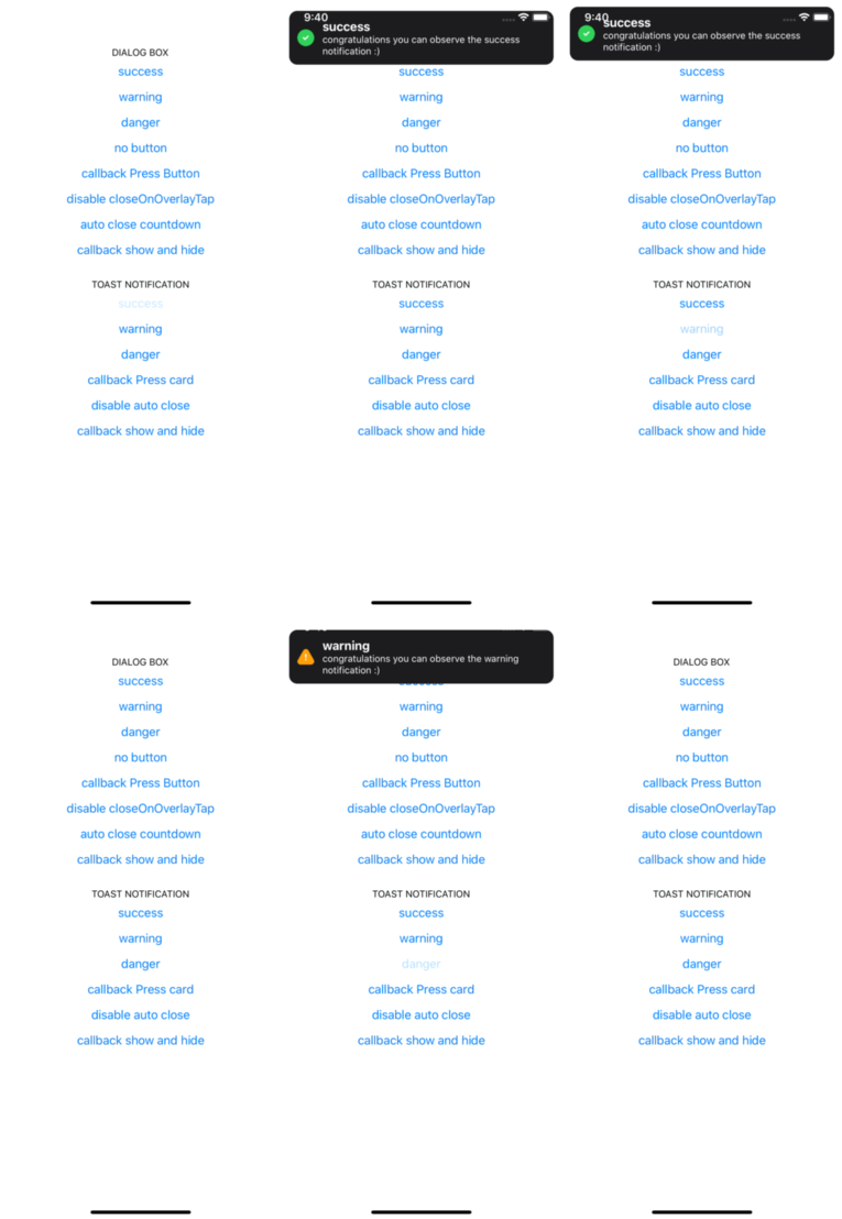
| Theme Light | Theme Dark |
|---|---|
 |  |
yarn add react-native-alert-notification
yarn add react-native-safe-area-context

pod install
expo install react-native-safe-area-context
import { ALERT_TYPE, Dialog, Root, Toast } from 'react-native-alert-notification';

<Root>
  <View>
    // dialog box
    <Button
      title={'dialog box'}
      onPress={() =>
        Dialog.show({
          type: ALERT_TYPE.SUCCESS,
          title: 'Success',
          textBody: 'Congrats! this is dialog box success',
          button: 'close',
        })
      }
    />
    // toast notification
    <Button
      title={'toast notification'}
      onPress={() =>
        Toast.show({
          type: ALERT_TYPE.SUCCESS,
          title: 'Success',
          textBody: 'Congrats! this is toast notification success',
        })
      }
    />
  </View>
</Root>;
A React node that will be most likely wrapping your whole app.
| Name | Description | Require | Default | Type |
|---|---|---|---|---|
| theme | select theme light dark (by default is auto) | auto | 'light','dark' | |
| colors | custom colors | [IColors, IColors] | ||
| dialogConfig | config dialog box global | {closeOnOverlayTap:bool, autoClose:bool / number} | ||
| toastConfig | config toast global | {autoClose:bool / number} |
type IProps = {
  dialogConfig?: Pick<IConfigDialog, 'closeOnOverlayTap' | 'autoClose'>;
  toastConfig?: Pick<IConfigToast, 'autoClose'>;
  theme?: 'light' | 'dark';
  colors?: [IColors, IColors] /** ['light_colors' , 'dark_colors'] */;
};
type IColors = {
  label: string;
  card: string;
  overlay: string;
  success: string;
  danger: string;
  warning: string;
};
| Name | Description | Require | Default | Type |
|---|---|---|---|---|
| title | The title text | String | ||
| type | Defines the type ("Success", "Warning" or "Error") | true | "SUCCESS", "DANGER", "WARNING" | |
| textBody | The text body | String | ||
| button | name button (for hide button: undefined) | String | ||
| autoClose | Defines time auto close dialog box in ms | face | bool / number | |
| closeOnOverlayTap | allow close if click in overlay | true | bool | |
| onPressButton | (if not declared and isset button action is close) | String | () => void | |
| onShow | action after end animation open | () => void | ||
| onHide | action after end animation close | () => void |
type IConfig = {
  type: ALERT_TYPE;
  title?: string;
  textBody?: string;
  button?: string;
  autoClose?: number | boolean;
  closeOnOverlayTap?: boolean;
  onPressButton?: () => void;
  onShow?: () => void;
  onHide?: () => void;
};
| Name | Description | Require | Default | Type |
|---|---|---|---|---|
| title | The title text | String | ||
| type | Defines the type ("Success", "Warning" or "Error") | "SUCCESS", "DANGER", "WARNING" | ||
| textBody | The text body | String | ||
| autoClose | Defines time auto close dialog box in ms | 5000 | bool / number | |
| onPress | action click in card | bool | ||
| onLongPress | action long click in card | () => void | ||
| onShow | event after end animation open | () => void | ||
| onHide | event after end animation close | () => void |
type IConfig = {
  type?: ALERT_TYPE;
  title?: string;
  textBody?: string;
  autoClose?: number | boolean;
  onPress?: () => void;
  onLongPress?: () => void;
  onShow?: () => void;
  onHide?: () => void;
};
// For Dialog Box
Dialog.hide();

// For Toast Notification
Toast.hide();
Rodolphe Jerez | https://codingbyjerez.com
See the contributing guide to learn how to contribute to the repository and the development workflow.
MIT
FAQs
## Example Dialog Box
The npm package alert-toast-react-native receives a total of 0 weekly downloads. As such, alert-toast-react-native popularity was classified as not popular.
We found that alert-toast-react-native demonstrated a not healthy version release cadence and project activity because the last version was released a year ago. It has 1 open source maintainer collaborating on the project.
Did you know?

Socket for GitHub automatically highlights issues in each pull request and monitors the health of all your open source dependencies. Discover the contents of your packages and block harmful activity before you install or update your dependencies.

Research
Security News
The Socket Research Team has discovered six new malicious npm packages linked to North Korea’s Lazarus Group, designed to steal credentials and deploy backdoors.

Security News
Socket CEO Feross Aboukhadijeh discusses the open web, open source security, and how Socket tackles software supply chain attacks on The Pair Program podcast.

Security News
Opengrep continues building momentum with the alpha release of its Playground tool, demonstrating the project's rapid evolution just two months after its initial launch.