Security Fundamentals
Turtles, Clams, and Cyber Threat Actors: Shell Usage
The Socket Threat Research Team uncovers how threat actors weaponize shell techniques across npm, PyPI, and Go ecosystems to maintain persistence and exfiltrate data.
alt-responsive
Advanced tools
An alt store for easily creating responsive designs in a flux architecture.
A flux store for easily creating responsive designs in an alt application
There are many solutions for cleanly handling responsive designs in React applications. One common approach is to wrap a component in another component which is responsible for handling the behavior and passing the information down as a prop. While this at first seems good and the "react way", as the behavior gets more complicated, this quickly leads to a lot of boilerplate code in a single component. Also, depending on the implementation, it is possible that many copies of the responsive wrapper would create many different resize handlers.
Using a flux store not only reduces the overall noise in a component, but also guarantees that only a single event listener is waiting for resize.
All you need to do is wrap the ResponsiveStore in your alt instance's createStore method.
// stores/ResponsiveStore.js

// import your singleton alt instance
import alt from 'my-alt-import'
// import our factory
import ResponsiveStore from 'alt-responsive'

// pass the store class to alt's wrapper
export default alt.createStore(ResponsiveStore)
Now your store is ready to use. The store's default breakpoints match common device sizes and are accessible by the following names which are used to indentify them in your view:
const default_breakpoints = {
    extra_small: 480,
    small: 768,
    medium: 992,
    large: 1200,
}
To use custom breakpoints, import the create_responsive_store factory, and pass it an object with the new names and values.
// stores/ResponsiveStore.js

// import your singleton alt instance
import alt from 'my-alt-import'
// import our factory
import {create_responsive_store} from 'alt-responsive'

// define your own breakpoints
const breakpoints = {
    small: 320,
    medium: 640,
    big: 960,
    huge: 1024,
}

// pass your breakpoints to the store factory
let ResponsiveStore = create_responsive_store(breakpoints)

// pass the store class to alt's wrapper
export default alt.createStore(ResponsiveStoreClass)
Now your store is ready to use with custom breakpoints.
The ReponsiveStore provides three attributes to handle responsive behavior (passed in as props to the particular component):
current_media_type: (string) The largest breakpoint category that the browser satisfies.browser_less_than: (object) An object of booleans that indicate whether the browser is currently less than a particular breakpoint.browser_greater_than: (object) An object of booleans that indicate whether the browser is currently greater than a particular breakpoint.For example,
// MyComponent.js

import React from 'react'
// imports alt's nice decorator
// (see https://github.com/goatslacker/alt/blob/master/src/utils/connectToStores.js)
import connectToStores from 'alt/utils/connectToStores'
// import the store you just made
import ResponsiveStore from 'stores/responsiveStore'

@connectToStores
class MyComponent extends React.Component {
    static getStores() {
        return [ResponsiveStore]
    }


    static getPropsFromStores() {
        return ResponsiveStore.getState()
    }


    render() {
        let message = `The viewport's current media type is: ${this.props.current_media_type}.  `

        if (this.props.browser_less_than.small) {
            message += 'Secret message for viewports smaller than than the "small" breakpoint!'
        } else if (this.props.browser_less_than.medium) {
            message += 'Secret message for viewports between the "small" and "medium" breakpoints!'
        } else {
            message += 'Message for viewports greater than the "medium" breakpoint.'
        }

        return (
            <p>
                {message}
            </p>
        )
    }
}
FAQs
An alt store for easily creating responsive designs in a flux architecture.
The npm package alt-responsive receives a total of 1 weekly downloads. As such, alt-responsive popularity was classified as not popular.
We found that alt-responsive demonstrated a not healthy version release cadence and project activity because the last version was released a year ago. It has 1 open source maintainer collaborating on the project.
Did you know?

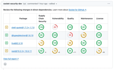
Socket for GitHub automatically highlights issues in each pull request and monitors the health of all your open source dependencies. Discover the contents of your packages and block harmful activity before you install or update your dependencies.

Security Fundamentals
The Socket Threat Research Team uncovers how threat actors weaponize shell techniques across npm, PyPI, and Go ecosystems to maintain persistence and exfiltrate data.

Security News
At VulnCon 2025, NIST scrapped its NVD consortium plans, admitted it can't keep up with CVEs, and outlined automation efforts amid a mounting backlog.

Product
We redesigned our GitHub PR comments to deliver clear, actionable security insights without adding noise to your workflow.