NOTE*** This library was generated using Angular CLI version 9.0.0. Therefore, it is recommended that you use a compatible version of Angular to ensure proper functionality
Angular Custom Selector

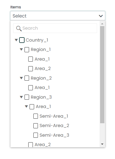
This package offers an intuitive interface that enables users to select multiple options from a dropdown list. It includes various customization options to allow developers to tailor the selector according to their specific needs, such as customizing labels, styling, and available options. It features a search and filter functionality that enables users to quickly locate the desired value from a vast list of options. Additionally, this package supports the selection of nested options, which is useful when dealing with complex data hierarchies.
User Interfaces
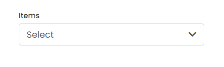
Single Selector
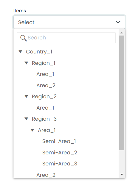
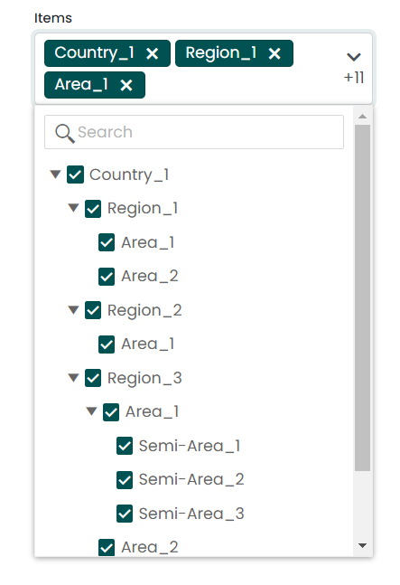
Multiple Selector
Installation
Install angular-custom-selector with npm
npm i angular-custom-selector
Finally, you need to import the related styles into your project's angular.json file. To do so, simply add the following path to your styles property under architect.
'node_modules/angular-custom-selector/src/lib/assets/styles/styles.scss'
"architect": {
    "build": {
         ...,
        "styles": [
         ...,
         "node_modules/angular-custom-selector/src/lib/assets/styles/styles.scss"
        ],
    ...,
}
After completing all of these steps, if you still run into a problem, you have to make sure to check the following things as well.
- Check whether BrowserAnimationsModule is imported to your app.
      import { BrowserAnimationsModule } from '@angular/platform-browser/animations';

      @NgModule({
        declarations: [
          AppComponent
        ],
        imports: [
          ...,
          BrowserAnimationsModule
        ],
        providers: [],
        bootstrap: [AppComponent]
      })
      export class AppModule { }
- Check whether @angular/localize is installed in your project. If it is not installed, you can install it using the following command.
ng add @angular/localize
Usage
As an example, you can use the module import in your corresponding Module class.
app.module.ts
import { AngularCustomSelectorModule } from 'angular-custom-selector';

@NgModule({
  imports: [
    ...
    AngularCustomSelectorModule
  ]
})

export class AppModule { }
The angular-custom-selector package is a convenient wrapper that allows you to use the HTML selector component in any part of your Angular application. By importing the module and using the selector in your HTML templates, you can quickly and easily create custom selector components that can be customized to suit your needs.
app.component.html
<angular-custom-selector type="multi" labelText="Items" [data]="dataHierachy" selectedName="Select"
  (onChange)="updateState($event)" hoverText="Select Location" [enableAllNodes]="true"
  (onFetchedData)="onFetched($event)" displayName="name" [disabled]="false" searchKey="name" >
</angular-custom-selector>
app.component.ts
import { Component } from '@angular/core';
@Component({
selector: 'app-root',
templateUrl: './app.component.html',
styleUrls: ['./app.component.scss']
})
export class AppComponent {
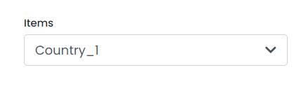
selectedName: string = 'Country_1';
public selectorDisabled: boolean = false;
public dataHierarchy: Array<any> = data;
public updateState(dataItem:any){
console.log(dataItem);
}
onFetched(data:any){
console.log(data);
}
}
Component API
type | string | type can be single or multi. Default value of type is 'single' so that is single value selector. (Ex:- type="multi" or type="single") |
labelText | string | Label for the selection field. |
hoverText | string | Text that shows when hovering the component. |
[data] | Array<any> | Input data hierarchy for the component should include elements with unique IDs, names, items field that describes child elements, and isSelectable fields that describe the selectable status of each element. Other fields may vary depending on your requirements. |
selectedName | string | Default selected name of the component. |
[enableAllNodes] | boolean | This can be used to enable all nodes, regardless of the isSelectable field of each element. |
[disabled] | boolean | That can be used for disable the component. |
displayName | string | That will be the display name of each elements in dropdown. This value must be a property of each element in the hierarchy (usually it can be used as the name, but it depends on your requirements). |
searchKey | string | Key that we are used for search items our dropdown. This value must be a property of each element in the hierarchy (usually it can be used as the name, but it depends on your requirements). |
(onFetchedData) | EventEmitter | The event triggers when all the data hierarchies have been fetched into the component. |
(onChange) | EventEmitter | The event is triggered when the user's selection has changed. |
Custom Styling
.k-treeview | For customize styles of treeview. |
.k-input | For customize the search field in treeview. |
.k-in | For customize each field in treeview. |
.d-flex | For customize styles of selected text of the dropdown. |
***NOTE: you have to use [:host ::ng-deep] with your class name for overwrite default styles. As below example,
:host ::ng-deep .k-treeview{
    font-family: 'Courier New', Courier, monospace;
}
Sample Data Hierarchy
export const data = [
  {
    id: 1,
    name: "Country_1",
    isSelectable: false,
    items: [
      {
        id: 45,
        name: "Region_1",
        isSelectable: false,
        items: [
          {
            id: 48,
            name: "Area_1",
            isSelectable: true,
            items: [],
            itemCode: "10102"
          },
          {
            id: 60,
            name: "Area_2",
            isSelectable: true,
            items: [],
            itemCode: "10103"
          }
        ],
        itemCode: "10234"
      },
      {
        id: 38,
        name: "Region_2",
        isSelectable: false,
        items: [
          {
            id: 56,
            name: "Area_1",
            isSelectable: true,
            items: [],
            itemCode: "10564"
          }
        ],
        itemCode: "10765"
      },
      {
        id: 61,
        name: "Region_3",
        isSelectable: false,
        items: [
          {
            id: 62,
            name: "Area_1",
            isSelectable: false,
            items: [
              {
                id: 63,
                name: "Semi-Area_1",
                isSelectable: true,
                items: [],
                itemCode: "10878"
              },
              {
                id: 129,
                name: "Semi-Area_2",
                isSelectable: true,
                items: [],
                itemCode: "10986"
              },
              {
                id: 125,
                name: "Semi-Area_3",
                isSelectable: true,
                items: [],
                itemCode: "10743"
              }
            ],
            itemCode: "12467",
          },
          {
            id: 76,
            name: "Area_2",
            isSelectable: true,
            items: [],
            itemCode: "12477",
          },
          {
            id: 15,
            name: "Area_3",
            isSelectable: true,
            items: [],
            itemCode: "10632"
          },
          {
            id: 21,
            name: "Area_4",
            isSelectable: true,
            items: [],
            itemCode: "13487"
          }
        ],
        itemCode: "12346"
      }
    ],
    itemCode: "12343"
  }]
Authors


