Security News
MCP Steering Committee Launches Official MCP Registry in Preview
The MCP Steering Committee has launched the official MCP Registry in preview, a central hub for discovering and publishing MCP servers.
angular-formly-templates-foundation
Advanced tools
Angular-Formly plugin which outputs foundation compatible form fields.
This is a template for Angular-Formly which adds templates with classes specific to foundation. Each field is wrapped in a div. This library is not standalone and requires angular-formly to be present and loaded.
Feel free to file issues and pull requests, but it may be a while before anyone gets to them :-/ Forks are welcome.
Dev dependencies to build Formly
Install Angular-Formly
Install Angular-Formly: Foundation Templates
$ bower install angular-formly angular-formly-templates-foundation --save
or
$ npm install angular-formly angular-formly-templates-foundation --save
<script src="bower_components/angular-formly/dist/formly.min.js"></script>
<script src="bower_components/angular-formly-templates-foundation/dist/angular-formly-templates-foundation.min.js"></script>and
angular.module('yourModule', ['formly', 'formlyFoundation']);
or
angular.module('yourModule', [require('angular-formly'), require('angular-formly-templates-foundation')]);
See Angular-Formly for formly core documentation.
NOTE: All of these properties will be under the templateOptions property as of angular-formly 3.0.0
labelis used to add an html label to each field.
A default is set for each field based on its type. ie
Text,Checkbox,Password
requiredis used to add the required attribute to a form field.
undefined
disabledis used to add the disabled attribute to a form field.
undefined
placeholderis used to add placeholder text to some inputs.
undefined
descriptionis used to add descriptive text to all inputs.
undefined
addonLeftis used to add an add-on on the left of a field. The object accepts two properties:textthat sets a simple text andclassthat sets classes to the add-on.
undefined
addonRightis used to add an add-on on the right of a field. The object accepts two properties:textthat sets a simple text andclassthat sets classes to the add-on.
undefined
Below is a detailed description of each form fields and its custom properties.
The input uses the element and allows you to specify it's type via the type property
Example text field
	{
		"type": "text",
		"key": "firstName",
		"templateOptions": {
		  "type": "email", // or url, or text, etc.
      "placeholder": "jane doe",
      "label": "First name"
		}
	}
The textarea field creates multiline input with a textarea element.
linessets the rows attribute for the textarea element.
Example textarea field
	{
		"type": "textarea",
		"key": "about",
		"templateOptions": {
      "placeholder": "I like puppies",
      "label": "Tell me about yourself",
      "rows": 4,
      "cols": 15
		}
	}
The checkbox field allows checkbox input with a input element set to
type='checkbox'. It doesn't have any custom properties.
Example checkbox field
	{
		"type": "checkbox",
		"key": "checkThis",
		"templateOptions": {
      "label": "Check this box"
		}
	}
The radio field allows multiple choice input with a series of linked inputs, with
type='radio'.
optionsis an array of options for the radio form field to display. Each option should be an object with aname(string) andvalue(string or number).
Example radio field
	{
		"key": "triedEmber",
		"type": "radio",
		"templateOptions": {
      "label": "Have you tried EmberJs yet?",
      "options": [
        {
          "name": "Yes, and I love it!",
          "value": "yesyes"
        },
        {
          "name": "Yes, but I'm not a fan...",
          "value": "yesno"
        },
        {
          "name": "Nope",
          "value": "no"
        }
      ]
		}
	}
The select field allows selection via dropdown using the select element.
The default can be set to the index of one of the
options.
optionsis an array of options for the select form field to display. Each option should be an object with aname(string). You may optionally add agroupto some or all of your options.
Example select field
{
  "key": "transportation",
  "type": "select",
  "templateOptions": {
    "label": "How do you get around in the city",
    "valueProp": "name",
    "options": [
      {
        "name": "Car"
      },
      {
        "name": "Helicopter"
      },
      {
        "name": "Sport Utility Vehicle"
      },
      {
        "name": "Bicycle",
        "group": "low emissions"
      },
      {
        "name": "Skateboard",
        "group": "low emissions"
      },
      {
        "name": "Walk",
        "group": "low emissions"
      },
      {
        "name": "Bus",
        "group": "low emissions"
      },
      {
        "name": "Scooter",
        "group": "low emissions"
      },
      {
        "name": "Train",
        "group": "low emissions"
      },
      {
        "name": "Hot Air Baloon",
        "group": "low emissions"
      }
    ]
  }
}
Please see the CONTRIBUTING Guidelines.
A special thanks to Nimbly for creating/sponsoring Angular-Formly's development. Thanks to Kent C. Dodds for his continued support on the project.
*Other Notes: (Bootstrap vs Foundation Differences) Our bootstrap templates are made to work with a class called help-block, Foundation 5 does not have this class, but it is a useful class used on paragraph elements following an input and is used to describe the input, but unlike a label it is usually underneath a text field and is easy to implement and support has been left in Angular-Formly-Foundation.
You could add the following to your css override to use it:
.help-block {
  display: block;
  margin-top: 5px;
  margin-bottom: 10px;
  color: #737373;
}
FAQs
Angular-Formly plugin which outputs foundation compatible form fields.
The npm package angular-formly-templates-foundation receives a total of 0 weekly downloads. As such, angular-formly-templates-foundation popularity was classified as not popular.
We found that angular-formly-templates-foundation demonstrated a not healthy version release cadence and project activity because the last version was released a year ago. It has 1 open source maintainer collaborating on the project.
Did you know?

Socket for GitHub automatically highlights issues in each pull request and monitors the health of all your open source dependencies. Discover the contents of your packages and block harmful activity before you install or update your dependencies.

Security News
The MCP Steering Committee has launched the official MCP Registry in preview, a central hub for discovering and publishing MCP servers.

Product
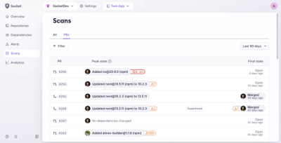
Socket’s new Pull Request Stories give security teams clear visibility into dependency risks and outcomes across scanned pull requests.

Research
/Security News
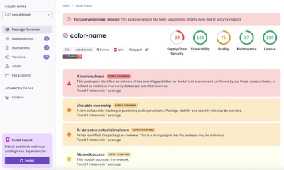
npm author Qix’s account was compromised, with malicious versions of popular packages like chalk-template, color-convert, and strip-ansi published.