Angular Moment Picker


Check out the homepage at http://indrimuska.github.io/angular-moment-picker/.
Angular Moment Picker is a native AngularJS directive for date and time picker that uses Moment.js and does not require jQuery.

Installation
Get Angular Moment Picker from npm, bower or git:
npm install angular-moment-picker
bower install moment-picker
git clone https://github.com/indrimuska/angular-moment-picker.git
Include style and script in your page:
<script src="//ajax.googleapis.com/ajax/libs/angularjs/1.4.4/angular.min.js"></script>
<script src="//cdnjs.cloudflare.com/ajax/libs/moment.js/2.10.6/moment-with-locales.js"></script>
<script src="//cdn.rawgit.com/indrimuska/angular-moment-picker/master/dist/angular-moment-picker.min.js"></script>
<link href="//cdn.rawgit.com/indrimuska/angular-moment-picker/master/dist/angular-moment-picker.min.css" rel="stylesheet">
Add moment-picker dependency to your module:
var myApp = angular.module('myApp', ['moment-picker']);
Provide the attribute to your element:
<div moment-picker="myDate"> {{ myDate }} </div>
Demo
Check out the demo page at http://indrimuska.github.io/angular-moment-picker/.
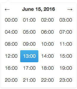
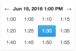
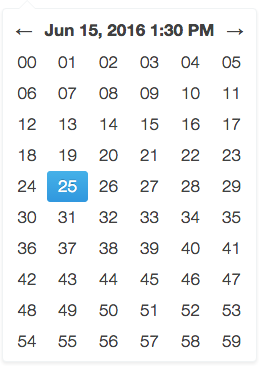
The views
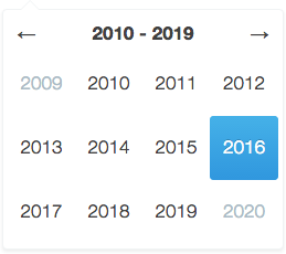 | 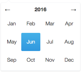 | 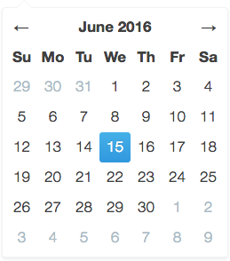 |
| Day view | Hour view | Minute view |
 |  |  |
Additional themes
Angular Moment Picker provides the following additional themes. Each theme has a dedicate stylesheet to be included in the application the overrides the default style.
A preview of the each theme is available here.
Options
To configure Angular Moment Picker you have to add to your element or your input the attribute relative to the options you want to set.
<div moment-picker="ctrl.birthday" locale="fr" format="LL">
    Mon anniversaire est le {{ ctrl.birthday }}
</div>
<input moment-picker="ctrl.dateFormatted" ng-model="ctrl.momentDate" format="DD/MM/YYYY">
| moment-picker | | Two-way bindable property as formatted datetime string. | Plunker |
| ng-model | | Two-way bindable property as Moment.js object. | Plunker |
| locale | "en" | Locale code. 1 | Plunker |
| format | "L LTS" | Format of the output value and min/max date. 1 | Plunker |
| min-view | "decade" | Minimum navigable view. | Plunker |
| max-view | "minute" | Maximum navigable view. | Plunker |
| start-view | "year" | Initial view when the picker is open. | Plunker |
| min-date | | Two-way bindable property representing the minimum selectable date (as String in the same format of the value, or as a Moment.js object). | Plunker |
| max-date | | Two-way bindable property representing the maximum selectable date (as String in the same format of the value, or as a Moment.js object). | Plunker |
| start-date | | Two-way bindable property representing the initial date to be shown in picker (as String in the same format of the value, or as a Moment.js object). | Plunker |
| disable | false | Disables the picker if truly. | Plunker |
| position | | Sets a fixed position for the picker. Available values are "top left", "top right", "bottom left", "bottom right". | Plunker |
| inline | false | Views the picker inline. | Plunker |
| validate | true | Forces picker value between the range minDate and maxDate. | Plunker |
| autoclose | true | Closes the picker after selecting a date. | Plunker |
| set-on-select | false | Updates picker model after selecting a date in each view. | Plunker |
| is-open | | Open/closes the picker when set to true or false. | Plunker |
| today | false | Highlights the current day. | Plunker |
| keyboard | false | Allows using the keyboard to navigate the picker. | Plunker |
| show-header | true | Shows the header in the view. | Plunker |
| additions | { top: undefined, bottom: undefined } | Template url for custom contents above and below each picker views (inside the dialog). | Plunker |
Methods
Append your method to your element and define its behavior in the controller.
<div moment-picker="ctrl.exhibition" format="dddd D MMMM" selectable="ctrl.isSelectable(date, type)">
    Next exhibition is on {{ ctrl.exhibition }}.
</div>
ctrl.isSelectable = function (date, type) {
return type != 'day' || date.format('dddd') != 'Sunday';
};
| selectable | date, type | Return true if the given date can be selected in the current view. Please note that this method is called for every date in the view, every time a view is rendered, so be careful, it may affect performances. | Plunker |
Events
As for methods, to bind an event you only need to attach the right property to your picker.
<div moment-picker="ctrl.meeting" format="HH:mm A" change="ctrl.onChange(newValue, oldValue)">
    The meeting starts at {{ ctrl.meeting }}.
</div>
ctrl.onChange = function (newValue, oldValue) {
    $log.log('Meeting changed from ' + oldValue + ' to ' + newValue);
};
| change | newValue, oldValue | Function fired upon change in picker value. | Plunker |
momentPickerProvider
Angular Moment Picker comes out with its own provider, in order to define your own configuration for all the pickers in your app.
angular
.module('myApp', ['moment-picker'])
.config(['momentPickerProvider', function (momentPickerProvider) {
momentPickerProvider.options({
});
}]);
| locale | "en" | Locale code. 1 |
| format | "L LTS" | Format of the output value and min/max date. 1 |
| min-view | "decade" | Minimum navigable view. |
| max-view | "minute" | Maximum navigable view. |
| start-view | "year" | Initial view after picker opening. |
| position | | Sets a fixed position for the picker. Available values are "top left", "top right", "bottom left", "bottom right". |
| inline | false | Views the picker inline. |
| validate | true | Forces picker value between the range minDate and maxDate. |
| autoclose | true | Closes the picker after selecting a date. |
| set-on-select | false | Updates picker model after selecting a date in each view. |
| today | false | Highlights the current day. |
| keyboard | false | Allows using the keyboard to navigate the picker. |
| show-header | true | Shows the header in the view. |
| left-arrow | "←" | Left arrow string (HTML allowed). |
| right-arrow | "→" | Right arrow string (HTML allowed). |
| additions | { top: undefined, bottom: undefined } | Template url for custom contents above and below each picker views (inside the dialog). |
| years-format | "YYYY" | Years format in decade view. |
| months-format | "MMM" | Months format in year view. |
| days-format | "D" | Days format in month view. |
| hours-format | "HH:[00]" | Hours format in day view. |
| hours-start | 0 | First rendered hour in day view (24h format). |
| hours-end | 23 | Last rendered hour in day view (24h format). |
| minutes-format | 2 | Minutes format in hour view. |
| minutes-step | 5 | Step between each visible minute in hour view. |
| minutes-start | 0 | First rendered minute in hour view. |
| minutes-end | 59 | Last rendered minute in hour view. |
| seconds-format | "ss" | Seconds format in minute view. |
| seconds-step | 1 | Step between each visible second in minute view. |
| seconds-start | 0 | First rendered second in minute view. |
| seconds-end | 59 | Last rendered second in minute view. |
Notes
- Locale codes and format tokens are available at http://momentjs.com/.
- Locale format
LT without meridiem part (AM/PM, am/pm).
Builder
Try the online Angular Moment Picker Builder:
http://indrimuska.github.io/angular-moment-picker/#builder.
Dev scripts
npm run build: compile sources and generate built files in dist folder.npm run minify: generate built files and minified ones.npm run release: increase package version and compile the project.npm run test: run all tests in the tests folder.
License
Copyright (c) 2015 Indri Muska. Licensed under the MIT license.


