✨ Features
- 🌈 Enterprise-class UI designed for web applications.
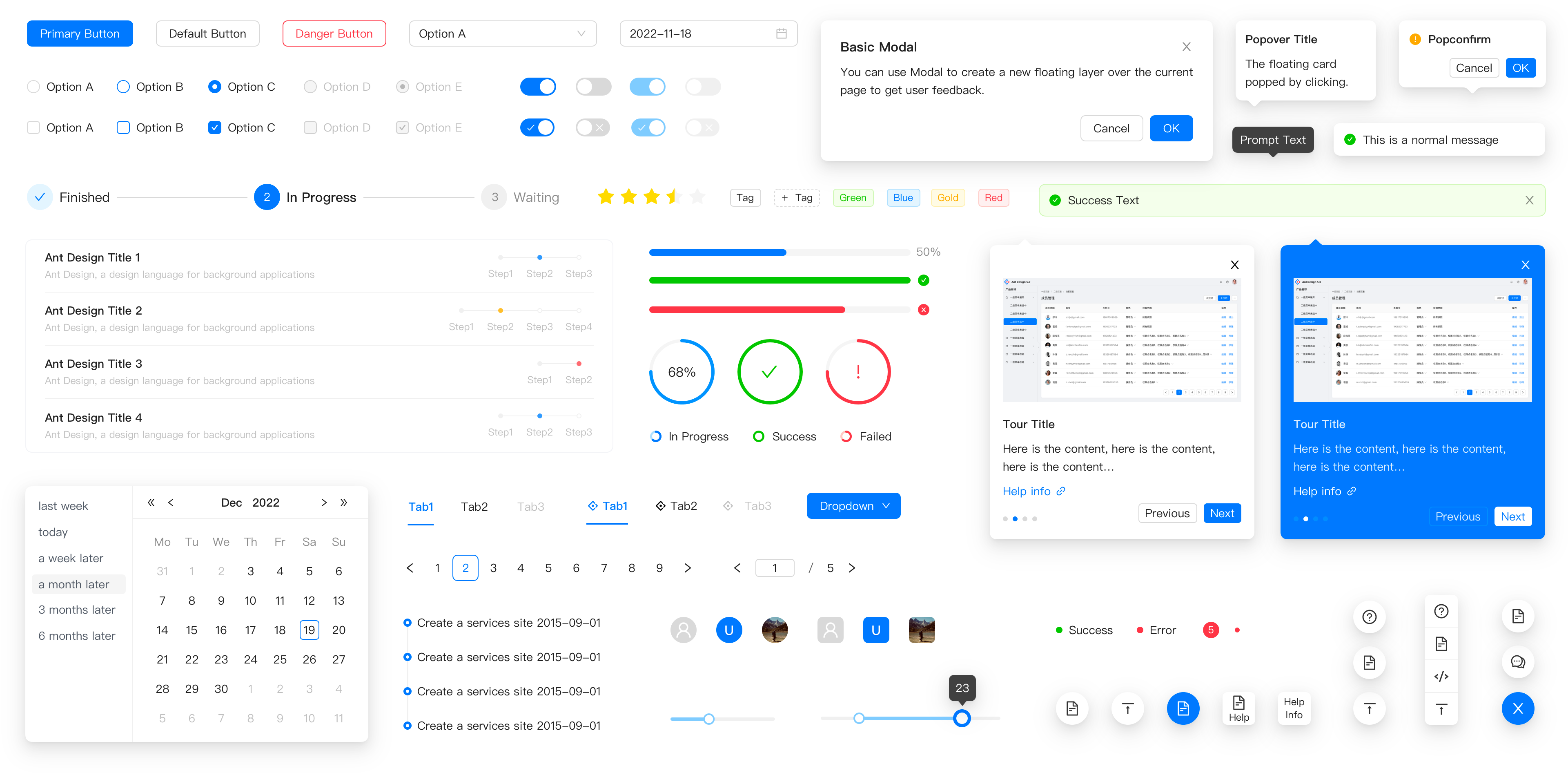
- 📦 A set of high-quality React components out of the box.
- 🛡 Written in TypeScript with predictable static types.
- ⚙️ Whole package of design resources and development tools.
- 🌍 Internationalization support for dozens of languages.
- 🎨 Powerful theme customization based on CSS-in-JS.
🖥 Environment Support
- Modern browsers
- Server-side Rendering
- Electron
| Edge | last 2 versions | last 2 versions | last 2 versions | last 2 versions |
📦 Install
npm install antd
yarn add antd
pnpm add antd
bun add antd
🔨 Usage
import { Button, DatePicker } from 'antd';

export default () => (
  <>
    <Button type="primary">PRESS ME</Button>
    <DatePicker placeholder="select date" />
  </>
);
🔗 Links
⌨️ Development
Use opensumi.run, a free online pure front-end dev environment.

Or clone locally:
$ git clone git@github.com:ant-design/ant-design.git
$ cd ant-design
$ npm install
$ npm start
Open your browser and visit http://127.0.0.1:8001, see more at Development.
🤝 Contributing 

Let's build a better antd together.
We warmly invite contributions from everyone. Before you get started, please take a moment to review our Contribution Guide. Feel free to share your ideas through Pull Requests or GitHub Issues. If you're interested in enhancing our codebase, explore the Development Instructions and enjoy your coding journey! :)
For collaborators, adhere to our Pull Request Principle and utilize our Pull Request Template when creating a Pull Request.
Issue funding
We use Issuehunt to up-vote and promote specific features that you would like to see and implement. Check our backlog and help us:

❤️ Backers 


