Apus - React Chart Library
A powerful and customizable chart library for React applications, built with D3.js and TypeScript.


📚 View Documentation | 🚀 Live Demo
Features
- 🎯 Built with React 18 and TypeScript
- 📊 Powered by D3.js for powerful data visualization
- 🎨 Customizable and responsive charts
- 📦 Lightweight and easy to integrate
- 🔍 Type-safe with TypeScript support
- 🎨 Modern UI components with Tailwind CSS
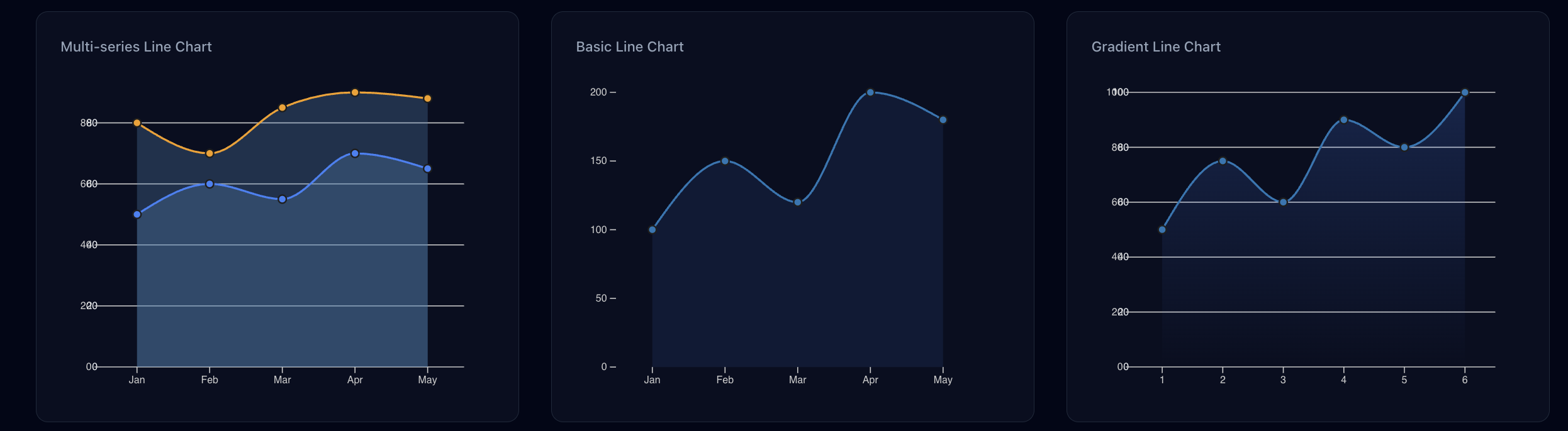
Screenshots
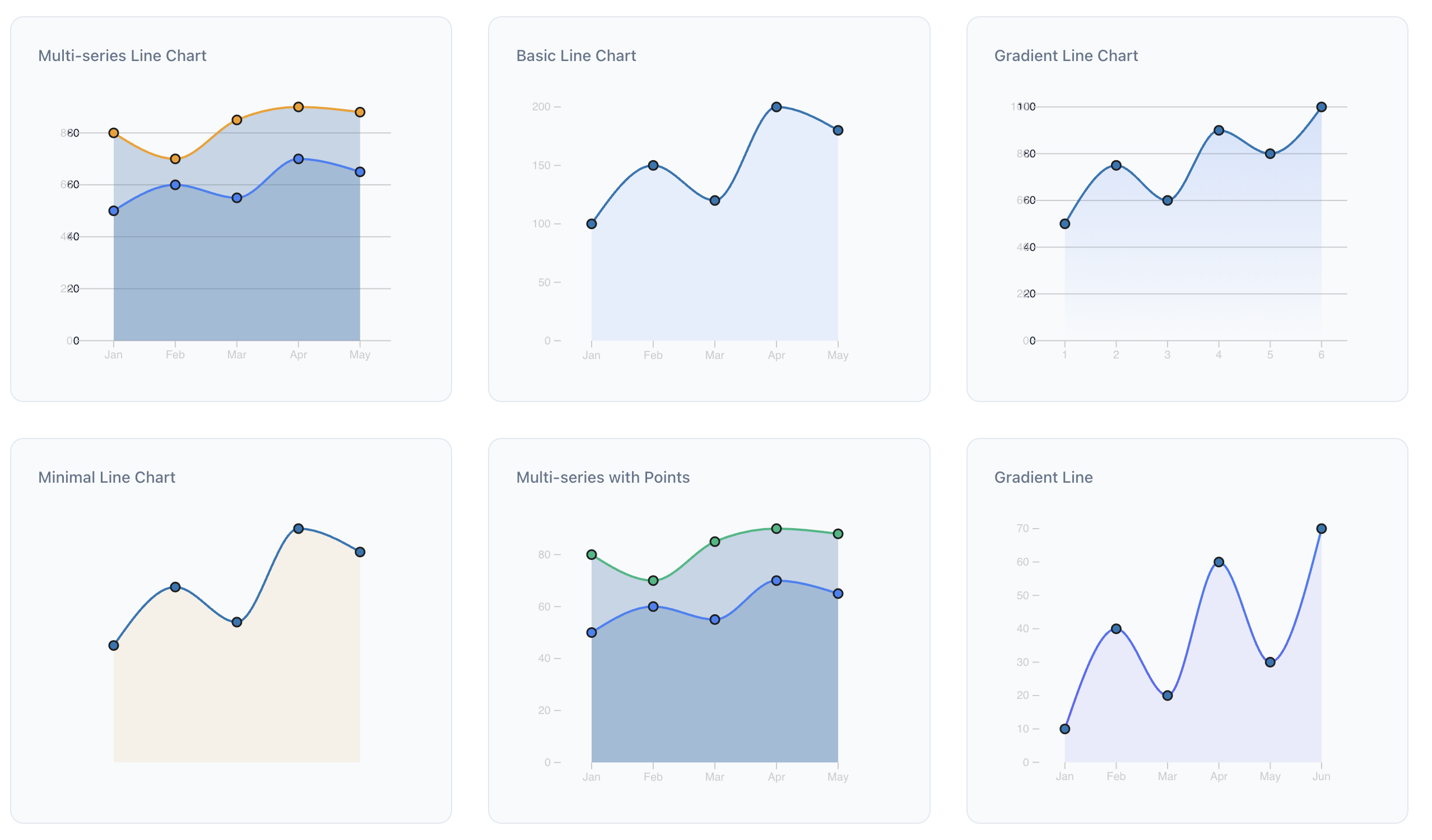 Interactive Line Chart with Multiple Datasets
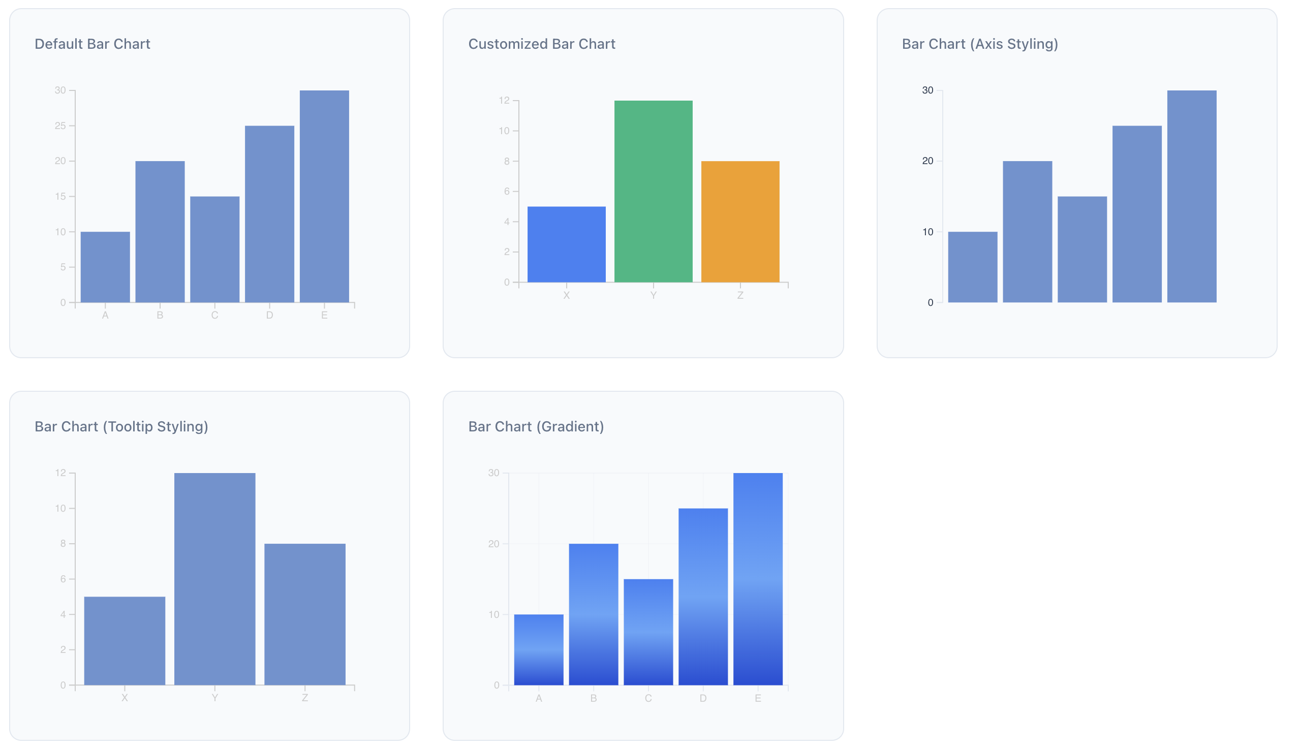 Customizable Bar Chart with Tooltips
 Advanced Scatter Plot with Regression Line
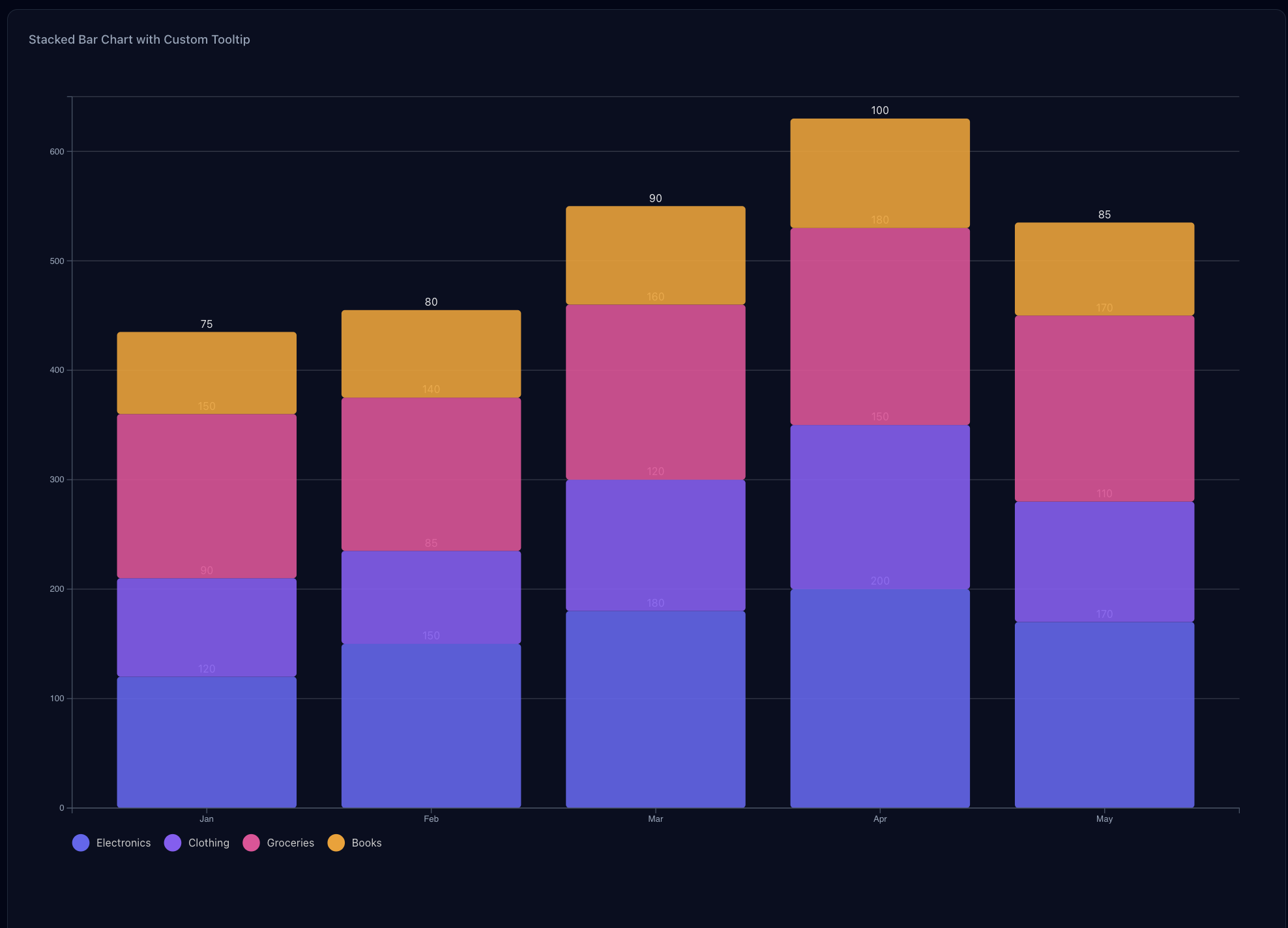 Stacked Bar Chart
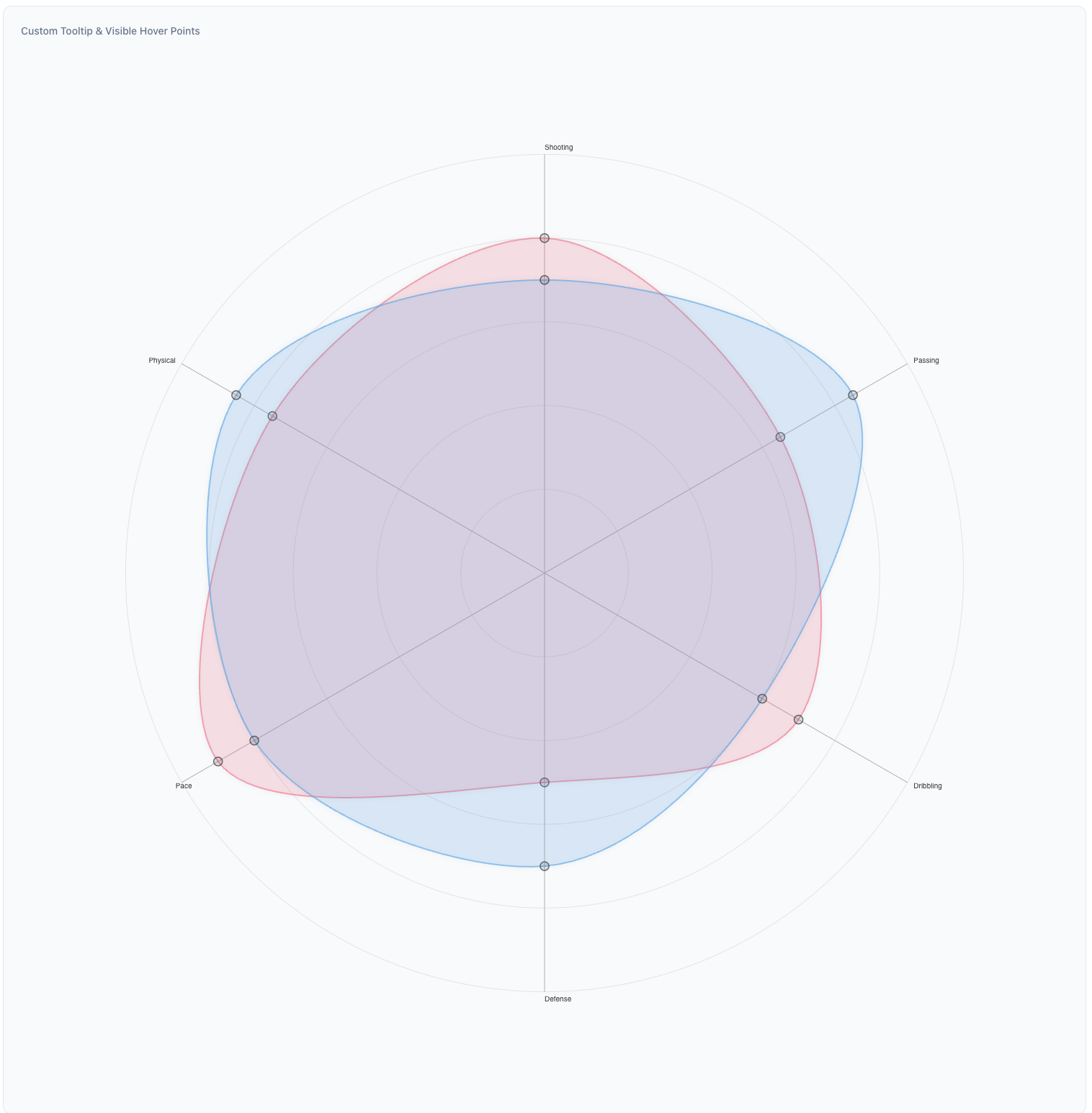 Radar Chart
Installation
npm install apus
yarn add apus
pnpm add apus
Peer Dependencies
This library requires the following peer dependencies:
{
  "d3": "^7.0.0",
  "react": "^18.0.0",
  "react-dom": "^18.0.0"
}
Available Chart Types
1. Line Chart
A versatile chart for displaying trends over time or continuous data. Supports multiple series, area fills, and customization options.
View LineChart Props and Details
import { LineChart } from 'apus';

const lineChartData = [
  {
    name: 'Series 1',
    values: [
      { label: 'Jan', value: 30 },
      { label: 'Feb', value: 40 },
      { label: 'Mar', value: 35 },
    ],
  },
  {
    name: 'Series 2',
    values: [
      { label: 'Jan', value: 50 },
      { label: 'Feb', value: 60 },
      { label: 'Mar', value: 55 },
    ],
  },
];

<LineChart
  data={lineChartData}
  width={600}
  height={400}
  lineColors={['#1f77b4', '#ff7f0e']} // Different color for each line series
  showArea={true}
  areaColor="rgba(70, 130, 180, 0.1)" // A light blue area fill
  pointColor="#88b0de" // Color for data points
  showGridLines={true}
  responsive={true}
  ariaLabel="Sales trend over months"
  xAxisTextColor="#333333" // Color for X-axis labels
  yAxisTextColor="#333333" // Color for Y-axis labels
  axisLineColor="#666666" // Color for axis lines
/>
2. Bar Chart
Ideal for comparing discrete categories. Supports single or multiple colors and responsiveness.
View BarChart Props and Details
import { BarChart } from 'apus';

const barChartData = [
  { label: 'Category A', value: 10 },
  { label: 'Category B', value: 20 },
  { label: 'Category C', value: 15 },
];

<BarChart
  data={barChartData}
  width={600}
  height={400}
  color="#6a93d1" // Single color for all bars
  // or use an array for multiple colors: color={['#ff0000', '#00ff00', '#0000ff']}
  showGridLines={true}
  xAxisTextColor="#333333"
  yAxisTextColor="#333333"
  responsive={true}
  ariaLabel="Comparison of categories"
/>
3. Stacked Bar Chart
Displays data as a series of stacked bars, suitable for showing parts of a whole or comparing cumulative totals across different categories.
View StackedBarChart Props and Details
import { StackedBarChart } from 'apus';

const salesData = [
  { month: 'Jan', apples: 10, oranges: 20, bananas: 15 },
  { month: 'Feb', apples: 12, oranges: 18, bananas: 22 },
  { month: 'Mar', apples: 8, oranges: 25, bananas: 10 },
];

const fruitKeys = ['apples', 'oranges', 'bananas'];

<StackedBarChart
  data={salesData}
  keys={fruitKeys}
  indexBy="month"
  width={700}
  height={450}
  colors={['#4CAF50', '#FF9800', '#FFEB3B']}
  showGridLines={true}
  showLegend={true}
  legendPosition="top"
  ariaLabel="Monthly fruit sales"
/>
Component Props
For detailed props of each component, please refer to their individual README files linked above.
Advanced Usage Examples
1. Custom Styling with Gradients (Line Chart)
<LineChart
data={lineChartData}
width={800}
height={500}
lineGradientColors={['#FF5733', '#C70039']}
areaGradientColors={['rgba(255, 87, 51, 0.4)', 'rgba(199, 0, 57, 0.1)']}
showArea={true}
pointColor="#FFC300"
tooltipBackgroundColor="#2C3E50"
tooltipTextColor="#ECF0F1"
yAxisTicks={10}
xAxisTextColor="#34495E"
yAxisTextColor="#34495E"
axisLineColor="#7F8C8D"
showLegend={true}
legendPosition="right"
legendFontColor="#34495E"
/>
2. Custom Styling with Multiple Colors (Bar Chart)
<BarChart
data={barChartData}
width={700}
height={450}
color={['#FFC300', '#FF5733', '#C70039', '#900C3F', '#581845']}
showGridLines={true}
axisLineColor="#BDC3C7"
xAxisTextColor="#7F8C8D"
yAxisTextColor="#7F8C8D"
margin={{ top: 30, right: 40, bottom: 50, left: 60 }}
/>
### 3. Charts with Legends
#### Line Chart with Legend
```tsx
// Multi-series line chart with legend on the right
const multiSeriesData = [
{
name: 'Series A',
values: [
{ label: 'Jan', value: 30 },
{ label: 'Feb', value: 45 },
{ label: 'Mar', value: 40 },
{ label: 'Apr', value: 55 },
{ label: 'May', value: 50 },
],
},
{
name: 'Series B',
values: [
{ label: 'Jan', value: 60 },
{ label: 'Feb', value: 50 },
{ label: 'Mar', value: 65 },
{ label: 'Apr', value: 70 },
{ label: 'May', value: 68 },
],
},
];
<LineChart
data={multiSeriesData}
width={700}
height={400}
lineColors={['#3b82f6', '#f59e0b']}
showLegend={true}
legendPosition="right" // Options: 'top', 'right', 'bottom', 'left'
legendFontColor="#666666"
legendFontSize="14px"
/>
Bar Chart with Legend
const barData = [
{ label: 'A', value: 10 },
{ label: 'B', value: 20 },
{ label: 'C', value: 15 },
{ label: 'D', value: 25 },
{ label: 'E', value: 30 },
];
<BarChart
data={barData}
width={600}
height={400}
color={['#3b82f6', '#10b981', '#f59e0b', '#ef4444', '#8b5cf6']}
showLegend={true}
legendPosition="bottom" // Options: 'top', 'right', 'bottom', 'left'
legendFontColor="#666666"
// Optional custom legend labels
legendLabels={['Category A', 'Category B', 'Category C', 'Category D', 'Category E']}
/>
Development
git clone https://github.com/harshattray/apus.git
cd apus
npm install
- Start the development server:
npm run dev
npm run build
Contributing
Contributions are welcome! Please feel free to submit a Pull Request. For major changes, please open an issue first to discuss what you would like to change.
Make sure to update tests as appropriate.
License
MIT
Support
If you encounter any issues or have questions, please open an issue on GitHub.
Author


