Product
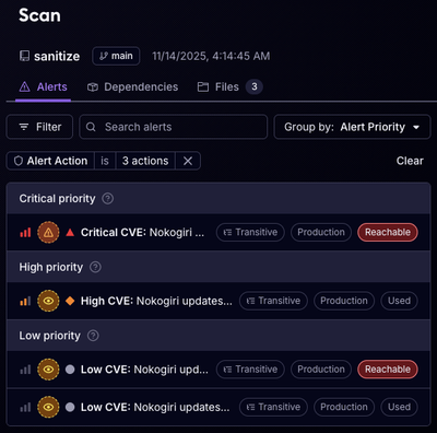
Reachability for Ruby Now in Beta
Reachability analysis for Ruby is now in beta, helping teams identify which vulnerabilities are truly exploitable in their applications.
aurelia-portal-attribute
Advanced tools
A plugin to customize rendering process in Aurelia application.
This article covers the portal attribute plugin for Aurelia. This plugin is created for managing rendering flow of part of custom element in an Aurelia application. The plugin supports the use of dynamic elements matching as render target, via either element references or CSS selectors. Online Demo
jspm with following commandjspm install aurelia-portal-attribute
If you use Webpack, install the plugin with the following command
npm install aurelia-portal-attribute --save
If you use the Aurelia CLI, install the plugin with the following command
au install aurelia-portal-attribute
alternatively you can manually add these dependencies to your vendor bundle:
  ...
  "dependencies": [
    {
      "name": "aurelia-portal-attribute",
      "path": "../node_modules/aurelia-portal-attribute/dist/amd",
      "main": "aurelia-portal-attribute"
    }
  ]
index.html and locate the element with the attribute aurelia-app. Change it to look like this: <body aurelia-app="main">...</body>
main.js in your src: export function configure(aurelia) {
aurelia.use
.standardConfiguration()
.plugin(PLATFORM.moduleName('aurelia-portal-attribute'))
aurelia.start().then(a => a.setRoot());
}
There are a few scenarios you can take advantage of the attribute.
overflow: hidden ancestor and it won't be able to display properly. Consider the following dom structure of a custom <combobox /> element: <template class="combobox">
<div class="input-ct">
<input ref="input" value.bind="filterText" />
<div>
<ul class="list-group items-list">
<li repeat.for="item of items | filter: filterText" class="list-group-item">${item.name}</li>
</ul>
</template>
This structure often works fine when we have ul.list-group.item-list CSS: position: absolute; top: 100%; But it will not work when the custom element is nested inside an element with overflow: hidden, or inside an element with scroll, like following example:
  <!-- app.html -->
  <div style="height: 200px; overflow: auto;">
    <!-- oopps, my list got clipped -->
    <combobox></combobox>
  </div>
A simple solution is to use CSS: position: fixed on the list and calculat its position, or the portal attribute like the following example:
  <template class="combobox">
    <div class="input-ct">
      <input ref="input" value.bind="filterText" />
    <div>
    <ul portal class="list-group items-list">
      <li repeat.for="item of items | filter: filterText" class="list-group-item">${item.name}</li>
    </ul>
  </template>
portal attribute may seem to be an overkill, but beside styling, it also helps you separate DOM path of different parts in your custom element,
whist still binds them to the same underlying view model, which should helps better DOM manangement, including event model in some cases.
Following is an example of final rendered DOM tree for <combobox/> above:
  <body>
    <app>
      <combobox>
        <!-- combobox internal elements -->
      </combobox>
    </app>
    <!-- combobox item list in the body -->
    <ul class="list-group items-list">
      <li class="list-group-item">item 1</li>
      <li class="list-group-item">item 2</li>
      <li class="list-group-item">item 3</li>
      ...
      <!-- more items -->
    </ul>
  </body>
| Name | Types | Default | Description |
|---|---|---|---|
| target | string/Element | undefined | Target of the portal, by default will be resolved to document body, if target cannot be found. If a string is supplied, it will be used to determine the real target with a call document.querySelector() |
| position | beforebegin or afterbegin or beforeend or afterend | beforeend | Describing the position relative to the target of a portal to move the content to |
Portalling an element to document body
<div class="my-menu" portal>
or
<div class="my-menu" portal="body">
Portalling multiple elements to the end of document body
<template portal>
  <p>paragraph 1</p>
  <p>paragraph 2</p>
</template>
To build the code, follow these steps.
npm install
npm run build
dist folder, available in three module formats: AMD, CommonJS and ES6.npm test
Thanks goes to Dwayne Charrington for his Aurelia-TypeScript starter package https://github.com/Vheissu/aurelia-typescript-plugin
FAQs
A plugin to customize rendering process in Aurelia application.
We found that aurelia-portal-attribute demonstrated a not healthy version release cadence and project activity because the last version was released a year ago. It has 1 open source maintainer collaborating on the project.
Did you know?

Socket for GitHub automatically highlights issues in each pull request and monitors the health of all your open source dependencies. Discover the contents of your packages and block harmful activity before you install or update your dependencies.

Product
Reachability analysis for Ruby is now in beta, helping teams identify which vulnerabilities are truly exploitable in their applications.

Research
/Security News
Malicious npm packages use Adspect cloaking and fake CAPTCHAs to fingerprint visitors and redirect victims to crypto-themed scam sites.

Security News
Recent coverage mislabels the latest TEA protocol spam as a worm. Here’s what’s actually happening.