cheers-alert
simple website notification


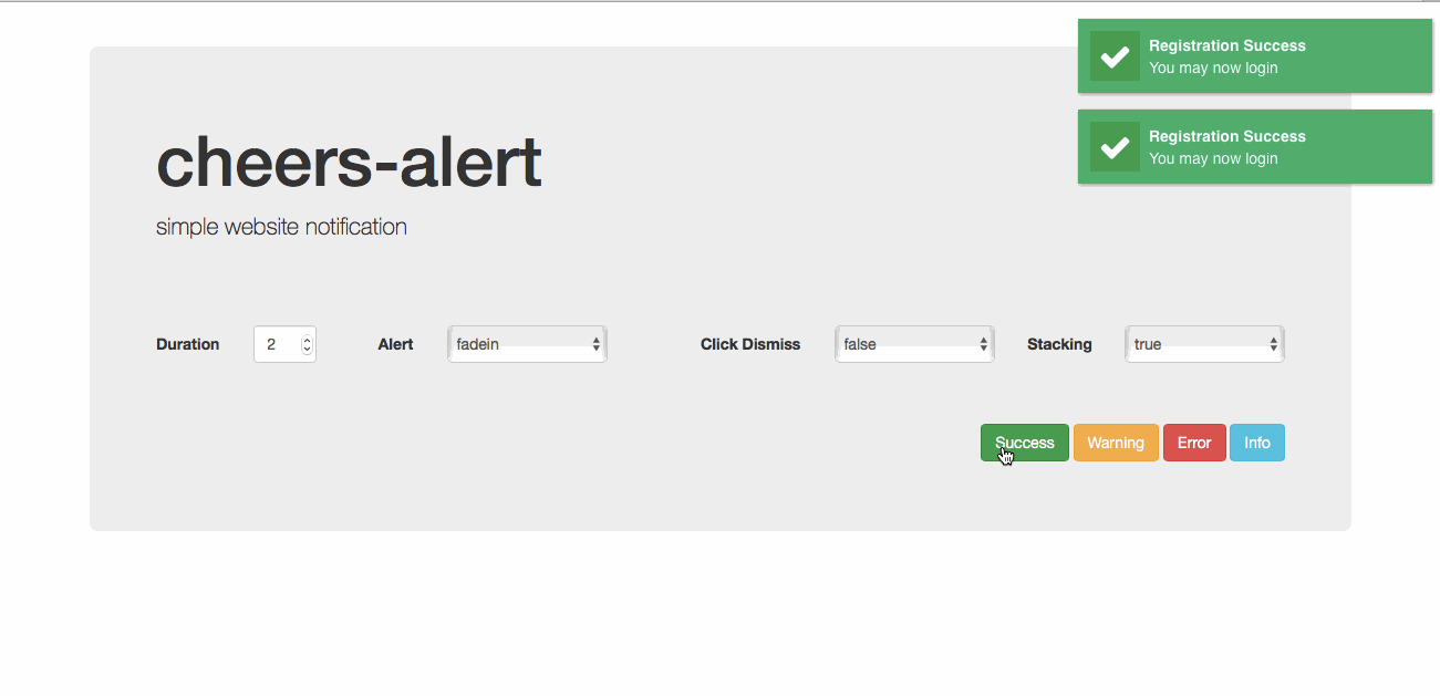
Demo Page
Install
NPM
$ npm install cheers-alert --save
Bower
$ bower install cheers-alert --save
Usage
import cheers from 'cheers-alert';
import 'cheers-alert/src/cheers-alert.css';
import 'font-awesome/css/font-awesome.min.css';
cheers.success({
title: 'Warning',
message: 'Validation error',
alert: 'slideleft',
icon: 'fa-user',
duration: 3,
callback: () => {}
});
Properties
- title - [String] header(optional).
- message - [String] message or content(required).
- alert - [String] transition of notification(defaults to fadein).
- icon - [String] uses font awesome(optional).
- duration - [Number] transition duration(defaults to 4) in seconds.
- callback - [Function] callback function triggered onClick.
Notification Types
- success
- warning
- error
- info
Alert Types
Configuring .duration
set the .duration one-time to avoid redundancy. minimum of 2(seconds).
cheers.setDuration(10);
Disable close onClick
set to false to prevent closing onClick.
cheers.setToggle(false);
Disable stacking
set false to disable stacking of notifications.
cheers.setStacking(false);
Customize CSS
overide this class to modify styles.
<div class="cheer-holder success">
<div class="cheers-icon"></div>
<div class="cheers-body">
<div class="cheers-title"></div>
</div>
</div>


