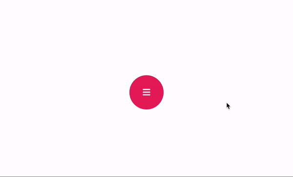
CNK-Floating-Button
An animated button component built with React.
Installation
npm install cnk-floating-button --save
Example
import  React  from  "react";
import { render } from  "react-dom";
import  CNKFloatingButton  from  "../../src";

const  buttonConfigurations  = {
	button1: {
		iconName:  "home",
		onClick: () => {
			console.log("Button1: Clicked");
		}
	},
	button2: {
		iconName:  "phone",
		onClick: () => {
			console.log("Button2: Clicked");
		}
	},
	button3: {
		iconName:  "envelope",
		onClick: () => {
			console.log("Button3: Clicked");
		}
	},
	button4: {
		iconName:  "star",
		onClick: () => {
			console.log("Button4: Clicked");
		}
	}
};

const  App  = () => (
		<CNKFloatingButton
			iconName="sidebar"
			button1={buttonConfigurations.button1}
			button2={buttonConfigurations.button2}
			button3={buttonConfigurations.button3}
			button4={buttonConfigurations.button4} />
);

render(<App />, document.getElementById("root"));
Component Props
| text | [String]: Label of the main button |
| iconName | [String]: Icon name of the main button. We use semantic ui library for icons. |
| size | [Number]: Width and Height's value of main button. One value for all of them. |
| fontSize | [Number]: Font Size of the Text or Icon. |
| button1 | [Object]: Child button configuration for top-left |
| button2 | [Object]: Child button configuration for top-right |
| button3 | [Object]: Child button configuration for bottom-left |
| button4 | [Object]: Child button configuration for bottom-right |
| Note: At least one button configuration must be valid | |
Child Button Configuration
| text | [String]: Label of the button |
| iconName | [String]: Icon name of the button. We use semantic ui library for icons. |
| fontSize | [Number]: Font Size of the Text or Icon. |
| onClick | [Function][Required]: OnClick event for the button. |
| backgroundColor | [String]: Background Color of the Button. This must be valid css color. |
| foregroundColor | [String]: Foreground Color of the Button for Text or Icon. This must be valid css color. |
| hoverBackgroundColor | [String]: Hover effect background color of the button. This must be valid css color. |
v1.0.1 (2018-10-26)
Initial Commit [Component Published]


