Security News
MCP Steering Committee Launches Official MCP Registry in Preview
The MCP Steering Committee has launched the official MCP Registry in preview, a central hub for discovering and publishing MCP servers.
coherent-gameface-accordion-menu
Advanced tools
The accordion-menu is part of the Gameface custom components suite. As most of the components in this suite it uses slots to allow dynamic content.
npm i coherent-gameface-accordion-menu
<script src="./node_modules/coherent-gameface-accordion-menu/dist/accordion-menu.production.min.js"></script>
<gameface-accordion-menu></gameface-accordion-menu>
This is all! Load the file in Gameface to see the accordion-menu.
If you wish to import the AccordionMenu using JavaScript you can remove the script tag and import it like this:
import { AccordionMenu } from 'coherent-gameface-accordion-menu';
or simply
import 'coherent-gameface-accordion-menu';
Note that this approach requires a module bundler like Webpack or Rollup to resolve the modules from the node_modules folder.
<link rel="stylesheet" href="coherent-gameface-components-theme.css">
<link rel="stylesheet" href="style.css">
To overwrite the default styles, simply create new rules for the class names that you wish to change and include them after the default styles.
Load the HTML file in Gameface to see the accordion-menu.
To use the accordion-menu component add the following element to your html
<gameface-accordion-menu></gmeface-accordion-menu>
To add panels that will expand on click you need to add gameface-accordion-panel.
<gameface-accordion-menu >
    <gameface-accordion-panel slot="accordion-panel">
        <gameface-accordion-header>Long Text</gameface-accordion-header>
        <gameface-accordion-content>
            Lorem ipsum, dolor sit amet consectetur adipisicing elit. Eius, in! At nesciunt earum ea deserunt architecto animi quod
            neque dicta asperiores. Error aliquid facilis hic in culpa quisquam temporibus aliquam.
        </gameface-accordion-content>
    </gameface-accordion-panel>
</gameface-accordion-menu>
You can add a gameface-accordion-panel for each panel in the accordion menu, it needs to contain a gameface-accordion-header and gameface-accordion-content components to display properly. The gameface-accordion-header is the part of the panel that is always visible and the gameface-accordion-content is hidden and gets expanded.
You can use the following attributes to customize the accordion-menu
| Attribute | Type | Default | Description |
|---|---|---|---|
| multiple | Boolean | false | If you can expand multiple panels at once |
You can also add the following attributes to the gameface-accordion-panel
| Attribute | Type | Default | Description |
|---|---|---|---|
| disabled | Boolean | false | If the panel is disabled. You can't expand or shrink disabled panels |
| expanded | Boolean | false | If the panel is expanded on load |
You can change the attributes mentioned above runtime via setAttribute, removeAttribute or with JavaScript.
For example we can change the multiple of accordion menu like that
const accordionMenu = document.querySelector('gameface-accordion-menu');
// If we want to enable multiple of the accordion menu
accordionMenu.setAttribute('multiple', '');
// or
accordionMenu.multiple = true;
// And if we want to disable the multiple of the accordion menu
accordionMenu.removeAttribute('multiple');
// or
accordionMenu.multiple = false;
Note that when disabling the multiple functionality of the accordion-menu and there are more than one accordion-panels expanded then it will close all of them if are not disabled and leave just the first one expanded.
You can change the disabled and expanded attributes of the accordion-panel in the similar way as above.
const accordionPanel = document.querySelector('gameface-accordion-panel');
// If we want to disable the accordion panel
accordionPanel.setAttribute('disabled', '');
// or
accordionPanel.disabled = true;
// And if we want to enable the accordion panel
accordionPanel.removeAttribute('disabled');
// or
accordionPanel.disabled = false;
// If we want to expand the accordion panel
accordionPanel.setAttribute('expanded', '');
// or
accordionPanel.expanded = true;
// If we want to collapse the accordion panel
accordionPanel.removeAttribute('expanded');
// or
accordionPanel.expanded = false;
FAQs
Did you know?

Socket for GitHub automatically highlights issues in each pull request and monitors the health of all your open source dependencies. Discover the contents of your packages and block harmful activity before you install or update your dependencies.

Security News
The MCP Steering Committee has launched the official MCP Registry in preview, a central hub for discovering and publishing MCP servers.

Product
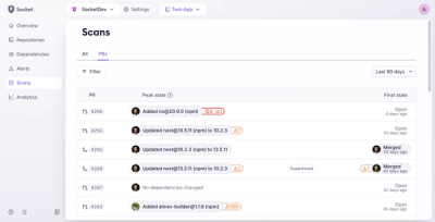
Socket’s new Pull Request Stories give security teams clear visibility into dependency risks and outcomes across scanned pull requests.

Research
/Security News
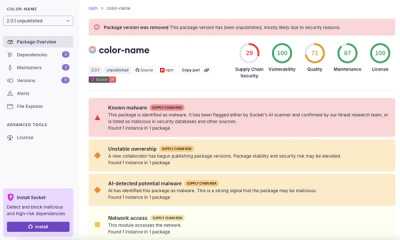
npm author Qix’s account was compromised, with malicious versions of popular packages like chalk-template, color-convert, and strip-ansi published.