Research
Malicious npm Packages Impersonate Flashbots SDKs, Targeting Ethereum Wallet Credentials
Four npm packages disguised as cryptographic tools steal developer credentials and send them to attacker-controlled Telegram infrastructure.
collapsible-react-component
Advanced tools
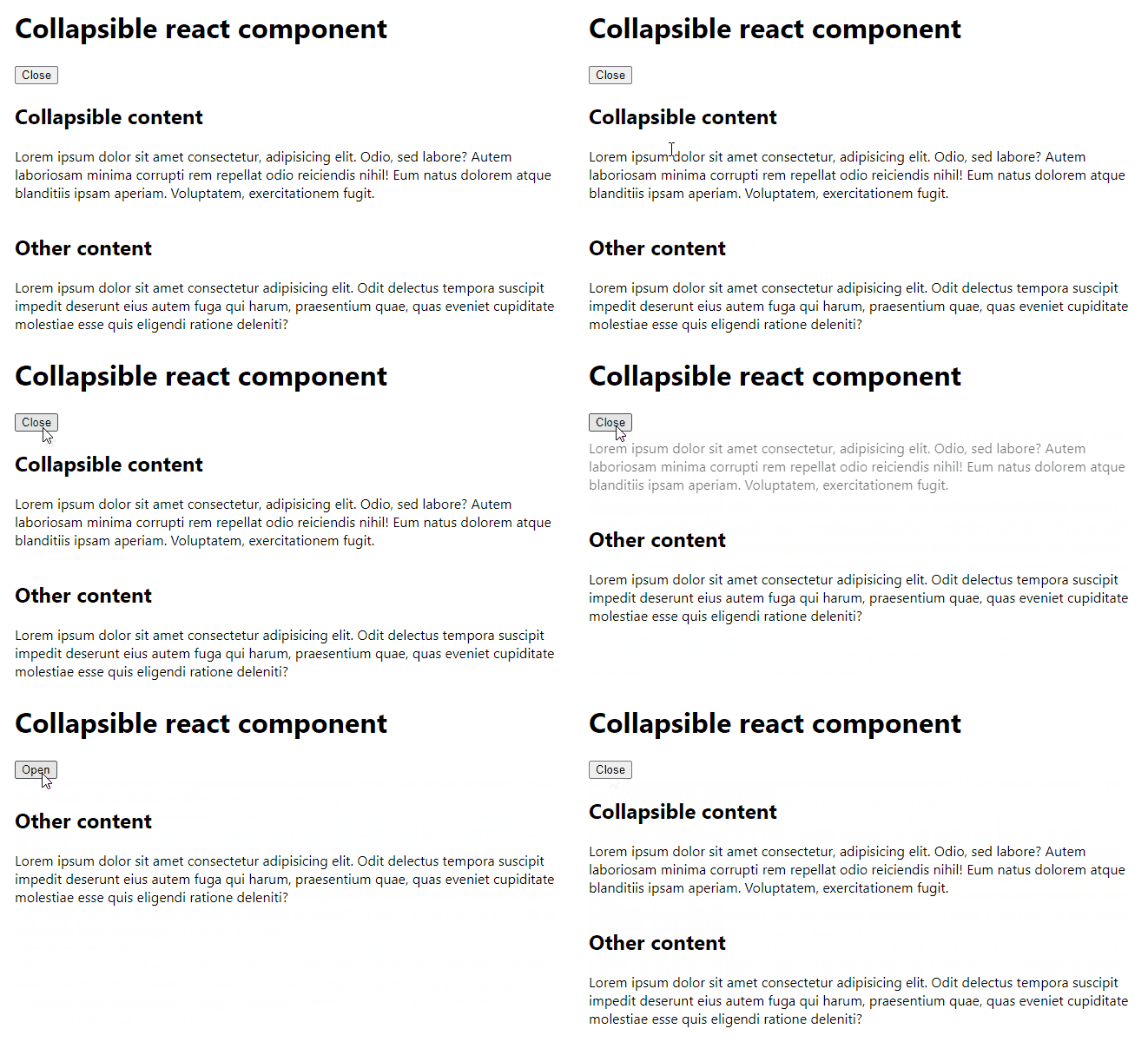
Collapses and expands content with an animation.

npm install collapsible-react-component
Try CodeSandbox interactive demo or see Storybook examples.
import { useState } from 'react'
import { Collapsible } from 'collapsible-react-component'
import 'collapsible-react-component/dist/index.css'

const Example = () => {
	const [open, setOpen] = useState(true)

	return (
		<>
			<button
				type="button"
				onClick={() => {
					setOpen(!open)
				}}
			>
				{open ? 'Close' : 'Open'}
			</button>
			<Collapsible
				open={open}
				onTransitionStart={(open) => {
					console.log('Collapsible box used to be', open ? 'open' : 'closed')
				}}
				onTransitionEnd={(open) => {
					console.log('Collapsible box is now', open ? 'open' : 'closed')
				}}
				revealType="bottomFirst"
			>
				Lorem ipsum dolor sit amet consectetur, adipisicing elit. Odio, sed
				labore? Autem laboriosam minima corrupti rem repellat odio reiciendis
				nihil! Eum natus dolorem atque blanditiis ipsam aperiam. Voluptatem,
				exercitationem fugit.
			</Collapsible>
		</>
	)
}
| Name | Required | Default | Type | Description |
|---|---|---|---|---|
open | ✅ | boolean | Determines whether the children content should be visible. | |
children | ✅ | ReactNode | Collapsible content. | |
onTransitionStart | noop | (open: boolean) => void | Callback invoked when transition starts. open is the starting state. | |
onTransitionEnd | noop | (open: boolean) => void | Callback after content is fully expanded or fully closed. open is the final state. | |
revealType | bottomFirst | bottomFirst | topFirst | Type of transition animation. | |
alwaysKeepChildrenMounted | false | boolean | If true then children won't be unmounted when collapsed. |
Run
npm ci
npm run dev
and
cd example
npm ci
npm run dev
FAQs
Collapses and expands content with an animation.
The npm package collapsible-react-component receives a total of 53 weekly downloads. As such, collapsible-react-component popularity was classified as not popular.
We found that collapsible-react-component demonstrated a healthy version release cadence and project activity because the last version was released less than a year ago. It has 0 open source maintainers collaborating on the project.
Did you know?

Socket for GitHub automatically highlights issues in each pull request and monitors the health of all your open source dependencies. Discover the contents of your packages and block harmful activity before you install or update your dependencies.

Research
Four npm packages disguised as cryptographic tools steal developer credentials and send them to attacker-controlled Telegram infrastructure.

Security News
Ruby maintainers from Bundler and rbenv teams are building rv to bring Python uv's speed and unified tooling approach to Ruby development.

Security News
Following last week’s supply chain attack, Nx published findings on the GitHub Actions exploit and moved npm publishing to Trusted Publishers.