View Live 🚀
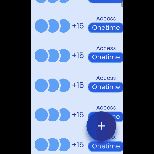
A lightweight, animated floating button component for React, perfect for modern UI's. Easily customizable with multiple options, backdrop darkening, and Tailwind styling support.
Key Features
- Smooth Animations: Eye-catching open/close animations.
- Customizable: Tailwind-compatible for seamless integration with your styling.
- Multiple Options: Supports multiple action buttons in a flexible menu.
- Backdrop Darkening: Optional overlay for focused interactions.
Installation
Install with npm
npm i cool-react-floating-button
Please Note: Tailwind CSS is required for styling to work.
Usage
Import
import {
    FloatingButton,
    FloatingButtonIcon,
    FloatingButtonOptionContainer,
    FloatingButtonOption,
    FloatingButtonOptionIcon,
    FloatingButtonOptionLabel,
} from "cool-react-floating-button";
Use in app
import React, { useState } from "react";

function App() {
    const [floatingBtnOpen, setFloatBtnOpen] = useState(false);

    return (
        <div>
            <FloatingButton
                open={floatingBtnOpen}
                setFloatBtnOpen={setFloatBtnOpen}
                className={"size-16 rounded-full bg-gradient-to-r from-blue-800 to-indigo-900 text-white text-2xl shadow-lg shadow-blue-800"}
            >
                <FloatingButtonIcon ariaLabel="Toggle Floating Button">
                    <svg
                        xmlns="http://www.w3.org/2000/svg"
                        width="24"
                        height="24"
                        viewBox="0 0 24 24"
                        fill="none"
                        stroke="currentColor"
                        strokeWidth="2"
                        strokeLinecap="round"
                        strokeLinejoin="round"
                        className="lucide lucide-plus"
                    >
                        <path d="M5 12h14" />
                        <path d="M12 5v14" />
                    </svg>
                </FloatingButtonIcon>
                <FloatingButtonOptionContainer ariaLabel="Floating Button Options">
                    <FloatingButtonOption
                        onClick={() => {
                            alert("clicked");
                            setFloatBtnOpen(false);
                        }}
                        ariaLabel="Department Option"
                    >
                        <FloatingButtonOptionIcon
                            ariaLabel="Department Icon"
                            className={"rounded-full shadow-xl bg-gradient-to-r from-blue-600 to-indigo-700 size-10"}
                        >
                            <svg
                                xmlns="http://www.w3.org/2000/svg"
                                width="24"
                                height="24"
                                viewBox="0 0 24 24"
                                fill="none"
                                stroke="currentColor"
                                strokeWidth="2"
                                strokeLinecap="round"
                                strokeLinejoin="round"
                                className="lucide lucide-house-plus"
                            >
                                <path d="M13.22 2.416a2 2 0 0 0-2.511.057l-7 5.999A2 2 0 0 0 3 10v9a2 2 0 0 0 2 2h14a2 2 0 0 0 2-2v-7.354" />
                                <path d="M15 21v-8a1 1 0 0 0-1-1h-4a1 1 0 0 0-1 1v8" />
                                <path d="M15 6h6" />
                                <path d="M18 3v6" />
                            </svg>
                        </FloatingButtonOptionIcon>
                        <FloatingButtonOptionLabel ariaLabel={"Department icon"} className={"text-sm pb-1 text-white bg-blue-800 rounded-full px-2"}>
                            Department
                        </FloatingButtonOptionLabel>
                    </FloatingButtonOption>
                    <FloatingButtonOption
                        onClick={() => {
                            alert("clicked");
                            setFloatBtnOpen(false);
                        }}
                        ariaLabel="Faculty Option"
                    >
                        <FloatingButtonOptionIcon
                            ariaLabel="Faculty Icon"
                            className={"rounded-full shadow-xl bg-gradient-to-r from-blue-600 to-indigo-700 size-10"}
                        >
                            <svg
                                xmlns="http://www.w3.org/2000/svg"
                                width="24"
                                height="24"
                                viewBox="0 0 24 24"
                                fill="none"
                                stroke="currentColor"
                                strokeWidth="2"
                                strokeLinecap="round"
                                strokeLinejoin="round"
                                className="lucide lucide-user-round"
                            >
                                <circle cx="12" cy="8" r="5" />
                                <path d="M20 21a8 8 0 0 0-16 0" />
                            </svg>
                        </FloatingButtonOptionIcon>
                        <FloatingButtonOptionLabel ariaLabel={"Faculty icon"} className={"text-sm pb-1 text-white bg-blue-800 rounded-full px-2"}>
                            Faculty
                        </FloatingButtonOptionLabel>
                    </FloatingButtonOption>
                    <FloatingButtonOption
                        onClick={() => {
                            alert("clicked");
                            setFloatBtnOpen(false);
                        }}
                        ariaLabel="Student Option"
                    >
                        <FloatingButtonOptionIcon
                            ariaLabel="Student Icon"
                            className={"rounded-full shadow-xl bg-gradient-to-r from-blue-600 to-indigo-700 size-10"}
                        >
                            <svg
                                xmlns="http://www.w3.org/2000/svg"
                                width="24"
                                height="24"
                                viewBox="0 0 24 24"
                                fill="none"
                                stroke="currentColor"
                                strokeWidth="2"
                                strokeLinecap="round"
                                strokeLinejoin="round"
                                className="lucide lucide-user-round"
                            >
                                <circle cx="12" cy="8" r="5" />
                                <path d="M20 21a8 8 0 0 0-16 0" />
                            </svg>
                        </FloatingButtonOptionIcon>
                        <FloatingButtonOptionLabel ariaLabel={"Student icon"} className={"text-sm pb-1 text-white bg-blue-800 rounded-full px-2"}>
                            Student
                        </FloatingButtonOptionLabel>
                    </FloatingButtonOption>
                </FloatingButtonOptionContainer>
            </FloatingButton>
        </div>
    );
}

export default App;
Visit my GitHub
Visit my Site


