Country Dropdown
A customizable React component for country, state, and city dropdowns.
Installation
Step 1: Install the package from npm.
To get started with the Country Dropdown component, follow these steps:
npm i country-dropdown
Before using the component, you need to get an API key from the Country State City API website.
Step 3: Set the API key in the environment(.env) file.
Please make sure to replace the your_api_key in the .env file with your actual API key.
REACT_APP_COUNTRY_STATE_CITY_API_KEY = your_api_key
Step 4: Wrap your component using ValueProvider.
Wrap your components using the ValueProvider component to ensure proper functionality.
import { ValueProvider } from "country-dropdown";

<ValueProvider>
    <YourComponents>
</ValueProvider>
Step 5: Import the Dropdown component and use it.
Import the Dropdown component and integrate it into your application, providing a suitable onChange function.
import { Dropdown, ValueProvider } from "country-dropdown";

<ValueProvider>
    <Dropdown
        onChange={(value, type) => handleChange(value, type)}
    />
</ValueProvider>
| onChange | (value: object, type: string) => void | A callback function triggered when the value of the dropdown changes. Receives the selected value and the type of dropdown (e.g., "Country", "State", "City"). |
| dropdownOptions (optional) | Array<string> | An array of strings representing the dropdown options. Determines the number of dropdowns to display. Example: ["Country", "State", "City"]. |
| cityPlaceholder (optional) | string | The placeholder text to display in the city dropdown. |
| statePlaceholder (optional) | string | The placeholder text to display in the state dropdown. |
| countryPlaceholder (optional) | string | The placeholder text to display in the country dropdown. |
| containerClassName (optional) | string | A CSS class name or Tailwind classes to customize the styling of the container that wraps the dropdown component. |
| inputClassName (optional) | string | A CSS class name or Tailwind classes to customize the styling of the dropdown input field. |
| optionItemClassName (optional) | string | A CSS class name or Tailwind classes to customize the styling of the dropdown options. |
| optionItemSelectedClassName (optional) | string | A CSS class name or Tailwind classes to customize the styling of the selected dropdown options. |
| optionsListClassName (optional) | string | A CSS class name or Tailwind classes to customize the styling of the dropdown options list. |
| optionItemHoverClassName (optional) | string | A CSS class name or Tailwind classes to customize the styling of the dropdown options when hovered. Use hover: for Tailwind classes and :hover for regular CSS classes. |
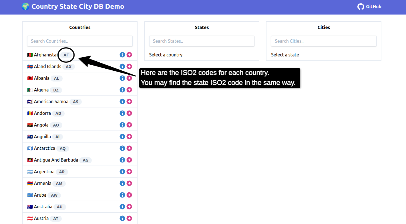
| defaultCountryValue (optional) | string | The ISO2 code for the default country to be selected if Country is not present in the dropdown options. |
| defaultStateValue (optional) | string | The ISO2 code for the default state to be selected if Country and State are not present in the dropdown options. |
| labelClasses (optional) | string | A CSS class name or Tailwind classes to customize the styling of the input label. |
| cityLabel (optional) | string | A label for the city dropdown. |
| countryLabel (optional) | string | A label for the country dropdown. |
| stateLabel (optional) | string | A label for the state dropdown. |
| cityDropdownName (optional) | string | A name for the city dropdown. |
| stateDropdownName (optional) | string | A name for the state dropdown. |
| countryDropdownName (optional) | string | A name for the country dropdown. |
| | |
Use Dropdown with react-hook-form Library
import { DropdownWithReactHookForm } from "country-dropdown";

<DropdownWithReactHookForm
    onDropdownChange={(value, type) =>
        handleChange(value, type)
    }
    dropdownOptions={["City", "State", "Country"]}
/>
| onDropdownChange | (value: object, type: string) => void | A callback function triggered when the value of the dropdown changes. Receives the selected value and the type of dropdown (e.g., "Country", "State", "City"). |
| dropdownOptions (optional) | Array<string> | An array of strings representing the dropdown options. Determines the number of dropdowns to display. Example: ["Country", "State", "City"]. |
| cityPlaceholder (optional) | string | The placeholder text to display in the city dropdown. |
| statePlaceholder (optional) | string | The placeholder text to display in the state dropdown. |
| countryPlaceholder (optional) | string | The placeholder text to display in the country dropdown. |
| containerClassName (optional) | string | A CSS class name or Tailwind classes to customize the styling of the container that wraps the dropdown component. |
| inputClassName (optional) | string | A CSS class name or Tailwind classes to customize the styling of the dropdown input field. |
| optionItemClassName (optional) | string | A CSS class name or Tailwind classes to customize the styling of the dropdown options. |
| optionItemSelectedClassName (optional) | string | A CSS class name or Tailwind classes to customize the styling of the selected dropdown options. |
| optionsListClassName (optional) | string | A CSS class name or Tailwind classes to customize the styling of the dropdown options list. |
| optionItemHoverClassName (optional) | string | A CSS class name or Tailwind classes to customize the styling of the dropdown options when hovered. Use hover: for Tailwind classes and :hover for regular CSS classes. |
| defaultCountryValue (optional) | string | The ISO2 code for the default country to be selected if Country is not present in the dropdown options. |
| defaultStateValue (optional) | string | The ISO2 code for the default state to be selected if Country and State are not present in the dropdown options. |
| labelClasses (optional) | string | A CSS class name or Tailwind classes to customize the styling of the input label. |
| cityLabel (optional) | string | A label for the city dropdown. |
| countryLabel (optional) | string | A label for the country dropdown. |
| stateLabel (optional) | string | A label for the state dropdown. |
| cityDropdownName (optional) | string | A name for the city dropdown. |
| stateDropdownName (optional) | string | A name for the state dropdown. |
| countryDropdownName (optional) | string | A name for the country dropdown. |
| errorClassNames (optional) | string | CSS class name or Tailwind classes to customize the styling of the error message. |
| cityValidations (optional) | RegisterOptions | Validations for city dropdown |
| stateValidations (optional) | RegisterOptions | Validations for state dropdown |
| countryValidations (optional) | RegisterOptions | Validations for country dropdown |


