Product
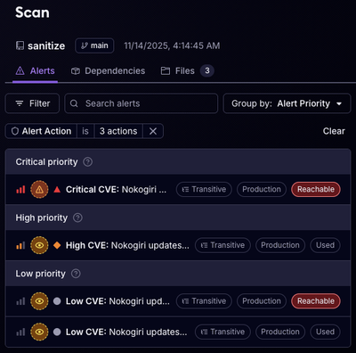
Reachability for Ruby Now in Beta
Reachability analysis for Ruby is now in beta, helping teams identify which vulnerabilities are truly exploitable in their applications.
cpr-tooltip
Advanced tools
a React tooltip for heart-threatening situations
npm install --save cpr-tooltip
import CprTooltip from 'cpr-tooltip';

export default function MyComponent() {
  return (
    <CprTooltip
      text="This will be shown on hover"
      delayTime={1500}
      disabled={false}
    />
      <div>
        This is the content that will have a tooltip when hovered.
      </div>
    </CprTooltip>
  );
}
text (required): The string of text to show in the tooltip.delayTime (optional): The number of milliseconds to wait after mouseover before showing the tooltip. Defaults to 0 (instantaneous tooltip).disabled (optional): If disabled is truthy, the tooltip will not be shown and an already visible tooltip will be hidden.FAQs
A React component for tooltips
We found that cpr-tooltip demonstrated a not healthy version release cadence and project activity because the last version was released a year ago. It has 5 open source maintainers collaborating on the project.
Did you know?

Socket for GitHub automatically highlights issues in each pull request and monitors the health of all your open source dependencies. Discover the contents of your packages and block harmful activity before you install or update your dependencies.

Product
Reachability analysis for Ruby is now in beta, helping teams identify which vulnerabilities are truly exploitable in their applications.

Research
/Security News
Malicious npm packages use Adspect cloaking and fake CAPTCHAs to fingerprint visitors and redirect victims to crypto-themed scam sites.

Security News
Recent coverage mislabels the latest TEA protocol spam as a worm. Here’s what’s actually happening.