
Security News
MCP Community Begins Work on Official MCP Metaregistry
The MCP community is launching an official registry to standardize AI tool discovery and let agents dynamically find and install MCP servers.
By Sarah Gooding - May 09, 2025
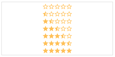
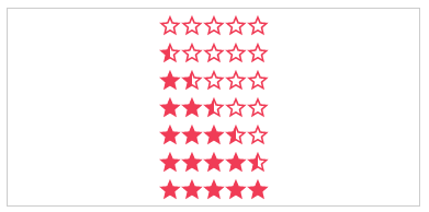
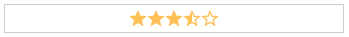
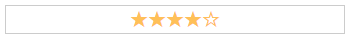
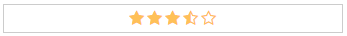
css-star-rating
Advanced tools


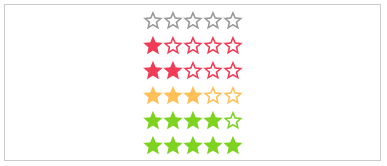
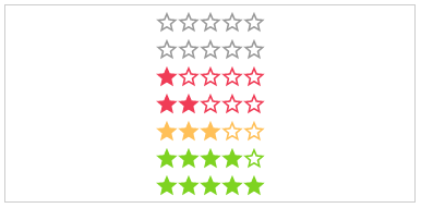
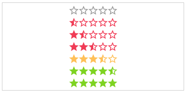
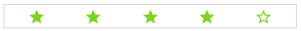
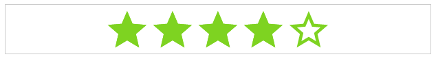
Css Star Rating is written in scss and fully customizable over variables.
Easily compose your own rating component over a rich set of css modifiers for any kind of UI state.
Demos in the KSS style guide
| IE | Firefox | Chrome | Safari | Opera |
|---|---|---|---|---|
| 11 | 50 | 55 | 10 | 41 |
 |  |  |  |  |
| Css | Angular1 (>=1.5) | Angular (>=10) |
|---|---|---|
 |  |  |
| Css Star Rating | Angular1 Star Rating | Angular Star Rating |
Get Css Star Rating:
$ npm install css-star-rating from your consoleLoad library
<link rel="stylesheet" href="node_modules/css-star-rating/css/star-rating.css">
Copy assets (optional)
If you want to use svg as icon type copy the
star-rating.icons.svg image form node_modules/css-star-rating/images/star-rating.css to your roots assets folder.
Usage
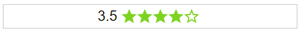
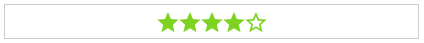
<div class="rating large star-icon direction-rtl value-1 half color-default label-top">
   <div class="label-value">1.5</div>
    <div class="star-container">
        <div class="star">
            <i class="star-empty"></i>
            <i class="star-half"></i>
            <i class="star-filled"></i>
        </div>
        <div class="star">
            <i class="star-empty"></i>
            <i class="star-half"></i>
            <i class="star-filled"></i>
        </div>
        <div class="star">
            <i class="star-empty"></i>
            <i class="star-half"></i>
            <i class="star-filled"></i>
        </div>
    </div>
</div>
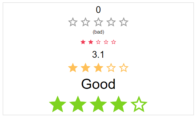
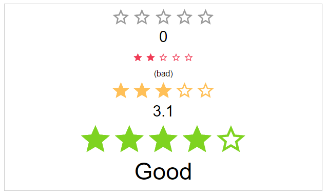
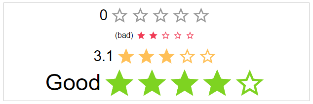
.value-[N]:
The actual star rating value. The color of the stars depends on the rating number
<div class="rating value-3">
   <div class="star-container">
        ...stars...
    </div>
</div>
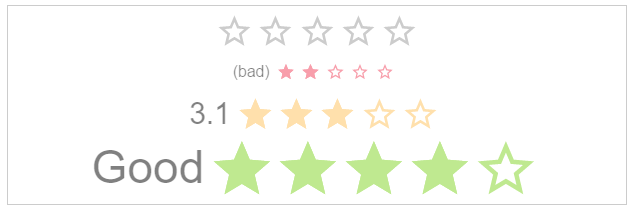
.half:
If set, every rating value will have a half star at the end.
<div class="rating value-3 half">
   <div class="star-container">
        ...stars...
    </div>
</div>
text:
The text next to the stars.
<div class="rating value-3">
   <div class="label-value">My text</div>
   <div class="star-container">
        ...stars...
    </div>
</div>

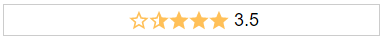
.label-[VISIBILITY]:
The position of the label.
<div class="rating value-3 label-hidden">
   <div class="label-value">3.5</div>
   <div class="star-container">
        ...stars...
    </div>
</div>
.label-[POSITION]:
The position of the label.
<div class="rating value-3 label-right">
   <div class="label-value">Good</div>
   <div class="star-container">
        ...stars...
    </div>
</div>

.space:
If the start use the whole space or not.
<div class="rating value-3 space-between">
   <div class="star-container">
        ...stars...
    </div>
</div>


.[SIZE]:
The height and width of the stars.
<div class="rating value-3 large">
   <div class="star-container">
        ...stars...
    </div>
</div>


color-[COLOR_NAME]:
Static color of stars.
<div class="rating value-3 color-negative">
   <div class="star-container">
        ...stars...
    </div>
</div>
.disabled: The click callback is disabled, colors are transparent
<div class="rating value-3 disabled">
   <div class="star-container">
        ...stars...
    </div>
</div>

.direction-[DIRECTION]:
The direction of the stars and label.
<div class="rating value-3 direction-rtl">
   <div class="star-container">
        ...stars...
    </div>
</div>

.[ANIMATION_SPEED]:
The duration of the animation in ms.
<div class="rating value-3 slow">
   <div class="star-container">
        ...stars...
    </div>
</div>


starType:
The type of start resource to use.
<div class="rating value-3 star-icon">
   <div class="star-container">
        <!-- font icons-->
        <div class="star">
            <i class="star-empty"></i>
            <i class="star-half"></i>
            <i class="star-filled"></i>
        </div>
        <!-- or svg icons-->
        <div class="star">
            <svg class="star-empty">
                <use xmlns:xlink="http://www.w3.org/1999/xlink" xlink:href="assets/images/star-rating.icons.svg#star-empty"></use>
            </svg>
            <svg class="star-half">
                <use xmlns:xlink="http://www.w3.org/1999/xlink" xlink:href="assets/images/star-rating.icons.svg#star-half"></use>
            </svg>
            <svg class="star-filled">
                <use xmlns:xlink="http://www.w3.org/1999/xlink" xlink:href="assets/images/star-rating.icons.svg#star-filled"></use>
            </svg>
        </div>
    </div>
</div>
As a bonus there are some themes as classes.
theme-[NAME]:
The type of start resource to use.
<div class="rating value-3 theme-google-places">
   <div class="star-container">
        ...stars...
    </div>
</div>
1.3.1 (2022-06-06)
All notable changes to this project will be documented in this file. See standard-version for commit guidelines.
FAQs
Css Star Rating is pure css component written in scss.
The npm package css-star-rating receives a total of 4,010 weekly downloads. As such, css-star-rating popularity was classified as popular.
We found that css-star-rating demonstrated a not healthy version release cadence and project activity because the last version was released a year ago. It has 1 open source maintainer collaborating on the project.
Did you know?

Socket for GitHub automatically highlights issues in each pull request and monitors the health of all your open source dependencies. Discover the contents of your packages and block harmful activity before you install or update your dependencies.
Security News
The MCP community is launching an official registry to standardize AI tool discovery and let agents dynamically find and install MCP servers.

Research
Security News
Socket uncovers an npm Trojan stealing crypto wallets and BullX credentials via obfuscated code and Telegram exfiltration.

Research
Security News
Malicious npm packages posing as developer tools target macOS Cursor IDE users, stealing credentials and modifying files to gain persistent backdoor access.