Product
Introducing License Overlays: Smarter License Management for Real-World Code
Customize license detection with Socket’s new license overlays: gain control, reduce noise, and handle edge cases with precision.
cursor-style
Advanced tools
Elevate your web application's user experience with cursor-style, a sophisticated library designed to customize and animate the cursor. From adding elegance and interactivity to standing out, cursor-style provides an array of options to enhance your site's interactive elements with minimal effort.
npm install cursor-style
Custom Cursor Shapes: Easily transform the default cursor into a variety of shapes to match the context of different web page elements.
Cursor Animations: Introduce animations to the cursor for interactive feedback in a stylish and engaging manner.
Seamless Integration: Effortlessly integrate cursor-style into any web project with just a few lines of code.
Extensive Configurability: Tailor size, color, animation speed, and more to perfectly align with your site's aesthetic.
Optimized Performance: Engineered for efficiency, ensuring fluid animations that do not hinder site responsiveness.
Flexible Configuration: Features such as optional movement delay allow for dynamic interaction customization.
Bug Fixes and Improvements:
Fixed issue where cursors would not center correctly at larger sizes.
Adjusted animation speeds for improved consistency across different cursor types.
Resolved bug where the delay prop was incorrectly required, now allowing for more flexible configuration.
Optional delay Prop: Introduced flexibility in cursor movement, allowing for immediate or delayed cursor response.
size Customization: New property to adjust the cursor size, enabling better control over the cursor's appearance.
Background Color Options: Added bgColor, bgColorDot, and bgColorOutline props to customize the cursor's color scheme to fit your design.
Unique Cursor Components: Expanded the cursor library with distinct styles, each supporting specific customizations:
CursorOne: Offers a simple, elegant cursor with size and background color customization.CursorTwo: Features a dot and outline design, with additional sizeDot and sizeOutline props for intricate adjustments.CursorThree: A minimalist approach with a transparent cursor that supports border customization.Enhanced Performance: Optimizations ensure smoother animations and responsiveness, even with multiple custom cursors active.
Comprehensive Customization: Beyond size and color, props like useMixBlendDifferenc` provide creative control over blending modes, allowing for dynamic visual effects that react to web page backgrounds.
Integrate custom cursors into your project with ease. Here are examples for each cursor type, showcasing how to utilize various props for customization:
CursorOne - Basic Circle
import { CursorOne } from "cursor-style";

function App() {
  return (
    <CursorOne size={30} delay={5} bgColor="red" useMixBlendDifference={true} />
  );
}
CursorTwo - Dot and Outline
import { CursorTwo } from "cursor-style";

function App() {
  return (
    <CursorTwo
      size={40}
      delay={5}
      sizeDot={10}
      sizeOutline={35}
      bgColorDot="blue"
      bgColorOutline="green"
    />
  );
}
CursorThree - Transparent with Border
import { CursorThree } from "cursor-style";

function App() {
  return <CursorThree size={25} delay={2} />;
}
CustomCursor - Flexible Type Selection
import { CustomCursor } from "cursor-style";

function App() {
  return (
    <CustomCursor
      type="two"
      size={40}
      delay={5}
      sizeDot={15}
      sizeOutline={30}
      bgColorDot="purple"
      bgColorOutline="yellow"
    />
  );
}
Each cursor component accepts specific props for customization:
size: Adjusts the overall size of the cursor.
delay: Alters the movement delay, creating a trailing effect.
bgColor, bgColorDot, bgColorOutline: Customizes the color for different cursor elements.
sizeDot, sizeOutline: Specifically for CursorTwo, these props adjust the sizes of the dot and outline elements.
Encountered an issue or have a feature request? Reach out through my Github account
FAQs
Multiple choose cursors prebuilt to choose from
The npm package cursor-style receives a total of 2 weekly downloads. As such, cursor-style popularity was classified as not popular.
We found that cursor-style demonstrated a healthy version release cadence and project activity because the last version was released less than a year ago. It has 2 open source maintainers collaborating on the project.
Did you know?

Socket for GitHub automatically highlights issues in each pull request and monitors the health of all your open source dependencies. Discover the contents of your packages and block harmful activity before you install or update your dependencies.

Product
Customize license detection with Socket’s new license overlays: gain control, reduce noise, and handle edge cases with precision.

Product
Socket now supports Rust and Cargo, offering package search for all users and experimental SBOM generation for enterprise projects.

Product
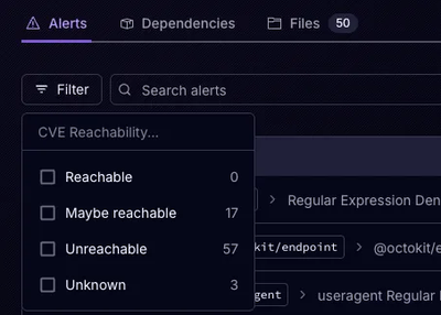
Socket’s precomputed reachability slashes false positives by flagging up to 80% of vulnerabilities as irrelevant, with no setup and instant results.