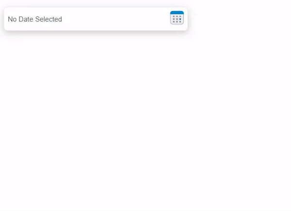
Date Range Picker React
Date range picker is a react UI component which is easily customizable and dependent on react and dayjs. Example of code for using the package is given below. Keep Scrolling :)
Add Compnent
import { useState, useEffect } from "react";
import { DateRangePicker } from "date-range-react-picker";
function App() {
const [userState, setUserState] = useState(null);
/* After pressing Accept button, userState will have following properties
userState={
startDate: dayJS Object,
endDate: dayJS Object
}
for modification, Please check dayJS functions
e.g. userState.startDate.format("DD-MM-YYYY")
*/
useEffect(() => console.log("UserState", userState), [userState]);
return (
<div
className="App"
style={{ marginLeft: "200px", width: "650px", marginTop: "200px" }}
>
<DateRangePicker
weekStartDay="1"
containerWidth="600px"
textBoxWidth="400px"
getDateRangeState={setUserState}
applyFunc={() => console.log("Apply from parent")}
cancelFunc={() => console.log("Cancel from parent")}
dateFormatShow="DD MMMM,YYYY"
/>
</div>
);
}
export default App;
Props
All props are optional.
- getdateRangeState - function can be passed in which the current state of the picker can be saved
- applyFunc - a callback can be passed to add event with apply button
- cancelFunc - a callback can be passed to add event with cancel button
- containerWidth - width measurement in css can be passed for picker UI. If not the default will be 650px
- textBoxWidth - width measurement in css can be passed for parent field. If not the default will be 300px
- weekStartDay - used to determine first day of calender. (eg. 0-Sunday, 1-Monday)
- dateFormatShow - date format show in parent textbox. for more check dayjs date formats


