Research
Namastex.ai npm Packages Hit with TeamPCP-Style CanisterWorm Malware
Malicious Namastex.ai npm packages appear to replicate TeamPCP-style Canister Worm tradecraft, including exfiltration and self-propagation.
ember-responsive
Advanced tools
An ember-cli addon that gives you a simple, Ember-aware way of dealing with media queries.
ember-responsive is an ember-cli addon that give you a simple, Ember-aware way of dealing with media queries.
All you need to do is tell it your application's breakpoints and it'll expose the rest for you. Here is an interactive demo
ember-responsive needs window.matchMedia() to function, which isn't available in all browsers. Compatibility matrix
There is a polyfill by Paul Irish called matchMedia.js that will add support to older browsers
This is an ember-cli addon so, so all you need to do is
ember install ember-responsive
After that, simply register the breakpoints that are pertinent to your application in app/breakpoints.js:
export default {
  mobile:  '(max-width: 767px)',
  tablet:  '(min-width: 768px) and (max-width: 991px)',
  desktop: '(min-width: 992px) and (max-width: 1200px)',
  jumbo:   '(min-width: 1201px)'
};
This default config has already been provided for you. If you wish to change the values or add new ones,
simply create a new app/breakpoints.js in your project and export your chosen config.
Now you can inject the media service in any object with access to the container:
import Component from '@ember/component';
import { inject as service } from '@ember/service';

export default Controller.extend({
  media: service(),
  doSomething() {
    this.get('media.isMobile'); // => true
  }
});
In your templates you have access to the media helper that allows you to query breakpoints easily.
{{#if (media 'isDesktop')}}
  Desktop view!
{{/if}}
You can also bind the list of active media queries to your app's rootElement. This means you won't have to deal with complicated media queries in CSS, instead simply use classes to style the different devices.
In your application.hbs template:
<div class="{{media 'classNames'}}">
  {{outlet}}
</div>
If you find explicitly injecting the service too repetitive, you can setup an initializer to inject it automatically in every controller and component like this:
// in app/initializers/ember-responsive
export default {
  name: 'responsive',
  initialize(application) {
    application.inject('controller', 'media', 'service:media');
    application.inject('component', 'media', 'service:media');
  }
};
Media queries beyond those based on size will also work in your breakpoints.js file, including:
  portrait: '(orientation: portrait)',
  landscape: '(orientation: landscape)',
  dark: '(prefers-color-scheme: dark)',
  light: '(prefers-color-scheme: light)'
When updating this addon, make sure to run the generate command. Choose no to overriding existing files, unless you want the defaults. This command has to be run when updating to 2.x if your application relies on automatic injection. Because as of version 1.2.9, the addon will generate an initializer to allow users to customize injection.
ember g ember-responsive
The major breaking changes to update to 3.x are so far:
setBreakpoint{{media.isDesktop}} -> {{media 'isDesktop'}}If you are using engines and you want to share responsive behaviour between the main application and engine, you must pass the 'media' service to the engine app.
This project provides a single test helper which works in both integration and acceptance tests to assist in testing content specific to different breakpoints.
...
import { setBreakpoint } from 'ember-responsive/test-support';

...

test('example test', function(assert) {
  setBreakpoint('mobile');
  visit('/');

  andThen(function() {
    // assert something specific to mobile
  });
});
...
import { setBreakpoint } from 'ember-responsive/test-support';

...

test('it renders', function(assert) {
  setBreakpoint('mobile');

  this.render(hbs`{{your-component}}`);

  // assert something specific to mobile
});
You can set multiple breakpoints to the helper. This is useful if your breakpoints.js file defines breakpoints
that overlap.
// in app/breakpoints.js
export default {
  tablet:  '(min-width: 768px)',
  desktop: '(min-width: 992px)',
  jumbo:   '(min-width: 1201px)'
};

// in test file
...
import { setBreakpoint } from 'ember-responsive/test-support';

...

test('it renders', function(assert) {
  setBreakpoint(['tablet', 'desktop']);

  this.render(hbs`{{your-component}}`);

  // assert something specific to desktop, i.e. sizes 992px - 1201px
  // `isTablet` and `isDesktop` will both return true
});
To run the tests, after cloning do:
npm install
bower install
npm test
This library is lovingly brought to you by the FreshBooks developers. We've released it under the MIT license.
FAQs
An ember-cli addon that gives you a simple, Ember-aware way of dealing with media queries.
The npm package ember-responsive receives a total of 21,811 weekly downloads. As such, ember-responsive popularity was classified as popular.
We found that ember-responsive demonstrated a not healthy version release cadence and project activity because the last version was released a year ago. It has 5 open source maintainers collaborating on the project.
Did you know?

Socket for GitHub automatically highlights issues in each pull request and monitors the health of all your open source dependencies. Discover the contents of your packages and block harmful activity before you install or update your dependencies.

Research
Malicious Namastex.ai npm packages appear to replicate TeamPCP-style Canister Worm tradecraft, including exfiltration and self-propagation.

Product
Explore exportable charts for vulnerabilities, dependencies, and usage with Reports, Socket’s new extensible reporting framework.

Product
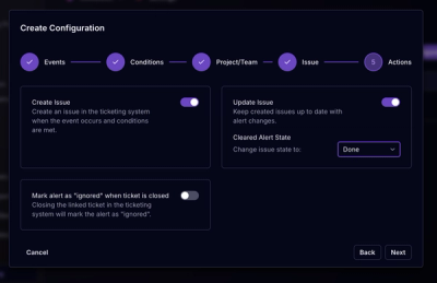
Socket for Jira lets teams turn alerts into Jira tickets with manual creation, automated ticketing rules, and two-way sync.