Research
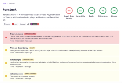
Malicious npm Package Brand-Squats TanStack to Exfiltrate Environment Variables
A brand-squatted TanStack npm package used postinstall scripts to steal .env files and exfiltrate developer secrets to an attacker-controlled endpoint.
eos-icons-vue2
Advanced tools
Refer to EOS Icons for more details about all the icons that are supported by EOS-Icons Vue 2
Storybook EOS-Icons, checkout storybook for an in-depth look at the various different icons that are provided by EOS-Icons Vue 2 as well the props available for configuring icons.
Nuxt Sandbox, checkout this Nuxt sandbox for testing out the icons as well as 'How to use it'
# yarn
yarn add eos-icons-vue2
# npm
npm install eos-icons-vue2
<template>
  <div>
    <EOS_10K_FILLED />
    <EOS_10K_OUTLINED />
    <EOS_LOADING_ANIMATED />
  </div>
</template>

<script>
import { EOS_10K_FILLED, EOS_10K_OUTLINED, EOS_LOADING_ANIMATED } from "eos-icons-vue2";

export default {
  name: "App",
  components: {
    EOS_10K_FILLED,
    EOS_10K_OUTLINED,
    EOS_LOADING_ANIMATED
  },
};
</script>
<template>
  <div>
    <EOS_10K_FILLED size="xl" color="cyan" rotate="120" verticalFlip="true" horizontalFlip="true"/>
  </div>
</template>

<script>
import { EOS_10K_FILLED } from "eos-icons-vue2";

export default {
  name: "App",
  components: {
    EOS_10K_FILLED
  },
};
</script>
| Name | Type | Default | Description |
|---|---|---|---|
| size | string | 'm' | sets the size of icon * |
| color | string | '#000000 | sets the color of icon |
| rotate | string | '0' | sets the rotation degree of icon |
| horizontalFlip | boolean | false | Flips icon horizontally |
| verticalFlip | boolean | false | Flips icon vertically |
(*) Size can be provided using either string or number. Pre-Defined size list
| Size Name | Size Value |
|---|---|
| xs | 4 |
| s | 8 |
| base | 14 |
| m | 18 |
| l | 24 |
| xl | 32 |
| xxl | 48 |
| xxxl | 64 |
(**) The theme prop is only available for common icon component. Eos-Icons React has 4 different types of icon components (common / filled / outlined / animated). The common icon component contains both filled and outlined version of the icon. For switching between the two types of version you can either supply 'outlined' or 'filled' to the theme prop.
git clone https://github.com/EOS-uiux-Solutions/eos-icons-vue2
npm install
npm run generate
Thanks to Browserstack and their continuous contribution to open source projects, we continuously test the EOS to make sure all our features and components work perfectly fine in all browsers. Browserstack helps us make sure our Design System also delivers a peace of mind to all developers and designers making use of our components and layout in their products.
FAQs
EOS-Icons vue 2 npm package
The npm package eos-icons-vue2 receives a total of 2 weekly downloads. As such, eos-icons-vue2 popularity was classified as not popular.
We found that eos-icons-vue2 demonstrated a not healthy version release cadence and project activity because the last version was released a year ago. It has 5 open source maintainers collaborating on the project.
Did you know?

Socket for GitHub automatically highlights issues in each pull request and monitors the health of all your open source dependencies. Discover the contents of your packages and block harmful activity before you install or update your dependencies.

Research
A brand-squatted TanStack npm package used postinstall scripts to steal .env files and exfiltrate developer secrets to an attacker-controlled endpoint.

Research
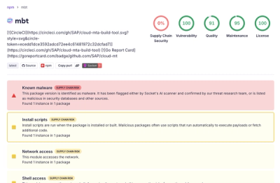
Compromised SAP CAP npm packages download and execute unverified binaries, creating urgent supply chain risk for affected developers and CI/CD environments.

Company News
Socket has acquired Secure Annex to expand extension security across browsers, IDEs, and AI tools.