expo-react-native-toastify

expo-react-native-toastify allows you to add notifications to your expo react-native app (ios, android, web) with ease.
Features
-
Smooth enter/exit animations
-
Plain simple and flexible APIs
-
Resize itself correctly on device rotation
-
Swipeable
-
Easy to set up for real, you can make it work in less than 10sec!
-
Super easy to customize
-
RTL support
-
Swipe to close 👌
-
Can choose swipe direction
-
Super easy to use an animation of your choice. Works well with animate.css for example
-
Define behavior per toast
-
Pause toast on hover (web) or touch (mobile) 🖱️
-
Fancy progress bar to display the remaining time
-
Progress bar pauses with toast
-
Static Toasts (duration: 0)
-
Possibility to update a toast
-
You can control the progress bar a la nprogress 😲
-
You can display multiple toast at the same time
-
Dark and light mode 🌒
-
Custom component support
-
Flexible icon system using Ionicons
-
And much more!
Installation
Using npm:
npm install expo-react-native-toastify
Using yarn:
yarn add expo-react-native-toastify
Pause Behavior
The toast notification and its progress bar will pause:
- On web: When hovering over the toast with mouse
- On mobile: When touching the toast
- The timer and progress bar will resume when the interaction ends
- Static toasts (duration: 0) are not affected by pause
Example with pause:
Toast.info("Pausable message", {
duration: 5000,
position: "top"
});
Toast.info("Static message", {
duration: 0,
position: "top"
});
Quick Start
import React from "react";
import { StyleSheet, View, TouchableOpacity, Text } from "react-native";
import ToastManager, { Toast } from "expo-react-native-toastify";


const App = () => {
  const showToasts = () => {
    Toast.info("This is a toast.",{position:'top'});
  };

  return (
    <View style={styles.container}>
      <ToastManager />
      <TouchableOpacity
        onPress={showToasts}
        style={{
          backgroundColor: "white",
          borderColor: "green",
          borderWidth: 1,
          padding: 10,
        }}
      >
        <Text>SHOW SOME AWESOMENESS!</Text>
      </TouchableOpacity>
    </View>
  );
};

const styles = StyleSheet.create({
  container: {
    flex: 1,
    backgroundColor: "#fff",
    alignItems: "center",
    justifyContent: "center",
  },
});

export default App;
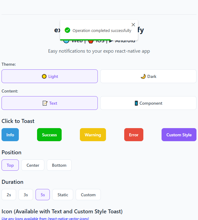
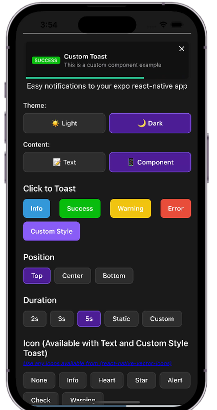
Basic Usage
Toast Types
Toast.success("Success message");
Toast.error("Error message");
Toast.info("Info message");
Toast.warn("Warning message");
Toast.custom("Custom message", {
barColor: "#FF5733",
icon: "heart",
position: "top",
theme: "dark"
});
Positions
Toast.success("Top position", { position: "top" });
Toast.success("Center position", { position: "center" });
Toast.success("Bottom position", { position: "bottom" });
Durations
Toast.info("Quick message", { duration: 2000 });
Toast.info("Longer message", { duration: 5000 });
Toast.info("Static message", { duration: 0 });
Themes
Toast.success("Light theme", { theme: "light" });
Toast.success("Dark theme", { theme: "dark" });
Available Props
| width | number | 256 | Width of toast |
| height | number | 68 | Height of the toast |
| style | any | null | Style applied to the toast |
| position | top, center or bottom | top | Position of toast |
| positionValue | number | 50 | position value of toast |
| duration | number | 3000 | The display time of toast |
| animationStyle | upInUpOut, rightInOut or zoomInOut | upInUpOut | The animation style of toast |
| animationIn | string or object | 'slideInRight' | Toast show animation |
| animationOut | string or object | 'slideOutLeft' | Toast hide animation |
| animationInTiming | number | 300 | Timing for the Toast show animation (in ms) |
| animationOutTiming | number | 300 | Timing for the toast hide animation (in ms) |
| backdropTransitionInTiming | number | 300 | The backdrop show timing (in ms) |
| backdropTransitionOutTiming | number | 300 | The backdrop hide timing (in ms) |
| hasBackdrop | bool | false | Render the backdrop |
| backdropColor | string | 'black' | The backdrop background color |
| backdropOpacity | number | 0.2 | The backdrop opacity when the toast is visible |
| icon | string | information-circle | Ionicon name for toast icon |
| theme | string | light | Toast theme (light/dark) |
| barColor | string | Based on type | Progress bar color |
Icons
This package uses Ionicons for toast icons. You can browse all available icons at:
https://oblador.github.io/react-native-vector-icons/
Some commonly used icons:
- information-circle
- checkmark-circle
- alert-circle
- warning
- close-circle
- heart
- star
Available Animations
Take a look at react-native-animatable to see the dozens of animations available out-of-the-box.
See in Action

Try the Demo
Want to see all features in action? Try our interactive demo:
Live Demo on Expo Snack
Credits
This package is inspired by toastify-react-native.
License
expo-react-native-toastify is [MIT licensed] by geeek.


