Security News
MCP Steering Committee Launches Official MCP Registry in Preview
The MCP Steering Committee has launched the official MCP Registry in preview, a central hub for discovering and publishing MCP servers.
flipadelphia
Advanced tools
A customizable feature toggle library with an angular component UI.
Extend the Flipadelphia class and add toggles with the Flip decorator like below:
import { Flip, Flipadelphia } from './flipadelphia';
export class MyFeatureToggles extends Flipadelphia {
@Flip() foo: boolean;
@Flip(true) bar: boolean;
@Flip(true, 'This toggle is for bah') bah: boolean;
// constructor is necessary if you make your toggles @Injectable
constructor() {
super();
}
}
The Flip decorator takes 2 params (defaultValue: boolean, descriptionForUI: string)
You may also pass an adapter that implements the provided FlipperService interface to the Flipadelphia base constructor.
import { Flip, Flipadelphia, LocalStorageFlipperService } from './flipadelphia';

export class MyFeatureToggles extends Flipadelphia {
  @Flip() foo: boolean;

  constructor() {
    // LocalStorageFlipperService is the default with a key of FLIPADELPHIA
    super(new LocalStorageFlipperService('CustomKey'));
  }
}
Then use the getters on an instance of your toggle class:
const myToggles = new MyFeatureToggles();
expect(myToggles.foo).toBe(false);
If you use angular you may want to consider setting up as a provider for DI.
If you would like to update a toggle w/o the UI you can add your custom key or the default "FLIPADELPIA" to local storage with a value of
{"toggleName": booleanState}
<flipadelphia [flipadelphiaInstance]="yourToggles"></flipadelphia>
1.0.1 (2018-07-16)
<a name="1.0.0"></a>
FAQs
Feature toggle library for angular
We found that flipadelphia demonstrated a not healthy version release cadence and project activity because the last version was released a year ago. It has 1 open source maintainer collaborating on the project.
Did you know?

Socket for GitHub automatically highlights issues in each pull request and monitors the health of all your open source dependencies. Discover the contents of your packages and block harmful activity before you install or update your dependencies.

Security News
The MCP Steering Committee has launched the official MCP Registry in preview, a central hub for discovering and publishing MCP servers.

Product
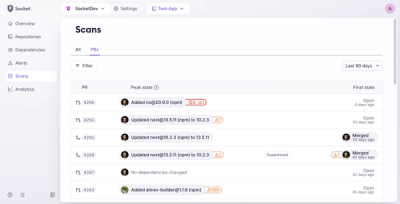
Socket’s new Pull Request Stories give security teams clear visibility into dependency risks and outcomes across scanned pull requests.

Research
/Security News
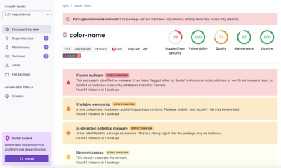
npm author Qix’s account was compromised, with malicious versions of popular packages like chalk-template, color-convert, and strip-ansi published.