floating-tooltip-react
Headless, ergonomic popper primitive for React (tooltips, popovers, menus) built on top of @floating-ui/react.
It delivers Floating UI's two core capabilities, positioning and interaction, via a simple, easy-to-use API that you can drop into any design system.
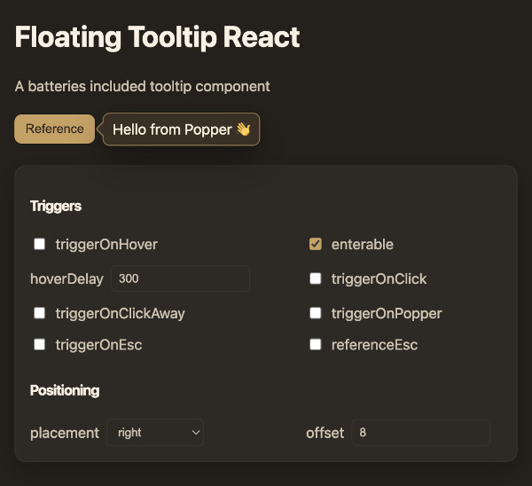
Demo
Try it live: https://kutneruri.github.io/floating-popper/
Features
- Implemented behaviors: Hover, click, click-away, Escape key, etc.
- Fully controlled with a simple
open={boolean} and a onOpen(boolean) callback
- Enterable hover with polygon-safe close and configurable
hoverDelay
- Enter/exit animations; optional portal support
- Fully customizable - no CSS or design assumptions
- Built in arrow support.
Installation
npm install floating-tooltip-react @floating-ui/react
Quick Start
As simple as passing children and a pop prop. Add triggers as necessary.
import React from "react";
import BasePopper from "floating-tooltip-react";

function App() {
  return (
    <BasePopper triggerOnHover pop="Hello, World!">
      <span>Hover over me</span>
    </BasePopper>
  );
}
DOM structure
For ref handling, the popper renders its own div. Beyond that, it's as minimal as possible.
<BasePopper
className="my-popper"
popClass="my-pop"
pop={<div className="pop-component">Pop content</div>}
>
<button type="button" className="reference">
Reference element
</button>
</BasePopper>
{}
<div class="my-popper">
<button type="button" class="reference">
Reference element
</button>
<div
/* positioned container (Floating UI styles applied inline) */
style="position: absolute; top: 100px; left: 200px; transform: translate3d(0px, 6px, 0px);"
>
<div class="my-pop" /* your pop wrapper via slots.Pop */>
<div class="pop-component">Pop content</div> {/* your pop node */}
{/* if withArrow is true: */}
<svg>...</div>
</div>
</div>
</div>
API Reference
Rendering
pop | Element | — | Floating content to render. Required. |
popProps | div props | — | Props for the pop element (e.g., className, role). |
popContainerProps | div props | — | Props for the positioned container. Inline styles from Floating UI are merged with style. |
slots.Pop | Component | "div" | Override the default pop wrapper element. |
slots.Arrow | Component | FloatingArrow | Override the arrow renderer. Receives FloatingArrowProps except ref. |
State & Control
open | boolean | false | Explicit open state. When set, component is controlled. |
onOpen | (open: boolean) => void | — | Called when internal triggers request an open state change. |
disable | boolean | false | Disable all triggers. |
Triggers
triggerOnHover | boolean | false | Open/close on hover; disables click triggers by default. |
enterable | boolean | true | Keep open while hovering the popper; uses polygon-safe close. |
hoverDelay | number | 300 | Delay before changing open on hover (ms). |
referenceEsc | boolean | false | Close when clicking the reference while open. (when click is disabled) |
triggerOnClick | boolean | !triggerOnHover | Toggle on reference click. |
triggerOnClickAway | boolean | !triggerOnHover | Close on outside click. |
triggerOnPopper | boolean | false | Close when clicking the popper itself. |
triggerOnEsc | boolean | !triggerOnHover | Close on Escape. |
Positioning & Transitions
placement | Placement | — | Desired placement (e.g., "top", "bottom-start"). |
offset | number | 6 | Gap between reference and popper. |
viewportPadding | Padding | 4 | Minimal distance from viewport edges. |
autoPlacement | 'flip' or false | "flip" | Automatic placement strategy. |
autoUpdate | boolean | false | Continuously update position (useful with portals or moving targets). |
usePortal | boolean or string | false | Render in a Floating UI portal; pass an id string to target a specific node. |
transitionMs | number | 210 | Enter/exit duration in ms. |
transitionStyles | UseTransitionStylesProps | — | Override useTransitionStyles configuration. |
Arrow
withArrow | boolean | false | Renders a pointing arrow connected to the popper. |
arrowPadding | `number | Padding` | undefined |
arrowClass | string | undefined | Convenience class applied to the Arrow component. |
arrowProps | Partial<FloatingArrowProps> | undefined | Additional props forwarded to the Arrow (e.g., width, height, tipRadius, stroke). |
Events
onPopperClick | (event: React.MouseEvent) => void | Fired when the pop surface is clicked. |
onClickOutside | (event: Event or undefined) => void | Fired on outside click (if that trigger is enabled). |
onReferenceEsc | (event: Event or undefined) => void | Fired when closing by clicking the reference (while open). |
Usage Notes
- The arrow is opt-in: set
withArrow to true. Styling is left to you; see the demo for an example.
- To fully customize the arrow, pass a custom
slots.Arrow component. The default uses @floating-ui/react’s FloatingArrow.
- If your popper uses a non-solid background or a shadow, style the arrow to visually match. The default library does not impose any CSS.
Contributing
Issues and PRs are welcome!


