Product
Introducing Reachability for PHP
Reachability analysis for PHP is now available in experimental, helping teams identify which vulnerabilities are actually exploitable.
flowchart-react
Advanced tools
Lightweight flowchart & flowchart designer for React.js
English | 中文
npm install --save flowchart-react
# or
yarn add flowchart-react
import React, { useState } from "react";
import Flowchart from "flowchart-react";
import { ConnectionData, NodeData } from "flowchart-react/dist/schema";

const App = () => {
  const [nodes, setNodes] = useState<NodeData[]>([
    {
      type: "start",
      title: "Start",
      x: 150,
      y: 190,
      id: 1,
    },
    {
      type: "end",
      title: "End",
      x: 500,
      y: 190,
      id: 2,
    },
    {
      x: 330,
      y: 190,
      id: 3,
      title: "Joyce",
    },
    {
      x: 330,
      y: 300,
      id: 4,
      title: () => {
        return "No approver";
      },
    },
  ]);
  const [conns, setConns] = useState<ConnectionData[]>([
    {
      source: { id: 1, position: "right" },
      destination: { id: 3, position: "left" },
    },
    {
      source: { id: 3, position: "right" },
      destination: { id: 2, position: "left" },
    },
    {
      source: { id: 1, position: "bottom" },
      destination: { id: 4, position: "left" },
    },
    {
      source: { id: 4, position: "right" },
      destination: { id: 2, position: "bottom" },
    },
  ]);

  return (
    <Flowchart
      onChange={(nodes, connections) => {
        setNodes(nodes);
        setConns(connections);
      }}
      style={{ width: 800, height: 600 }}
      nodes={nodes}
      connections={conns}
    />
  );
};

export default App;
Flowchart use nodes and connections to describe a flowchart.
NodeData[]Array of nodes.
| Props | Description | Type | Default | Required |
|---|---|---|---|---|
| id | Identity | number | true | |
| title | Title of node | string, (node: NodeData) => string, JSX.Element | true | |
| type | Type of node | start, end, operation, decision | operation | false |
| x | X axis | number | true | |
| y | Y axis | number | true | |
| payload | Custom data | {[key: string]: unknown} | false | |
| width | Node width | number | 120 | false |
| height | Node height | number | 60 | false |
| connectionPosition | Connection position | top, bottom | top | false |
| containerProps | SupportedSVGShapeProps | false | ||
| textProps | SupportedSVGTextProps | false |
Node shape props, only fill and stroke are supported, for more information, please refer to MDN.
| Props | Description | Type | Default | Required |
|---|---|---|---|---|
| fill | string | false | ||
| stroke | string | false |
Node text props, only fill is supported, for more information, please refer to MDN.
Works when title is a string.
| Props | Description | Type | Default | Required |
|---|---|---|---|---|
| fill | string | false |
ConnectionData[]Connections between nodes.
Use type to describe the type of connection, success will draw a green line, fail will draw a red line.
| Props | Description | Type | Default | Required |
|---|---|---|---|---|
| type | Type of connection | success, fail | success | false |
| source | Source info | {id: number, position: 'left', 'right', 'top', 'bottom'} | true | |
| destination | Destination info | {id: number, position: 'left', 'right', 'top', 'bottom'} | true | |
| title | Title of connection | string | false | |
| color | Specify a color for the connection line | string | false |
boolean | undefinedProp to disabled drag, connect and delete nodes.
React.CSSPropertiesStyle of container.
{width: number, height: number} | undefinedGlobal node size, works when width or height of node is not set.
Default: { width: 120, height: 60 }.
boolean | undefined | ("start-end" | "operation" | "decision")[]false to hide toolbar.
(nodes: NodeData[], connections: ConnectionData[]) => voidTriggered when a node is deleted(click a node and press delete), moved, disconnected(click a connection and press delete) or connected.
(node: NodeData) => voidTriggered when a node is double-clicked.
Tip: Double-click to edit.
(event: React.MouseEvent<SVGGElement, MouseEvent>, zoom: number) => voidTriggered when the background svg is double-clicked.
Tip: Double-click to create a node.
function handleDoubleClick(event: React.MouseEvent<SVGGElement, MouseEvent>, zoom: number): void {
  const point = {
    x: event.nativeEvent.offsetX / zoom,
    y: event.nativeEvent.offsetY / zoom,
    id: +new Date(),
  };
  let nodeData: NodeData;
  if (!nodes.find((item) => item.type === "start")) {
    nodeData = {
      type: "start",
      title: "Start",
      ...point,
    };
  } else if (!nodes.find((item) => item.type === "end")) {
    nodeData = {
      type: "end",
      title: "End",
      ...point,
    };
  } else {
    nodeData = {
      ...point,
      title: "New",
      type: "operation",
    };
  }
  setNodes((prevState) => [...prevState, nodeData]);
}
(connection: ConnectionData) => voidTriggered when a connection is double-clicked.
Tip: Double-click to edit connection.
(event: React.MouseEvent<SVGSVGElement>, zoom: number) => voidTriggered when the mouse is up on the background svg.
Tip: Drop something to here to implement node creation.
string | undefinedCustom class name of container.
MIT © Joyceworks
FAQs
> Lightweight flowchart & flowchart designer for React.js
The npm package flowchart-react receives a total of 91 weekly downloads. As such, flowchart-react popularity was classified as not popular.
We found that flowchart-react demonstrated a not healthy version release cadence and project activity because the last version was released a year ago. It has 1 open source maintainer collaborating on the project.
Did you know?

Socket for GitHub automatically highlights issues in each pull request and monitors the health of all your open source dependencies. Discover the contents of your packages and block harmful activity before you install or update your dependencies.

Product
Reachability analysis for PHP is now available in experimental, helping teams identify which vulnerabilities are actually exploitable.

Product
Export Socket alert data to your own cloud storage in JSON, CSV, or Parquet, with flexible snapshot or incremental delivery.

Research
/Security News
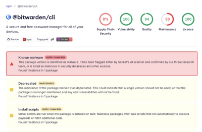
Bitwarden CLI 2026.4.0 was compromised in the Checkmarx supply chain campaign after attackers abused a GitHub Action in Bitwarden’s CI/CD pipeline.