framed-animation-on-scroll
This is a framed animation on scroll library for React.
Motivated by iPhone 12 pro page
Core
ContentsWrapper makes your component be able to measure scroll progress in the section by useScrollProgress. It calculates scroll progress that how deep your component is in section. You can make framed-animation by the progress. And also you can control the progress range for animation by getWeightByProgress.
How it works
- Detect the viewport is in a section.
- Measure the progress of scroll in a section with a threshold value.
- Make an interaction in the progress range you want.
Update Notes
- v1.1.2
- Add fixed-point(6) of progress, weight value
- v1.1.1
- Remove function that automatically resize height of
ContentWrapper
- Fix 'undefined ref' error of
useScrollProgress
- v1.1.0 - Update
ContentWrapper
- Add props(isSticky, contentHeight)
- Improve inner structure
- Change default value of height prop ("100%" to "120vh")
Use
ContentsWrapper
: It's necessary to get customized Ref(type: ContentsWrapperRefTypes) for using useScrollProgress.
| ref | Ref | MutableRefObject<ContentsWrapperRefTypes> | NOT_NULL |
| height | The height of wrapper | string | undefined | "120vh" |
| bgColor | The background color of ContentsWrapper component | string | undefined | "black" |
| isSticky | The boolean value whether the content is sticky or not | boolean | undefined | true |
| contentHeight | The height of content in wrapper | string | undefined | "100vh" |
useScrollProgress
: It handles scroll event listener. It's for calculating the progress by how deep scroll is in a section with a threshold value.
| ref | Ref | MutableRefObject<ContentsWrapperRefTypes> | NOT_NULL |
| threshold | Specifying a ratio of intersection area to total bounding box area for the observed target | number(0~1) | undefined | 0.5 |
getWeightByProgress
: It's for calculating the weight value that you can use at interaction value(e.g: opacity value of css) by the progress range you want.
| start | The start point of progress that you want | number | NOT_NULL |
| end | The endpoint of progress that you want | number | NOT_NULL |
| progress | The progress value from useScrollProgress | number | NOT_NULL |
| min | The minimum weight value you want | number | undefined | 0 |
| max | The maximum weight value you want | number | undefined | 1 |
Usage
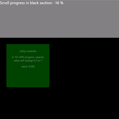
import { useEffect, useRef, useState } from 'react';
import { ContentsWrapper, getWeightByProgress, useScrollProgress } from 'framed-animation-on-scroll';
function App() {
const ref = useRef();
const [progress] = useScrollProgress(ref, 0);
const [opacityValue, setOpacityValue] = useState(0);
useEffect(() => {
setOpacityValue(getWeightByProgress(10, 30, progress, 0.5, 1).toFixed(3));
}, [progress])
return (
<div className="App">
<div style={{ position: "fixed", top: 0, left: 0, color: "white", zIndex: 999, fontSize: "30px" }}>Scroll progress in black section: {progress} %</div>
<div style={{ height: "100vh", width: "100%", background: "gray" }} />
{/* Usage */}
<ContentsWrapper
height="200vh"
ref={ref}
>
<div
style={{
width: 300, height: 300, padding: 20, margin: 50, background: "green", color: "white", fontSize: "20px",
opacity: opacityValue
}}
>
<p>sticky contents</p>
<p>in 10~30% progress, opacity value will change 0.5 to 1</p>
<p>value: {opacityValue}</p>
</div>
</ContentsWrapper>
<div style={{ height: "100vh", width: "100%", background: "gray" }} />
</div>
);
}
export default App;
Demo
Demo page
License
This project is licensed under the terms of the
MIT license.


