
Security News
CVE Volume Surges Past 48,000 in 2025 as WordPress Plugin Ecosystem Drives Growth
CVE disclosures hit a record 48,185 in 2025, driven largely by vulnerabilities in third-party WordPress plugins.
By Sarah Gooding - Jan 09, 2026
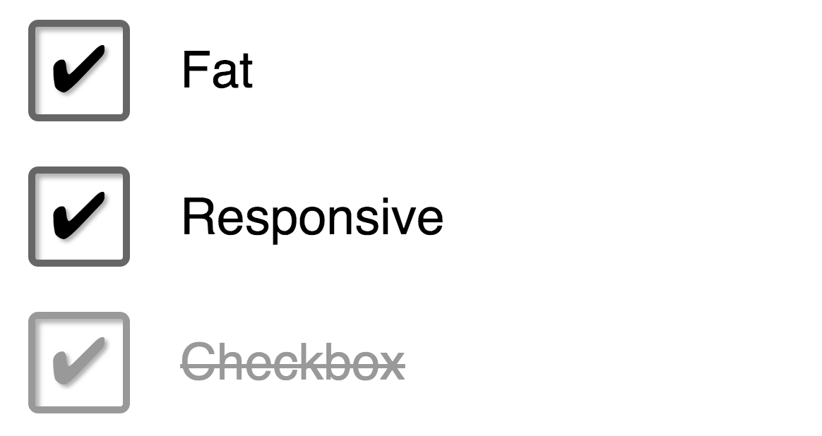
Fat Responsive Checkbox
Install frcb using npm:
npm install --save frcb
See a demo of the component here.
In your React app:
import React from 'react';
import FatResponsiveCheckbox from 'frcb';

class App extends React.Component {
	render() {
		return <FatResponsiveCheckbox>Check me</FatResponsiveCheckbox>;
	}
}
In your Unistyle code:
import fatResponsiveCheckbox from 'frcb/style';

export default [
	fatResponsiveCheckbox,
	// your other styles here...
];
<FatResponsiveCheckbox {...props} />| Prop | Type | Description |
|---|---|---|
| striked | Boolean | Toggle the alternate style (strike through text when checked) |
| caption | String | Checkbox label text. Can also be specified as children |
| ... | Mixed | All other props are passed on to the internal <input> see Forms for examples |
MIT © Joakim Carlstein
FAQs
Fat Responsive Checkbox
We found that frcb demonstrated a not healthy version release cadence and project activity because the last version was released a year ago. It has 1 open source maintainer collaborating on the project.
Did you know?

Socket for GitHub automatically highlights issues in each pull request and monitors the health of all your open source dependencies. Discover the contents of your packages and block harmful activity before you install or update your dependencies.
Security News
CVE disclosures hit a record 48,185 in 2025, driven largely by vulnerabilities in third-party WordPress plugins.

Security News
Socket CEO Feross Aboukhadijeh joins Insecure Agents to discuss CVE remediation and why supply chain attacks require a different security approach.

Security News
Tailwind Labs laid off 75% of its engineering team after revenue dropped 80%, as LLMs redirect traffic away from documentation where developers discover paid products.