Research
/Security News
Weaponizing Discord for Command and Control Across npm, PyPI, and RubyGems.org
Socket researchers uncover how threat actors weaponize Discord across the npm, PyPI, and RubyGems ecosystems to exfiltrate sensitive data.
A web component that displays a GDG name (and optionally the next scheduled event and/or other text) and links to the group's Meetup page (and event page, if the next event is displayed).

Polyfill tags if you need them. This will include ShadowDOM and Custom Elements support.
<script src="https://unpkg.com/@webcomponents/webcomponentsjs@latest/webcomponents-sd-ce.js"></script>
Loading this component. It would be a good idea to use a specific version instead of latest.
<script src="https://unpkg.com/gdg-group@latest/dist/gdg-group.min.js"></script>
Properties:
url-name: string
show-next-event: boolean
group-name: string
image-url: string
image-width: string
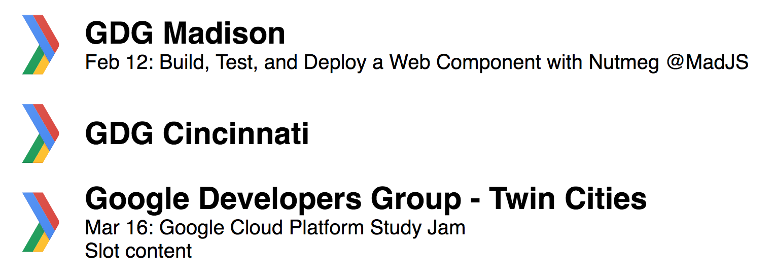
  <gdg-group url-name="gdgmadison" show-next-event></gdg-group>

  <gdg-group url-name="cincy-android" group-name="GDG Cincinnati"></gdg-group>

  <gdg-group url-name="gdg-tc" image-width="90">Slot content</gdg-group>
Live demo on codepen.
GdgGroup is released under an MIT license.
Built, tested, and published with Nutmeg.
FAQs
A GDG web component made with Nutmeg
The npm package gdg-group receives a total of 181 weekly downloads. As such, gdg-group popularity was classified as not popular.
We found that gdg-group demonstrated a not healthy version release cadence and project activity because the last version was released a year ago. It has 1 open source maintainer collaborating on the project.
Did you know?

Socket for GitHub automatically highlights issues in each pull request and monitors the health of all your open source dependencies. Discover the contents of your packages and block harmful activity before you install or update your dependencies.

Research
/Security News
Socket researchers uncover how threat actors weaponize Discord across the npm, PyPI, and RubyGems ecosystems to exfiltrate sensitive data.

Security News
Socket now integrates with Bun 1.3’s Security Scanner API to block risky packages at install time and enforce your organization’s policies in local dev and CI.

Research
The Socket Threat Research Team is tracking weekly intrusions into the npm registry that follow a repeatable adversarial playbook used by North Korean state-sponsored actors.