Product
Socket for Jira Is Now Available
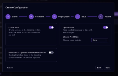
Socket for Jira lets teams turn alerts into Jira tickets with manual creation, automated ticketing rules, and two-way sync.
A flexible code implementation of the GEL Grid.
Forms part of the GEL Foundations
v7.0.0 of GEL Grid implements the @use and @forward approach and removes @import.
This has a number of consequences; how modules are loaded, and how to access variables. Namespaces now come into play, so please read the sass documentation links above to learn more.
The properties output from this module could be controlled via three variables: $core, $enhanced and $fixed. These three variables allowed for control of the output, where core functionality could be separated out from enhanced functionality (for more advanced browsers) and for Internet Explorer (fixed).
As browsers have moved on significantly since this approach was adopted it is considered a good time to remove this functionality.
For usage of GEL Grid prior to v7.0.0 please reference the v6.3.0 readme.
An implementation of the GEL Grid Guidelines. The Grid provides a way of creating flexible and unique layouts whilst also maintaining consistent margins, gutters and containing widths across the BBC, online.
This is implementation of the grid is built using flexbox with an inline-block fallback older browsers. This allows us to support browsers IE8 and above.
It can used in two forms, by simply adding the relevant classes to your markup:
<div class="gel-layout">
    <div class="gel-layout__item gel-1/2"></div>
    <div class="gel-layout__item gel-1/2"></div>
</div>
Or using a Sass mixin:
@use 'gel-grid/grid';

.my-component {
    @include grid.gel-layout;
}

.my-component__item {
    @include grid.gel-layout-item;
    @include grid.gel-columns(1/2);
}
The easiest way to get started with the GEL Grid component is to use the compiled version of the grid included within this repository.
If you're a more advanced user and want to integrate the GEL Grid component within your codebase, use one of the following options:
$ npm install --save gel-grid
// your-app/main.scss
@use 'gel-grid/grid';
You can install this component manually by downloading the content of this Git repo into your project and use a Sass @use to include it in your project.
Note: you will manually need to manage the dependencies below, without these this component will fail to compile.
If you require just the built css, it is automatically built to the gel-grid.css repository.
Because this module depends on other modules, GEL Sass Tools and Sass MQ, when compiling your Sass it needs to know where find the referenced modules. It does this via a loadPath.
If compiling from the command line you can specify:
sass --load-path=node_modules/ <options>
With nodejs you can call compile or compileAsync:
await sass.compileAsync(file, { loadPaths: ['./node_modules'] })
This ensures the dependencies can be loaded correctly.
A collection of grid utility classes can be output by defining $gel-grid-enable--markup-output: true when you @use the main grid partial.
Example:
@use 'gel-grid/grid' with (
  $gel-grid-enable--markup-output: true,
);
This will allow you to create grids using specific markup within your page. With the grid markup enabled, its possible to create grids like so:
<div class="gel-wrap">
    <div class="gel-layout">
        <div class="gel-layout__item gel-1/2 gel-1/4@m"></div>
        <div class="gel-layout__item gel-1/2 gel-1/4@m"></div>
        <div class="gel-layout__item gel-1/2 gel-1/4@m"></div>
        <div class="gel-layout__item gel-1/2 gel-1/4@m"></div>
    </div>
</div>
This would create a grid with each item being 50% wide. At the medium GEL breakpoint (600px), the width of each item changes to 25%.
Core Grid Classes
gel-wrap - the outer grid wrapper, defines the maximum width of the grid and applies page marginsgel-layout - a grid rowgel-layout__item - an item within the grid, applies gutters between items. Width can be controlled using width classesModifier Classes
gel-layout--flush - removes gutters between itemsgel-layout--rev - reversed order of layout items, e.g. items 1, 2, 3, 4 in your markup will display in order 4, 3, 2, 1 on your pagegel-layout--middle - align layout items to the vertical centers of each othergel-layout--bottom - align layout items to the vertical bottoms of each othergel-layout--right - make the layout items fill up from the right hand sidegel-layout--center - make the layout items fill up from the center outwardgel-layout--auto - cause layout items to take up a non-explicit amount of widthFlexbox Only
gel-layout--equal - cause each layout item to be of equal heightgel-layout--fit - allows each layout items to size itself automatically by dividing the space equally between the total number of itemsWidths can be applied to grid items using a collection of utility classes which are automatically generated when the grid markup is enabled. The utility classes allow widths to be changed at different breakpoints.
The width utility classes are entirely fraction based allowing you to size grid elements proportionally. By default the following fractional groups are output: whole, halves, thirds, quarters, fifths, eighths, tenths, twelfths and twenty-fourths.
The class structure is as follows:
.gel-1/1 - 100%.gel-1/2 - 50%.gel-2/3 - 66.666666667%.gel-10/12 - 83.333333333%In order to reduce page weight we do not output whole fractions for each group as this can be simply normalised to one whole (.gel-1/1). Also, mathematically identical fractions should be normalised to the lowest denominator (for example instead of .gel-2/4 or .gel-6/12 use .gel-1/2)
It is possible to apply width classes at specific breakpoints by applying a breakpoint specific suffix to the end of the class. That might look something like this:
<div class="gel-layout">
    <div class="gel-layout__item gel-1/1 gel-1/2@m gel-1/4@l"></div>
</div>
Here the item would be 100% wide by default, then 50% wide from 600px and 25% for anything beyond 900px.
The following breakpoint suffixes are available by default:
@s - 400px@m - 600px@l - 900px@xl - 1008px@xxl - 1280pxMore information:
Utility classes like these width classes always need to win when it comes to specificity, otherwise they're not doing their job correctly. You should never need to override a utility class, if you do you're doing something wrong. E.g. if you'd used a class of gel-1/2 you would never want it to be anything other than 50%. If you want something other than 50% you should have used a different class.
To help enforce this way of thinking all width utilities classes proactively carry the !important keyword to boost their specificity.
More information:
The GEL grid component exposes a collection of Sass Mixins which can be called within your Sass. Should you need to create a more bespoke component which is not possible using the standard utility classes.
Example
@use 'gel-grid/grid';
@use 'sass-mq/mq';

.my-component {
    @include grid.gel-layout;
}

.my-component__item {
    @include grid.gel-layout-item;
    @include grid.gel-columns(1/2);

    @include mq.mq($from: gel-bp-m) {
        @include grid.gel-columns(1/4);
    }
}
Available Mixins
@include gel-wrap - create the outer grid wrapper@include gel-layout - defines a single grid row@include gel-layout-item - a single grid item@include gel-columns($span, $columns) - outputs a width for the requested number of columns, accepts either a fraction or number of columnsAvailable Functions:
gel-columns($span, $columns) - returns a width value for the requested number of columns, accepts either a fraction or number of columnsThe grid is developed using flexbox giving us a flexible, powerful grid solution. Flexbox is not fully supported in all browsers and has seen a number of development iterations. With this in mind we have intentionally targeted specific implementations of flexbox and avoided some older more troublesome implementations.
For browsers which do not support flexbox we fallback to an inline-block grid which offers ~80% of the features available in the flexbox grid.
We recommend you include some JavaScript based Feature Detection which can apply a top level class to signify if flexbox is supported or not. This will increase the features available to older browsers. The specific class applied can be controlled using the $gel-grid-flexbox-feature-detection-class option.
The following features are only supported by the flexbox grid and will degrade gracefully:
More information:
The GEL Grid guideline has been updated to include a wider 1280px breakpoint. By default the grid supports this breakpoint. It can be displayed by setting the $gel-grid-enable--1280-breakpoint to false.
It is also possible to toggle the 1280px breakpoint on and off based on the presence of a specific class. If a class name is supplied e.g. $gel-grid-1280-toggle-class: 'b-pw-1280'; then all wider 1280px styles will be scoped in this class.
More information:
The GEL Grid consistences of a combination of fixed gutters and margins with fluid width columns. This combination of fixed and fluid units is achieved using box-sizing: border-box.
If you do not have border-box defined globally on your project you will need to enable the $gel-grid-enable--box-sizing flag to enable a bundled fix.
More information:
The GEL Grid is constructed using flexbox with an inline-block fallback for older browsers. Using inline-block allows us to achieve a lot of the same complex layout technique that flexbox offers and provides a more powerful and flexible grid than is possible with more traditional techniques likes the use of floats.
One challenge to the using of display: inline-block; is the white-space which is introduced between inline-block elements. This space is a representation of the space between elements in the HTML. In order for the grid to work correctly this space needs to be removed.
There are a few ways you can do this:
The best way to get around this issue is to remove the space between elements in your HTML. This could be done by minifying your markup or by using HTML comments to comment out the space:
<div class="gel-layout">
    <div class="gel-layout__item gel-1/2"></div><!--
 --><div class="gel-layout__item gel-1/2"></div>
</div>
If you're building you're grid using something like ReactJS you will not have this problem with space between elements as a result of how the markup is generated by the ReactJS library.
It is possible to collapse the space using CSS. An optional CSS fix can be enabled by setting the $gel-grid-enable--whitespace-fix flag to true.
Note: This is included as an optional fix as it is not 100% guaranteed to work. There are certain edge cases where this solution falls down. The only 100% guaranteed and recommended solution is to remove the space in the HTML.
The following configurable options are available:
$gel-grid-namespace: 'gel-'; - the default namespace applied to all grid classes$gel-grid-breakpoint-namespace: 'gel-bp-'; - the default namespace applied to breakpoint variables from GEL Sass Tools$gel-grid-1280-toggle-class: null - an optional scoping class to wrap all 1280px grid style in. Allows the wider grid to be used in a products that do not fully support the wider grid yet$gel-grid-breakpoints - a Sass map containing a list of breakpoints width classes should be generated for$gel-grid-breakpoints--1280 - a Sass map containing a list of breakpoints which relate specifically to the 1280 breakpoint$gel-grid-default-columns: 12 - the default number of columns the grid should be based on$gel-grid-columns - a Sass list containing a list of which fractions utility classes will be generated for$gel-grid-flexbox-feature-detection-class: 'no-flexbox' - The class applied by a feature detection script to signify there the current browser doesn't support Flexbox$gel-grid-enable--markup-output: false; - output a collection of utility classes$gel-grid-enable--1280-breakpoint: true; - toggle the support for the wider 1280px grid$gel-grid-enable--box-sizing: false; - enable built in box-sizing rules if box-sizing: border-box; is not already defined$gel-grid-enable--whitespace-fix: false; - enable a built CSS fix to collapse the whitespace between inline-block items, this fix is not guaranteed to work 100% of the timeThe following Grid Bookmarklets can be used to overlay the grid in the browser to check visual alignment of elements:
The following teams are currently using this component: GEL, News, Sport, Live, Search, BBC Food, Taster & Academy, IPS Web (R&D) and Subtitle Guidelines.
If your team is using this component, let us know and we'll add you to the list.
The foundations of this grid is based on the great work of Harry Roberts and his Inuit CSS Grid
The MIT License (MIT)
Copyright 2016 British Broadcasting Corporation
Permission is hereby granted, free of charge, to any person obtaining a copy of this software and associated documentation files (the "Software"), to deal in the Software without restriction, including without limitation the rights to use, copy, modify, merge, publish, distribute, sublicense, and/or sell copies of the Software, and to permit persons to whom the Software is furnished to do so, subject to the following conditions:
The above copyright notice and this permission notice shall be included in all copies or substantial portions of the Software.
THE SOFTWARE IS PROVIDED "AS IS", WITHOUT WARRANTY OF ANY KIND, EXPRESS OR IMPLIED, INCLUDING BUT NOT LIMITED TO THE WARRANTIES OF MERCHANTABILITY, FITNESS FOR A PARTICULAR PURPOSE AND NONINFRINGEMENT. IN NO EVENT SHALL THE AUTHORS OR COPYRIGHT HOLDERS BE LIABLE FOR ANY CLAIM, DAMAGES OR OTHER LIABILITY, WHETHER IN AN ACTION OF CONTRACT, TORT OR OTHERWISE, ARISING FROM, OUT OF OR IN CONNECTION WITH THE SOFTWARE OR THE USE OR OTHER DEALINGS IN THE SOFTWARE.
FAQs
A flexible code implementation of the GEL Grid
The npm package gel-grid receives a total of 1,256 weekly downloads. As such, gel-grid popularity was classified as popular.
We found that gel-grid demonstrated a healthy version release cadence and project activity because the last version was released less than a year ago. It has 3 open source maintainers collaborating on the project.
Did you know?

Socket for GitHub automatically highlights issues in each pull request and monitors the health of all your open source dependencies. Discover the contents of your packages and block harmful activity before you install or update your dependencies.

Product
Socket for Jira lets teams turn alerts into Jira tickets with manual creation, automated ticketing rules, and two-way sync.

Company News
Socket won two 2026 Reppy Awards from RepVue, ranking in the top 5% of all sales orgs. AE Alexandra Lister shares what it's like to grow a sales career here.

Security News
NIST will stop enriching most CVEs under a new risk-based model, narrowing the NVD's scope as vulnerability submissions continue to surge.