
Security News
MCP Community Begins Work on Official MCP Metaregistry
The MCP community is launching an official registry to standardize AI tool discovery and let agents dynamically find and install MCP servers.
By Sarah Gooding - May 09, 2025
gradient-react
Advanced tools
gradient-react is a React component library that simplifies the creation of gradient elements. It includes components like GradientCircle, GradientContent, and GradientContain to help you design attractive user interfaces with gradients easily.
npm install gradient-react
or you can use yarn
yarn add gradient-react
import {
	GradientContain,
	GradientCircle,
	GradientContent,
} from 'gradient-react';

const MyComponent = () => (
	<GradientContain styles={{ margin: '100px', padding: '20px' }}>
		<GradientCircle
			color1='#7701cc'
			color2='#01a7cc'
			width='350px'
			height='350px'
		/>
		<GradientCircle
			color1='#eb540e'
			blur='50'
			color2='#cc0101'
			width='450px'
			height='450px'
		/>
		<GradientContent>
			<h2>Section title</h2>
			<p>Generic text</p>
		</GradientContent>
	</GradientContain>
);
The GradientCircle component allows you to create circles with custom gradients.
import { GradientCircle } from 'gradient-react';

const MyComponent = () => (
	<GradientCircle
		color1='#7701cc'
		color2='#01a7cc'
		width='350px'
		height='350px'
		styles={{ left: '130px', top: '300px' }}
	/>
);
| Property | Description | Default Value |
|---|---|---|
| color1 | The color of the circle's center | '#ED0101' |
| color2 | The color of the circle's outer edge | '#CC2A01' |
| width | The width of the circle | '200px' |
| height | The height of the circle | '200px' |
| blur | The intensity of the circle's blur | '80' |
| styles | CSS styles applied to the container | {} |
GradientContent is used to wrap content within an area with a gradient background.
import { GradientContent } from 'gradient-react';

const MyComponent = () => (
	<GradientContent
		styles={{
			display: 'flex',
			flexDirection: 'column',
			alignContent: 'center',
			justifyContent: 'center',
			width: '100%',
		}}
	>
		<h2>Section Title</h2> <p>Generic text</p>
	</GradientContent>
);
| Property | Description | Default Value |
|---|---|---|
| styles | CSS styles applied to the container | {} |
GradientContain is a container that can house multiple components with gradients.
import {
	GradientContain,
	GradientCircle,
	GradientContent,
} from 'gradient-react';

const MyComponent = () => (
	<GradientContain styles={{ margin: '100px', padding: '20px' }}>
		<GradientCircle
			color1='#7701cc'
			color2='#01a7cc'
			width='350px'
			height='350px'
		/>
		<GradientCircle
			color1='#eb540e'
			blur='50'
			color2='#cc0101'
			width='450px'
			height='450px'
		/> <GradientContent>
			<h2>Section Title</h2> <p>Generic text</p>
		</GradientContent>
	</GradientContain>
);
| Property | Description | Default Value |
|---|---|---|
| styles | CSS styles applied to the container | {} |
If you would like to contribute to this library, you're welcome!
gradient-react es una librería de componentes React que facilita la creación de elementos con gradientes. Incluye componentes como GradientCircle, GradientContent y GradientContain para ayudarte a diseñar interfaces de usuario atractivas con gradientes de manera sencilla.
npm install gradient-react
o puedes usar yarn
yarn add gradient-react
import {
GradientContain,
GradientCircle,
GradientContent,
} from 'gradient-react';
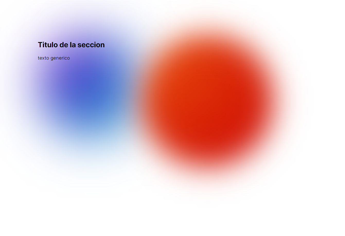
const MyComponent = () => (
<GradientContain styles={{ margin: '100px', padding: '20px' }}>
<GradientCircle
color1='#7701cc'
color2='#01a7cc'
width='350px'
height='350px'
/>
<GradientCircle
color1='#eb540e'
blur='50'
color2='#cc0101'
width='450px'
height='450px'
/>
<GradientContent>
<h2>Título de la sección</h2>
<p>Texto genérico</p>
</GradientContent>
</GradientContain>
);
GradientCircle El componente GradientCircle te permite crear círculos con gradientes personalizados.
import { GradientCircle } from 'gradient-react';
import { GradientCircle } from 'gradient-react';

const MyComponent = () => (
	<GradientCircle
		color1='#7701cc'
		color2='#01a7cc'
		width='350px'
		height='350px'
		styles={{
			left: '130px',
			top: '300px',
		}}
	/>
);
| Propiedad | Descripción | Valor por Defecto |
|---|---|---|
| color1 | Color del centro del círculo | '#ED0101' |
| color2 | Color del borde exterior del círculo | '#CC2A01' |
| width | Ancho del círculo | '200px' |
| height | Altura del círculo | '200px' |
| blur | Intensidad del desenfoque del círculo | '80' |
| styles | Estilos CSS aplicados al contenedor | {} |
GradientContent se utiliza para envolver contenido dentro de un área con un fondo de gradiente.
import { GradientContent } from 'gradient-react';

const MyComponent = () => (
	<GradientContent
		styles={{
			display: 'flex',
			flexDirection: 'column',
			alignContent: 'center',
			justifyContent: 'center',
			width: '100%',
		}}
	>
		<h2>Título de la sección</h2>
		<p>Texto genérico</p>
	</GradientContent>
);
| Propiedad | Descripción | Valor por Defecto |
|---|---|---|
| styles | Estilos CSS aplicados al contenedor | {} |
GradientContain es un contenedor que puede albergar varios componentes con gradientes.
import {
	GradientContain,
	GradientCircle,
	GradientContent,
} from 'gradient-react';

const MyComponent = () => (
	<GradientContain styles={{ margin: '100px', padding: '20px' }}>
		<GradientCircle
			color1='#7701cc'
			color2='#01a7cc'
			width='350px'
			height='350px'
		/>
		<GradientCircle
			color1='#eb540e'
			blur='50'
			color2='#cc0101'
			width='450px'
			height='450px'
		/>
		<GradientContent>
			<h2>Título de la sección</h2>
			<p>Texto genérico</p>
		</GradientContent>
	</GradientContain>
);
| Propiedad | Descripción | Valor por Defecto |
|---|---|---|
| styles | Estilos CSS aplicados al contenedor | {} |
Si quieres contribuir a esta librería, ¡te damos la bienvenida!
FAQs
create gradients easily
The npm package gradient-react receives a total of 1 weekly downloads. As such, gradient-react popularity was classified as not popular.
We found that gradient-react demonstrated a healthy version release cadence and project activity because the last version was released less than a year ago. It has 0 open source maintainers collaborating on the project.
Did you know?

Socket for GitHub automatically highlights issues in each pull request and monitors the health of all your open source dependencies. Discover the contents of your packages and block harmful activity before you install or update your dependencies.
Security News
The MCP community is launching an official registry to standardize AI tool discovery and let agents dynamically find and install MCP servers.

Research
Security News
Socket uncovers an npm Trojan stealing crypto wallets and BullX credentials via obfuscated code and Telegram exfiltration.

Research
Security News
Malicious npm packages posing as developer tools target macOS Cursor IDE users, stealing credentials and modifying files to gain persistent backdoor access.