theme: channing-cyan
r-swiper vue3 version contains no sliding block, fast continuous broadcast mode, which perfectly solves the mobile/PC end carousel needs


This is a vue3 version of the carousel plug-in, which is perfectly adapted to the mobile terminal and the PC terminal.
vue2version link
Some friends may ask, it is already 2023, and there are countless carousel components on the market, who would be stupid enough to build carousel wheels?
Ah this. . .
Doesn't it mean that existence is reasonable?
The reason? There are two main points
-
If the official swiper package is introduced, will it be too big, is it necessary?
-
There are other small-sized vue3 open source components, which can be adapted to most scenarios, and have encountered special needs many times, but have no choice but to change the source code many times
But Please: Don't Repeat Yourself!
That being the case, then I will package a carousel component with powerful functions and exquisite animation effects, which can perfectly adapt to most of the normal business needs (if this component of mine still can’t meet your needs, in the spirit of patience, think more and more for a while. Gas, take a step back from the principle that the more you think, the more you lose, I advise you to find a product alignment immediately... Ah no, contact me immediately, and I will see if I can optimize it).
This plugin contains the forbidden slider mode (noMove attribute), which can realize the blocking sliding effect inside the swiper carousel
Silky mode (fast attribute), when switching continuously, there is no mandatory limit on the animation time, the switching speed only depends on your hand speed, Dove ~ enjoy silky smoothness
Can be nested, all bugs encountered so far have been changed
The first time I wrote carousel was 17 years ago. I used jQuery, and the code can no longer be found. This time I browsed a lot of swiper open source codes, organized them comprehensively, and made some optimizations. If you feel that it is not smooth or have suggestions for modifying this plugin, please Contact me in time (the contact information is at the bottom), and finally hope you like it!
Install dependencies
Import dependencies
Import according to your own needs after installing dependencies
-
Global import
import Swiper from 'r-swiper'
app. use(Swiper)
-
local import
<script setup>
  // Composition combined API introduction
  import {rSwiper, rSlide} from 'r-swiper'
</script>

// Options option API introduction
<script>
import {rSwiper, rSlide} from 'r-swiper'

export default {
  components: {
    'rSwiper': rSwiper,
    'rSlide': rSlide
  }
}
</script>
Component explanation
| rSwiper | External components, all kinds of event animations are completed in this |
| rSlide | Internal components, wrapping the content of each carousel page |
props parameters (all named with small camel case)
| fast | false | Boolean | Whether it is fast sliding, enjoy the silky mode |
| autoPlay | false | Boolean | Whether to automatically play in carousel |
| playTime | 5000 | Number | Sting |
| speed | 500 | Number, String | animation transition time after switching pages |
| therehold | 100 | Number | How many distances to slide to trigger the page cut function |
| slide | 0 | Number | initial default subscript |
| indicator | true | Boolean | Indicator display? Bottom centered blinking dot/bar |
| indicatorFlash | true | Boolean | indicator flashing animation |
| noMove | cs | String | non-sliding mode className (emphasis will be given later) |
| mobile | false | Boolean | Whether it is a mobile terminal (the mobile terminal will hide the left and right page cut buttons) |
| vLock | false | Boolean | Whether to scroll vertically |
####methos event
| ref event | refDom.prev() | Switch to the previous page |
| / | refDom.next() | Switch to the next page |
| / | refDom.slideTo(i) | Switch to the specified subscript (i) page |
| emit event | @loadEnd | feedback function after the first rendering is completed |
| / | @transitionend(i) | Feedback function after switching pages, i is the current subscript |
Code example
<template>
<div class="home-style">
  <rSwiper ref="swiperDOM" class="swiper" @loadEnd="funLoadEnd" @transitionend="funTransitionend">
    <rSlide>
      <div class="box"></div>
    </rSlide>
    <rSlide>
      <div class="box box2"></div>
    </rSlide>
    <rSlide>
      <div class="box box3"></div>
    </rSlide>
  </rSwiper>
</div>
</template>

<script setup>
  import { rSlide, rSwiper } from 'r-swiper'

  const nowIndex = ref(0) // current index

  const swiperDOM = ref(null) // Dom element


  /**
   * 2023-08-12 19:23:06 Ywr
   * Feedback function for initialization loading completion
  */
  const funLoadEnd = () => {
    console.log('loading - success');
    // changePage(1, true)
  }

  /**
   * 2023-08-12 19:23:06 Ywr
   * Switch page completion feedback function
   * @param {Number} i current subscript
  */
  const funTransitionend = (i) => {
    nowIndex. value = i
    console.log('current index', nowIndex.value)
  }

  /**
   * 2023-08-12 19:23:06 Ywr
   * Switch page function
   * @param {Number} i subscript
   * @param {Boolean} st current subscript
  */
  const changePage = (i, st = false) => {
    // If jumping to a page
    if (st) {
      swiperDOM. value. slideTo(i)
    }
    else {
      i < 0 ? (swiperDOM.value.prev()) : (swiperDOM.value.next())
    }
  }

</script>

<style scope lang="scss">
.home-style {
  width: 100vw;
  height: 100vh;

  .box {
    width: 100vw;
    height: 100vh;
    background: url('../1.png') no-repeat center center;
    background-size: cover;
  }

  .box2 {
    background-image: url('../2.png')
  }

  .box3 {
    background-image: url('../5.png')
  }
}
</style>
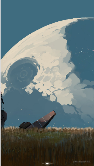
Renderings
pc side

mobile terminal
Kind tips
By default, the bottom indicator, [pc end: two left and right switching buttons] will be displayed, and both the indicator and the button have the effect of clicking the page
It can be hidden according to the value of props
Named slots:
If you feel that the style of the left and right buttons and the indicator is not beautiful or you want to write new content, you can use the following slots
<template #leftBtn>
...
</template>
<template #rightBtn>
...
</template>
<template #indicator>
...
</template>
<template #all>
...
</template>
noMove explained
Why is there a noMove attribute [default: cs]?
If I want to nest two carousels, the parent carousel will not be affected when the child carousel is switched. At this time, the child carousel must not trigger the parent carousel to slide when sliding
pc side:
- Slide the top blue hello world! area, the overall parent swiper page will be switched, the effect is as follows

- Swipe the earth picture, only switch the internal sub-swiper
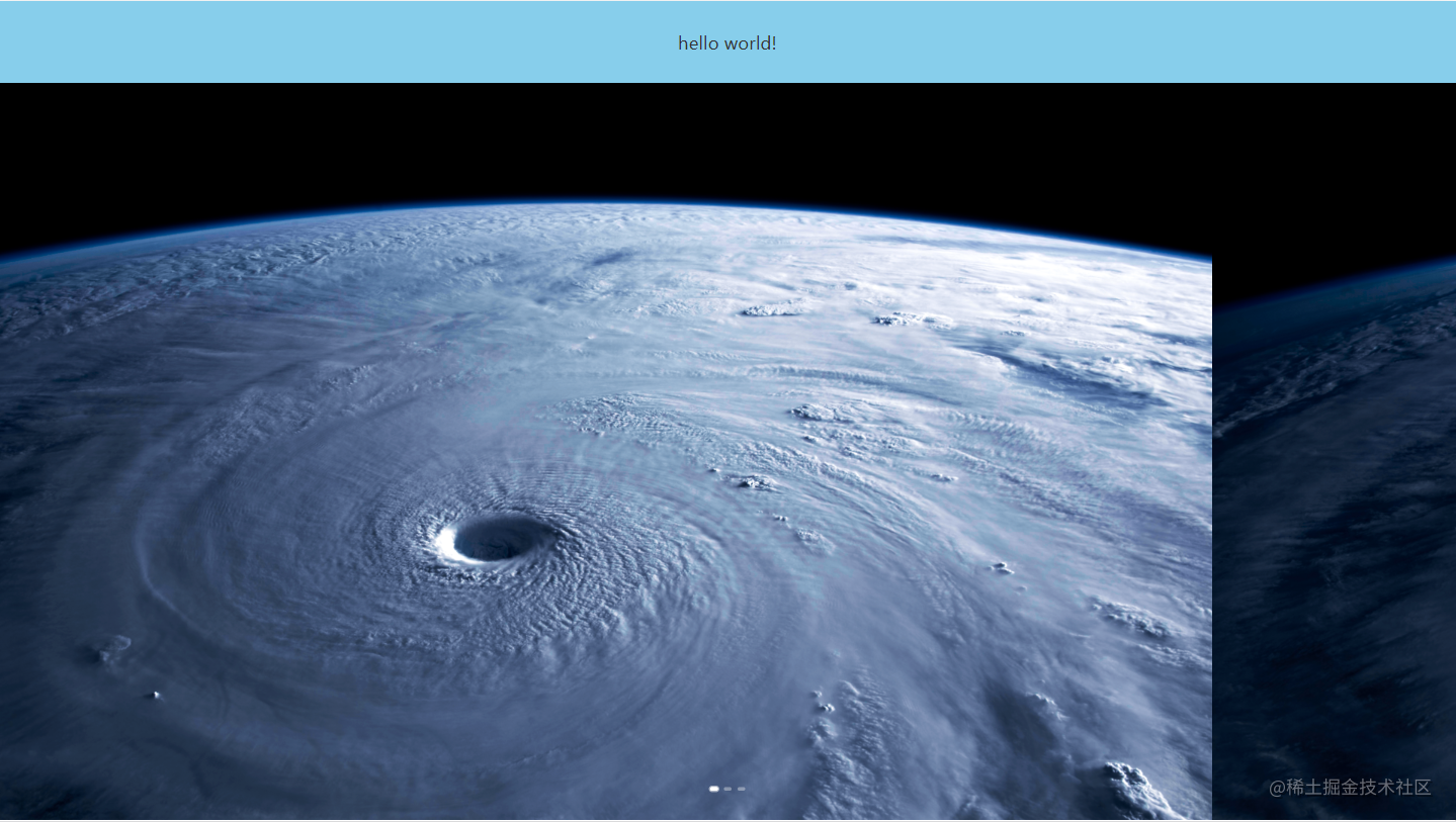
We only need to add the className attribute "cs" to the inner element
<img class="cs" src="../2.png" alt="">
Note that if you feel that cs does not meet the requirements, you can choose to change the props attribute
<rSwiper :noMove="yourClassName"></rSwiper>

<!-- This is consistent with noMove parameter passing -->
<img class="yourClassName" src="../2.png" alt="">
Complete code example
<template>
<div class="home-style">
   <rSwiper class="swiper" :autoPlay="false" :indicator="false" ref="swiper" @loadEnd="funLoadEnd" @transitionend=funTransitionend :mobile="true">
     <rSlide>
       <div class="first-cont">
         <div class="can"></div>
         <!-- Note here that the noMove attribute of the child swiper must not be cs [the noMove attribute in the parent swiper, otherwise its own sliding events will also be blocked] -->
         <rSwiper class="child" noMove="nononononono" playTime="2000" :mobile="true" :autoplay="false">
           <rSlide>
             <img class="cs" src="../5.png" alt="">
           </rSlide>
           <rSlide>
             <img class="cs" src="../7.png" alt="">
           </rSlide>
           <rSlide>
             <img class="cs" src="../6.png" alt="">
           </rSlide>
         </rSwiper>
       </div>
       </rSlide>
       <rSlide>
         <img src="../1.png" alt="">
       </rSlide>
       <rSlide>
       <img src="../1.png" alt="">
       </rSlide>
     </rSwiper>
</div>
</template>

<script setup>
  import { rSlide, rSwiper } from 'r-swiper'

  const nowIndex = ref(0) // current index

  const swiperDOM = ref(null) // Dom element


  /**
   * 2023-08-12 19:23:06 Ywr
   * Feedback function for initialization loading completion
  */
  const funLoadEnd = () => {
    console.log('loading - success');
    // changePage(1, true)
  }

  /**
   * Switch page completion feedback function 2023-08-12 19:23:06 Ywr
   * @param {Number} i current subscript
  */
  const funTransitionend = (i) => {
    nowIndex. value = i
    console.log('current index', nowIndex.value)
  }

  /**
   * Switch page function 2023-08-12 19:23:06 Ywr
   * @param {Number} i subscript
   * @param {Boolean} st current subscript
  */
  const changePage = (i, st = false) => {
    // If jumping to a page
    if (st) {
      swiperDOM. value. slideTo(i)
    }
    else {
      i < 0 ? (swiperDOM.value.prev()) : (swiperDOM.value.next())
    }
  }

</script>

<style scope lang="scss">

.home-style {
   width: 100vw;
   height: 100vh;

   .first-cont {
     display: flex;
     flex-direction: column;
     overflow: hidden;
     width: 100%;
     height: 100vh;
     .can {
       display: flex;
       justify-content: center;
       align-items: center;
       width: 100%;
       height: 10vh;
       background: skyblue;
     }
     .child {
       flex: 1;
     }
   }
   img {
     width: 100vw;
     height: 100vh;
   }
}

</style>
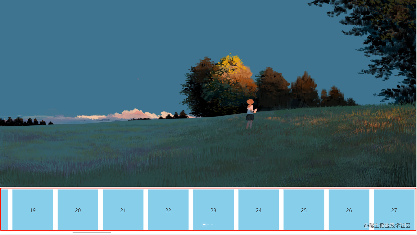
Mobile terminal:
Many platforms such as JD.com/Taobao/Pinduoduo/Dewu have this demand
Swipe the red box part of the left picture, and the overall swiper will switch
Slide the red box part of the right picture, the overall swiper will not switch, but the internal swiper-banner will switch

Or, some internal areas (such as the blue quick list below) need to complete their own scrolling effect
The complete code is as follows
<template>
   <div class="home-style">
     <rSwiper class="swiper" :autoPlay="false" :identifier="false" ref="swiper" @loadEnd="funLoadEnd" @transitionend="funTransitionend " :mobile="true">
       <rSlide>
         <div class="first-cont">
           <img src="../1.png" alt="">
           <!-- Add noMove attribute cs here -->
           <div class="box cs">
              <div class="can cs">
                <div class="cs" v-for="i in 100" :key="i">{{i}}</div>
              </div>
           </div>
         </div>
       </rSlide>
       <rSlide>
         <img src="../1.png" alt="">
       </rSlide>
       <rSlide>
         <img src="../1.png" alt="">
       </rSlide>
     </rSwiper>
   </div>
</template>

<script setup>
  import { rSlide, rSwiper } from 'r-swiper'

  const nowIndex = ref(0) // current index

  const swiperDOM = ref(null) // Dom element


  /**
   * 2023-08-12 19:23:06 Ywr
   * Feedback function for initialization loading completion
  */
  const funLoadEnd = () => {
    console.log('loading - success');
    // changePage(1, true)
  }

  /**
   * 2023-08-12 19:23:06 Ywr
   * Switch page completion feedback function
   * @param {Number} i current subscript
  */
  const funTransitionend = (i) => {
    nowIndex. value = i
    console.log('current index', nowIndex.value)
  }

  /**
   * 2023-08-12 19:23:06 Ywr
   * Switch page function
   * @param {Number} i subscript
   * @param {Boolean} st current subscript
  */
  const changePage = (i, st = false) => {
    // If jumping to a page
    if (st) {
      swiperDOM. value. slideTo(i)
    }
    else {
      i < 0 ? (swiperDOM.value.prev()) : (swiperDOM.value.next())
    }
  }

</script>

<style scope lang="scss">
.home-style {
   width: 100vw;
   height: 100vh;

  .first-cont {
     display: flex;
     flex-direction: column;
     overflow: hidden;
     width: 100%;
     height: 100vh;

     .box {
       width: 100%;
       height: 20vh;
       overflow-x: scroll;
       .can {
         display: flex;
         justify-content: flex-start;
         align-items: center;
         height: 20vh;

         div {
           background: skyblue;
           border: 1px solid #fff;
           width: 100px;
           padding: 80px;
           margin: 10px;
         }
       }
     }

     img {
       height: 80vh;
     }

     .child {
       flex: 1;
     }
   }
   img {
     width: 100vw;
     height: 100vh;
   }
}

</style>
The above situations can be solved by using the current swiper.
fast silky mode
You can try the swiper official website and the carousel pages of JD.com, Taobao, and Dewu. When you swipe quickly, you will feel disconnected
Because inside the carousel component, there will be a protection mechanism for a time period. During this time period, you need to wait for the dynamic effect of the carousel event to complete. At this time, if you force the slide, there will be an exception
For the fast mode of the plug-in in this article, you only need to set the fast mode of the swiper to immediately open the silky mode
<rSwiper fast></swiper>
At this point, fast sliding can be realized, and the switching time only depends on your hand speed, enjoying silky smoothness
That's all for this issue, thank you for reading.
grateful
Thanks to all swiper open source developers
Special thanks to linfeng [https://github.com/helicopters?tab=repositories]
Contact Author
Email: zywr012345@gmail.com
WeChat: ywr_98


