
Security News
The Hidden Blast Radius of the Axios Compromise
The Axios compromise shows how time-dependent dependency resolution makes exposure harder to detect and contain.
By Ahmad Nassri - Apr 01, 2026
help-center-widget-react
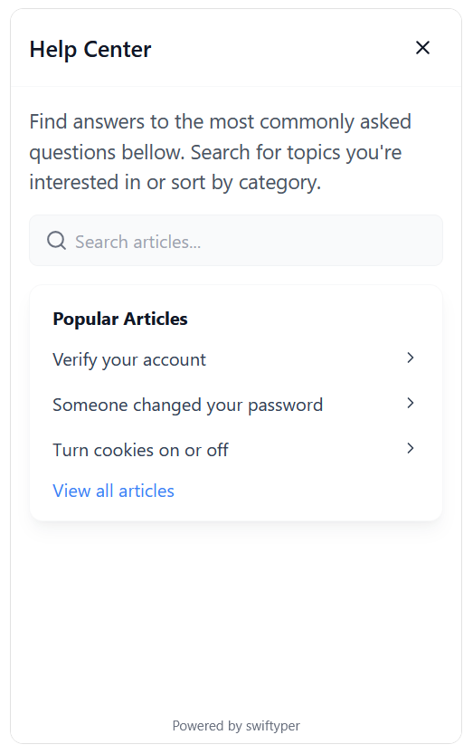
Advanced tools
Publish help articles, FAQs, and guides. Allow customers to find answers on their own, reduce repetitive questions, and keep your support team to focus on more challenging issues.
Install the widget via npm or yarn:
npm install help-center-widget-react
# or
yarn add help-center-widget-react
Register your project on Swiftyper.
Customize the widget to fit your needs using the following options:
| Option | Type | Description |
|---|---|---|
apiKey | string | API key for authenticating with the help center. |
locale | string | Locale setting for the widget (e.g., en_US, de_DE). |
isOpen | boolean | Whether the widget is open by default. |
launcherPosition | string | Position of the launcher on the screen (e.g., bottom-right). |
launcherColor | string | Color of the launcher icon. |
launcherBackgroundColor | string | Background color of the launcher. |
launcherSize | string | Size of the launcher (e.g., 3.5rem). |
launcherMargin | string | Margin around the launcher (e.g., 1rem). |
launcherAnimation | boolean | Enable animation for the launcher. |
widgetRadius | string | Border radius of the widget (e.g., 12px). |
widgetWidth | string | Width of the widget (e.g., 400px). |
widgetHeight | string | Height of the widget (e.g., 650px). |
displayMode | string | Display mode of the widget (modal, popup). |
showModalBackdrop | boolean | Show a backdrop when the widget is in modal mode. |
backdropColor | string | Color of the modal backdrop (e.g. rgba(0, 0, 0, 0.5)). |
launcherIconSvg | string | Custom SVG icon for the launcher. |
Follow these steps to integrate the widget into your app:
import { HelpCenterWidget } from 'help-center-widget-react';

function App() {
  return (
    <div>
      <HelpCenterWidget
        apiKey="YOUR_API_KEY"
        launcherPosition="bottom-right"
        launcherColor="#fff"
        launcherBackgroundColor="#2563eb"
        displayMode="popup"
      />
      {/* Your app content */}
    </div>
  );
}
Replace YOUR_API_KEY with your actual API key.
Customize the configuration options as needed.
The widget supports all modern browsers:
We welcome contributions! If you'd like to help improve this project, feel free to open an issue or submit a pull request.
This project is licensed under the MIT License. See the LICENSE file for details.
FAQs
React help center component for React.
We found that help-center-widget-react demonstrated a healthy version release cadence and project activity because the last version was released less than a year ago. It has 1 open source maintainer collaborating on the project.
Did you know?

Socket for GitHub automatically highlights issues in each pull request and monitors the health of all your open source dependencies. Discover the contents of your packages and block harmful activity before you install or update your dependencies.
Security News
The Axios compromise shows how time-dependent dependency resolution makes exposure harder to detect and contain.

Research
A supply chain attack on Axios introduced a malicious dependency, plain-crypto-js@4.2.1, published minutes earlier and absent from the project’s GitHub releases.

Research
Malicious versions of the Telnyx Python SDK on PyPI delivered credential-stealing malware via a multi-stage supply chain attack.