Product
Introducing Socket Fix for Safe, Automated Dependency Upgrades
Automatically fix and test dependency updates with socket fix—a new CLI tool that turns CVE alerts into safe, automated upgrades.
By John-David Dalton - Apr 25, 2025
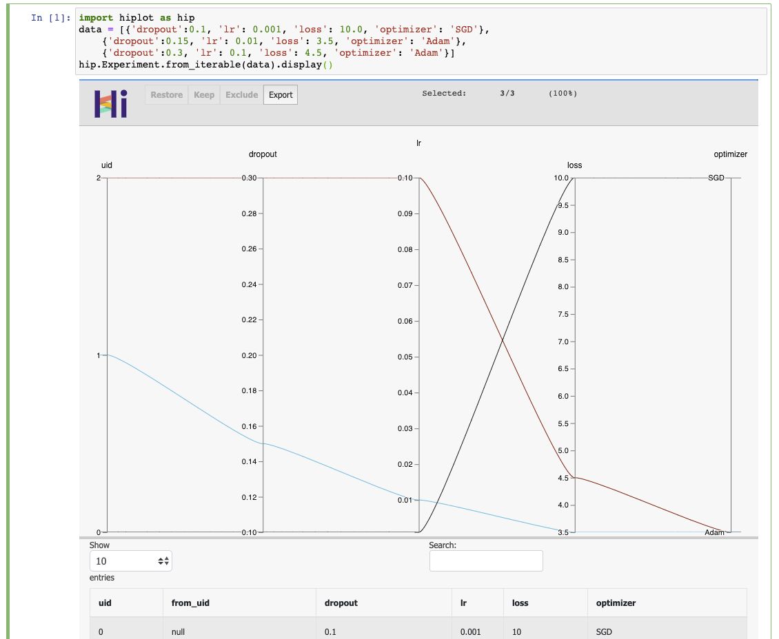
HiPlot is a lightweight interactive visualization tool to help AI researchers discover correlations and patterns in high-dimensional data using parallel plots and other graphical ways to represent information.

![]()
![]()


![]()
![]()
HiPlot is a lightweight interactive visualization tool to help AI researchers discover correlations and patterns in high-dimensional data using parallel plots and other graphical ways to represent information.
There are several modes to HiPlot:
pip install -U hiplot # Or for conda users: conda install -c conda-forge hiplot
If you have a jupyter notebook, you can get started with something as simple as:
import hiplot as hip
data = [{'dropout':0.1, 'lr': 0.001, 'loss': 10.0, 'optimizer': 'SGD'},
        {'dropout':0.15, 'lr': 0.01, 'loss': 3.5, 'optimizer': 'Adam'},
        {'dropout':0.3, 'lr': 0.1, 'loss': 4.5, 'optimizer': 'Adam'}]
hip.Experiment.from_iterable(data).display()
@misc{hiplot,
    author = {Haziza, D. and Rapin, J. and Synnaeve, G.},
    title = {{Hiplot, interactive high-dimensionality plots}},
    year = {2020},
    publisher = {GitHub},
    journal = {GitHub repository},
    howpublished = {\url{https://github.com/facebookresearch/hiplot}},
}
Inspired by and based on code from Kai Chang, Mike Bostock and Jason Davies.
External contributors (please add your name when you submit your first pull request):
FAQs
HiPlot is a lightweight interactive visualization tool to help AI researchers discover correlations and patterns in high-dimensional data using parallel plots and other graphical ways to represent information.
The npm package hiplot receives a total of 995 weekly downloads. As such, hiplot popularity was classified as not popular.
We found that hiplot demonstrated a not healthy version release cadence and project activity because the last version was released a year ago. It has 1 open source maintainer collaborating on the project.
Did you know?

Socket for GitHub automatically highlights issues in each pull request and monitors the health of all your open source dependencies. Discover the contents of your packages and block harmful activity before you install or update your dependencies.
Product
Automatically fix and test dependency updates with socket fix—a new CLI tool that turns CVE alerts into safe, automated upgrades.

Security News
CISA denies CVE funding issues amid backlash over a new CVE foundation formed by board members, raising concerns about transparency and program governance.
Product
We’re excited to announce a powerful new capability in Socket: historical data and enhanced analytics.