input-chips
Contributions of any kind welcome!
Motivation
This project provides a input with chips. It is inspired by material-ui-chip-input
But this package is deprecated, and I wanted a different design.
I thought the form with chips inside the input was inappropriate and it was strange that the position of the placeholder kept changing.
Installation
npm i input-chips
Point Of Focus
Usage
import { InputChips } from "input-chips";
import React, { useReducer } from 'react';

const reducer = (state, action) => {
  switch (action.type) {
    case "ADD":
      return state.includes(action.keyword)
        ? state
        : [...state, action.keyword];
    case "DELETE":
      return state.filter((existing) => existing !== action.keyword);
    default:
      return state;
  }
};

const App = () => {
  const [keywords, dispatch] = useReducer(reducer, []);

  const handleAdd = (keyword: string) => {
    dispatch({ type: "ADD", keyword: keyword });
  };

  const handleDelete = (keyword: string) => {
    dispatch({ type: "DELETE", keyword: keyword });
  };

  return (
    <InputChips
      id={id}
      title={title}
      tip={tip}
      placeholder={inputChips.placeholder}
      keywords={keywords}
      onDelete={handleDelete}
      onAdd={handleAdd}
    />
  );
};

export default App;
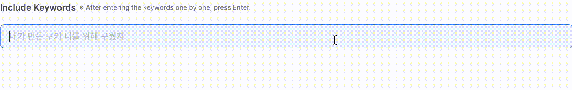
Result
If you want to try the component yourself instead of watching a gif, head over to the storybook for a live demo !
Properties
| id | string | | String key for input-label coupling |
| title | string | | Enter your input label |
| tip | string | | Enter tip for using input. It's located next to title. |
| placeholder | string | | Enter the placeholder showed by input |
| keywords | string[] | | It will return pretty chips |
| onAdd | function(arg0: string) | | This will send you a keyword, so you should manage it using hook like useState. |
| onDelete | function(arg0: string) | | This will send you a keyword, so you should manage it using hook like useState. |
| disabled | boolean | | True if you want to make disable input |
| maxLength | number | | It defines the maximum number of characters |
| minLength | number | | It defines the minimum number of characters |
| name | string | | A string specifying a name for the input control. |
| readonly | boolean | | A Boolean attribute which, if present, indicates that the user should not be able to edit the value of the input. |
| required | boolean | | Required is a Boolean attribute which, if present, indicates that the user must specify a value for the input before the owning form can be submitted. |
| border | string | | You can customize your input border. |
| background | string | | You can customize your input background and chip background. |