JsWidthBreakpoints


JsWidthBreakpoints is a lightweight, vanilla JavaScript library for handling responsive breakpoints with dynamic CSS classes and visual rules. It allows you to define custom breakpoints, apply CSS classes dynamically based on the window width, and visualize breakpoints with a customizable rule.
Features
- Dynamic CSS Classes: Automatically apply CSS classes based on the current window width.
- Visual Rule: Display vertical lines and labels for each breakpoint to help with responsive design.
- Customizable: Configure breakpoints, rule color, opacity, and more.
- No Dependencies: Written in pure JavaScript (Vanilla JS), no jQuery or other libraries required.
- Callback Support: Execute custom logic when a breakpoint is reached.
Installation
Via CDN
You can include the library directly in your project using a CDN:
<script src="https://cdn.jsdelivr.net/gh/marceloxp/JsWidthBreakpoints@main/dist/JsWidthBreakpoints.min.js"></script>
Manual Installation
Include the library directly in your project:
- Download the latest version from the GitHub repository.
- Add the script to your HTML file:
<script src="path/to/JsWidthBreakpoints.js"></script>
Usage
Basic Setup
- Include the library in your HTML file.
- Initialize the library with your desired breakpoints.
<!DOCTYPE html>
<html lang="en">
<head>
<meta charset="UTF-8">
<meta name="viewport" content="width=device-width, initial-scale=1.0">
<title>JsWidthBreakpoints Demo</title>
<style>
.width-lt400 { background-color: lightcoral; }
.width-b400a600 { background-color: lightblue; }
.width-b600a800 { background-color: lightgreen; }
.width-gt800 { background-color: lightyellow; }
</style>
</head>
<body>
<h1>JsWidthBreakpoints</h1>
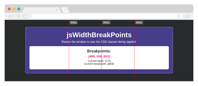
<p>Resize the window to see the CSS classes being applied.</p>
<p>Breakpoints: [400, 600, 800]</p>
<p id="current-width"></p>
<script src="https://cdn.jsdelivr.net/gh/marceloxp/JsWidthBreakpoints@main/dist/JsWidthBreakpoints.min.js"></script>
<script>
JsWidthBreakpoints.init({
widths: [400, 600, 800],
applyClasses: true,
classPrefix: 'width-',
rule: {
show: true,
opacity: 0.6,
color: 'red',
},
onBreakPoint: (event) => {
console.log('Breakpoint reached:', event);
},
});
const drawInfo = () => {
document.getElementById('current-width').innerHTML = `
<p>Current width: ${window.innerWidth}
<br>
Current breakpoint: ${JsWidthBreakpoints.currentClass}</p>
`;
};
window.addEventListener('resize', (event) => {
drawInfo();
});
drawInfo();
</script>
</body>
</html>
Understanding Breakpoints
The library dynamically applies CSS classes based on the current window width. Here's how the breakpoint classes are generated:
-
lt{min-width}: Applied when the window width is less than the specified breakpoint.
- Example:
lt400 (less than 400px).
-
b{min-width}a{max-width}: Applied when the window width is between two breakpoints.
- Example:
b400a600 (between 400px and 600px).
-
gt{max-width}: Applied when the window width is greater than the specified breakpoint.
- Example:
gt800 (greater than 800px).
Example
If you define breakpoints as [400, 600, 800], the library will apply the following classes:
width-lt400 for widths less than 400px.width-b400a600 for widths between 400px and 600px.width-b600a800 for widths between 600px and 800px.width-gt800 for widths greater than 800px.
Configuration Options
The JsWidthBreakpoints.init() method accepts the following options:
widths | number[] | [] | Array of breakpoints (e.g., [400, 600, 800]). |
applyClasses | boolean | true | Whether to dynamically apply CSS classes based on the current breakpoint. |
classPrefix | string | 'width-' | Prefix for the CSS classes (e.g., width-lt400, width-b400a600). |
rule.show | boolean | false | Whether to display the visual rule. |
rule.opacity | number | 1 | Opacity of the rule lines and labels. |
rule.color | string | 'red' | Color of the rule lines. |
onBreakPoint | function | null | Callback function executed when a breakpoint is reached. |
Callback Function
The onBreakPoint callback receives an object with the following properties:
{
oldBreakpoint: string,
currentWidth: number,
currentBreakpoint: string
}
Visual Rule
When rule.show is true, the library displays vertical lines and labels for each breakpoint. This helps you visualize where the breakpoints are located on the page.
Example
rule: {
    show: true,
    opacity: 0.6,
    color: 'blue',
}
Contributing
Contributions are welcome! If you'd like to contribute to JsWidthBreakpoints, please follow these steps:
- Fork the repository.
- Create a new branch for your feature or bugfix.
- Commit your changes.
- Submit a pull request.
License
This project is licensed under the MIT License. See the LICENSE file for details.
Support
If you find this library useful, consider giving it a ⭐️ on GitHub. For questions or issues, please open an issue on the repository.


