Kron UI
Kron UI is a simple UI Framework that helps create
beautiful Layouts, with simple Components.
This is part of DataFrameworks Exam @ HIOF GROUP 18
Installation
npm install kron-ui
or
yarn add kron-ui
Getting Started
Vanilla JavaScript Setup
If you are unsure how to install, you will need a package manager. Easiest way is to install NodeJS
to get Npm chances are you already have this installed aswell, you can check you version
by writing node -v in the terminal. Make sure you have a version > 13.
With Node you get npm.
npm init
or
yarn init
After initialization, install Kron-UI as shown in the installation above.
And you can starting importing Kron-UI by refrencing to it with the script tag :
<script src="node_modules/kron-ui/dist/kron-ui/kron-ui.js"></script>
Your <head> should look like this:
<!DOCTYPE html>
<html lang="en">
<head>
    <meta charset="UTF-8">
    <meta name="viewport" content="width=device-width, initial-scale=1.0">
    <title>My Awsome Site</title>
    <script src="node_modules/kron-ui/dist/kron-ui/kron-ui.js"></script>
</head>
Thats it! You have Kron UI setup in your project.
React Setup
Coming soon-
Components & Properties
All components uses the appearance attribute for their styles, and some have component specific attributes
that is documentet for each component below.
Colors
Colors are used within the appearance property as well as for color intensity, example:
<kron-componenttype appearance='blue4'></kron-componenttype>
blue is the color and 4 is the intensity of the color blue. Put togheter we get blue4.
All the colors have an intensity from 1 to 10.
Colors Available
- Red
- Blue
- Green
- Yellow
- Pink
- Brown
- Grey
- Gray
Components
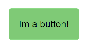
Button
<kron-button>Im a button!<kron-button></kron-button></kron-button>
Properties kron-button
| appearance | color,b-color,h-color,bg-none |
| color = background color | blue10 : color + intensity(1-10) |
| b-color = border color | b-blue10 : b-color + intensity(1-10) |
| h-color = hover color | h-blue10 : b-color + intensity(1-10) |
| bg-none = no border | bg-none |
Example usage
<kron-button appearance="blue7 b-blue3 h-green3">Styled Button!</kron-button>
<kron-button appearance="bg-none">Styled Button!</kron-button>
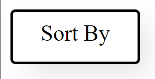
Menu is only activated by hovering for now.
  <kron-menu menu='Sort By'>
    <a href='=asc'>Ascending Order</a>
    <a href='=desc'>Descending Order</a>
  <kron-menu>
Properties kron-menu
| appearance | color,b-color,h-color,sm,md,lg,font-sm,font-md,font-lg |
| menu | "text" |
| color = background color | blue10 : color + intensity(1-10) |
| b-color = border color | b-blue10 : b-color + intensity(1-10) |
| h-color = hover color | h-blue10 : b-color + intensity(1-10) |
| sm = small button size | sm |
| md = medium button size | md |
| lg = large button size | lg |
| font-sm = small font size | font-sm |
| font-md = medium font size | font-md |
| font-lg = large font size | font-lg |
  Example Usage
  <kron-menu menu='Sort By' appearance='blue3 b-blue5 h-green3 sm font-sm'>
  <a href='=asc'>Ascending Order</a>
  <a href='=desc'>Descending Order</a>
  <kron-menu>
Navbar
<kron-navbar> </kron-navbar>
Properties kron-navbar
| appearance | color,hover-c, |
| navlogo | "Text" |
| contactlogo | "Text" |
| color = background color | blue10 : color + intensity(1-10) |
| hover-c = hover color | hover-b10 : hover color + intensity(1-10) |
Example usage
<kron-navbar appearance="blue5 hover-b8" contactlogo="Contact us!" navlogo="Testpage">
  <a href="#"> Home </a>
  <a href="#"> Page 2 </a>
</kron-navbar>

Box
<kron-box> </kron-box>
Properties kron-box
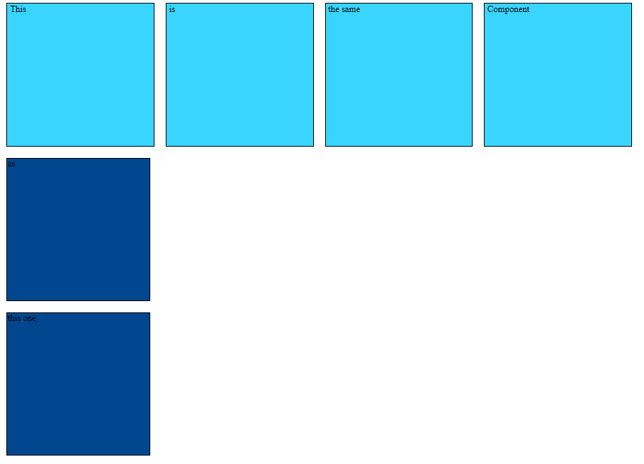
| appearance | color,hover-c, flex-row-wrap, flex-column-wrap |
Attributes for kron-box
| color = background color | blue10 : color + intensity(1-10) |
| hover-c = hover color | hover-b10 : hover + color + intensity(1-10) |
| flex-row-wrap | vertically placing the divs |
| flex-column-wrap | horisontally placing the divs |
Example usage
 <kron-box appearance="flex-row-wrap blue1 hover-y10">
  <div> This</div>
  <div> is </div>
  <div> the same </div>
  <div> Component</div>
</kron-box>

<kron-box appearance="flex-column-wrap blue10 hover-r10">
  <div> as</div>
 <div>this one </div>
Article
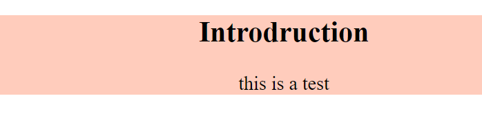
<kron-article>
  <h2>header<h2>
  <p> lorum ispom</p>
</kron-article>
Properties kron-article
| appearance | serif, sans-serif, monospace, fantasy, large, medium, small, right, center, left, textRight, textLeft, textCenter |
| serif = font-family | Times New Roman + Times + serif | sans |
| sans-serif = font-family | Arial + Helvetica + sans-serif | sans-serif |
| monospace = font-family | Courier New + Courier + monospace | monospace |
| fantasy = font-family | Copperplate + Papyrus | fantasy |
| large = font-size | big font size | large |
| medium = font-size | medium font size | medium |
| small = font-size | small font size | small |
| center left right = placement website | floating center, floating left, floating right | center |
| color = background color | all the available color | blue10 : color + intensity(1-10) |
| textRight = text-align right | places in the right side of the article tagg | textRight |
| textLeft = text-align left | places in the left side of the article tagg | textLeft |
| textCenter = text-align Center | places in the middle side of the article tagg | textCenter |
<kron-article appearance="large serif center red1">
  <h2>header</h2>
  <p>lorum ipsom</p>
</kron-article>
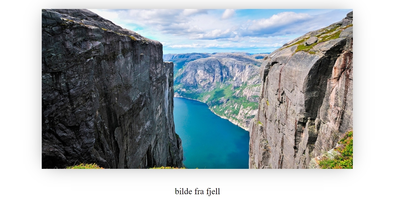
Figure
<kron-figure></kron-figure>
Properties kron-figure
| appearance | serif, sans-serif, monospace, fantasy right, center, left |
| appearance-Image | radius, size |
| img | src: enters image address |
| alt | string value if image doesnt show |
| appearance-Fig | figcaption-10 to figcaption-60 |
| serif = font-family | Times New Roman + Times + serif | sans |
| sans-serif = font-family | Arial + Helvetica + sans-serif | sans-serif |
| monospace = font-family | Courier New + Courier + monospace | monospace |
| fantasy = font-family | Copperplate + Papyrus | fantasy |
| radius = radius size image | radius-size10: radius intensity increasing 10 each time to 60 | radius-20 |
| size = size image | size increasing 10 each time to 60 | size-10 |
| figcaption = center figacption | size increase from 10 each time to 60 | figcaption-10 |
| large = font-size | big font size | large |
| medium = font-size | medium font size | medium |
| small = font-size | small font size | small |
| center left right = placement website | floating center, floating left, floating right | center |
|propterties in appearance-Fig| example |
|img = src | put in image adresse | "https://imgcomfort.com/Userfiles/Upload/images/illustration-geiranger.jpg"
|alt = alt for descriping the image | "change text inside quotation marks" |
<kron-figure
  appearance="center"
  appearance-Image="size-40"
  appearance-Fig="figcaption-40"
  img="https://imgcomfort.com/Userfiles/Upload/images/illustration-geiranger.jpg"
  text="bilde fra fjell"
>
</kron-figure>
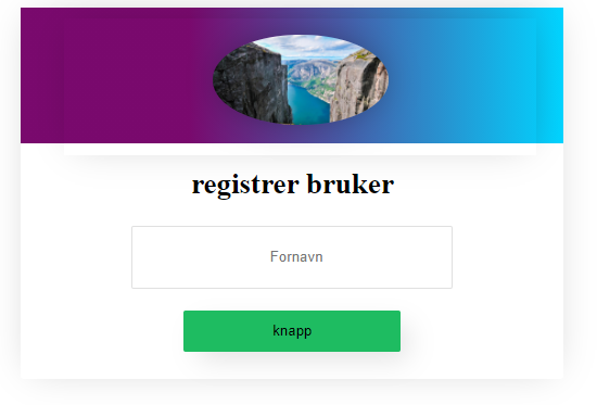
Form
<kron-form></kron-form>
Properties kron-form
| appearance | serif, sans-serif, monospace, fantasy right, center, left, large, medium, small |
| image | true = having picture, false = remove picture |
| serif = font-family | Times New Roman + Times + serif | serif |
| sans-serif = font-family | Arial + Helvetica + sans-serif | sans-serif |
| monospace = font-family | Courier New + Courier + monospace | monospace |
| fantasy = font-family | Copperplate + Papyrus | fantasy |
| radius = radius size image | radius-size10: radius intensity increasing 10 each time to 60 | radius-30 |
| size = size image | size increasing 10 each time to 60 | size 30 |
| large = font-size | big font size | large |
| medium = font-size | medium font size | medium |
| small = font-size | small font size | small |
| center left right = placement website | floating center, floating left, floating right | center |
Nesting comopnents
kron-form show you the ability for nestin the components.
Its importants that you add div slot="name" for adding kron-figure inside the form or whant get the kron-figure to work. Remember that you can follow the documentation for the kron-figure for adding styling for the component.
<kron-form appearance="large serif center" image="true">
  <div slot="start">
    <kron-figure slot="img" appearance="center" img="https://imgcomfort.com/Userfiles/Upload/images/illustration-geiranger.jpg" appearance-Image="size-40 radius-50" />
  </div>
  <h2>registrer bruker</h2>
  <input type="text" name="fornavn" placeholder="  Fornavn" required />
  <button>knapp</button>
</kron-form>
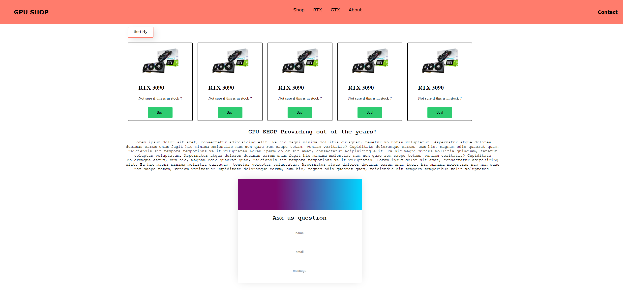
Adding it all up
Adding all the different components togheter creating a our own example ecommerce page.
Code: https://pastebin.com/QfxSngAA


