lightbox.js


All-in-one React lightbox with animation and customization options
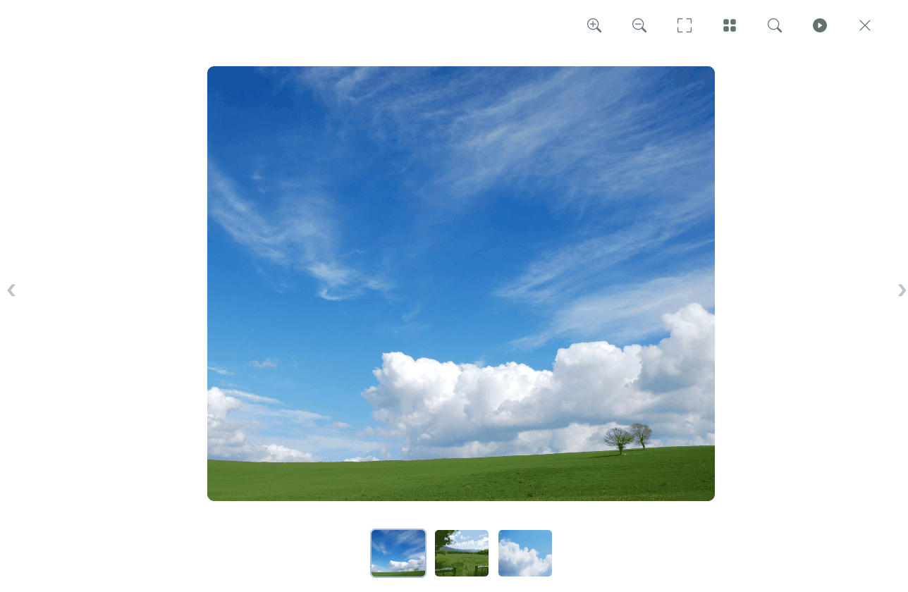
Lightbox.js is a fully-responsive, customizable React lightbox with intuitive zooming and theming options.

The following features are provided:
-
Fully responsive for mobile devices
-
Animations: Multiple image transitions with entry/exit animations
-
Intuitive Zooming: Users can zoom through:
- Mouse wheel
- Double-click
- Pinch-to-zoom on mobile
- The zoom icons in the controls
-
Panning: Once an image is zoomed into, the image can be panned by dragging the image through the mouse, or if on a mobile device, with a swipe-to-drag motion.

- Keyboard shortcuts: You can cycle through the images by pressing the right and left arrow keys.
- Full-screen mode: To exit full-screen mode, click the minimize icon or press the
Esc key.
- Built-in themes: Three pre-built lightbox designs with variations in UI and theme are available.

-
Slideshow feature: A slideshow feature is also available, allowing for images to automatically transition to the next.
-
Customization: All lightbox components can be fully customized, including background color, icon colors and so much more.
-
Magnifying glass: A built-in magnifying glass is also included, allowing users to view the details. 🧐

- Thumbnails: The option to add thumbnails is also available, along with animated entry/exit transitions.
- New features: This is only the beginning! We're working hard to add even more new features to make Lightbox.js even better. If you have any feature requests, be sure to let us know by opening an issue.
Demos
You can try out the demos here.
Getting Started
Install
To get started, simply install the module via NPM:
npm install lightbox.js-react
Usage
Once the library has been installed, import the CSS file for Lightbox.js within your React app's index.js file. You'll also need to import the function to initialize the lightbox with your license key. See the details here on how to get a license key.
import {initLightboxJS} from 'lightbox.js-react'
Then, just initialize the license key within your React app's index.js file like so:
  useEffect(() => {
    initLightboxJS("Insert your License Key here", "Insert plan type here");
  }, []);
The two plan types are individual and team.
Navigate to the React component where you wish to insert a lightbox, and import the component required:
import {SlideshowLightbox} from 'lightbox.js-react'
Next, wrap the images in the SlideshowLightbox component:
<SlideshowLightbox className="container grid grid-cols-3 gap-2 mx-auto">
    <img className="w-full rounded" src="https://source.unsplash.com/pAKCx4y2H6Q/1400x1200" />
    <img className="w-full rounded" src="https://source.unsplash.com/AYS2sSAMyhc/1400x1200" />
    <img className="w-full rounded" src="https://source.unsplash.com/Kk8mEQAoIpI/1600x1200" />
    <img className="w-full rounded" src="https://source.unsplash.com/HF3X2TWv1-w/1600x1200" />
</SlideshowLightbox>
Next.js Guide
To get started with Next.js, be sure to take a look at the Next.js tutorial here, which shows how to set-up Lightbox.js and create an image gallery that opens the lightbox when an image is clicked on.
Full Example
import React, { Component } from 'react'

import {SlideshowLightbox} from 'lightbox.js-react'

class Demo extends Component {
  render() {
    return <SlideshowLightbox className="container grid grid-cols-3 gap-2 mx-auto">
    <img className="w-full rounded" src="https://source.unsplash.com/pAKCx4y2H6Q/1400x1200" />
    <img className="w-full rounded" src="https://source.unsplash.com/AYS2sSAMyhc/1400x1200" />
    <img className="w-full rounded" src="https://source.unsplash.com/Kk8mEQAoIpI/1600x1200" />
    <img className="w-full rounded" src="https://source.unsplash.com/HF3X2TWv1-w/1600x1200" />
</SlideshowLightbox>
  }
}
🔑 Getting A License Key
Depending on the nature of your project, there are two ways to get a license key:
- Commercial product: If you require Lightbox.js for a commercial product, then a license can be purchased from our website.
- Open-source: If your project is open-source, then you can request a free license key from our website's contact form.
📚 Documentation
View the official documentation here, which includes code samples, prop information, details on customizing the lightbox and much more.
Types of Lightboxes Available
Several types of lightboxes have been provided, which have varying features to cater to your project's requirements.
These include:
- Slideshow w/ thumbnails: A lightbox which displays images along with thumbnails underneath, so that users can navigate to other imagery in the slideshow.
- Full-screen lightbox: A lightbox which displays images at full-screen width and height. Simply set the
fullScreen prop to true
for the SlideshowLightbox component.
- Image: Another lightbox is provided for displaying a single image only. See the documentation for the Image component here.
Props
| theme | The theme to be applied to the lightbox. Options include day, night, lightbox |
| fullScreen | Whether to display images so that they take up the screen's full width and height |
| backgroundColor | The background color of the lightbox, as a CSS color name, RGBA value or HEX code |
| iconColor | Icon color for the lightbox, as a CSS color name, RGBA value or HEX code |
| thumbnailBorder | The color of the thumbnails' borders, as a CSS color name, RGBA value or HEX code |
| showThumbnails | Whether or not to show image thumbnails. |
| slideshowInterval | The time in milliseconds before the slideshow transitions to the next image. |
| animateThumbnails | Whether or not to animate the thumbnails as they enter the view. |
| imgAnimation | The image animation type to show between image transitions in the slideshow, options include "fade" and "imgDrag" |
| fullScreen | Whether or not to display the images as full-screen |
| showControls | Show the additional controls. If false, only the close icon is displayed. |
| showFullScreenIcon | Show the full-screen icon in the controls. Default is true |
| showThumbnailIcon | Show the thumbnail icon in the controls. Default is true. |
| showSlideshowIcon | Show the slideshow icon in the controls. Default is true |
| showNavigationDots | Show navigation dots instead of image thumbnails. Default is false |
| showMagnificationIcons | Show the magnification icons in the controls. Default is true |
| modalClose | If set to "clickOutside", modal will close when outside of image is clicked on. |
| disableImageZoom | To disable image zoom functionality, set to true. |
| open | Whether or not the lightbox is opened |
| startingSlideIndex | The image with the matching index that the lightbox should open to |
| rightArrowClassname | Custom classname(s) for the right arrow |
| leftArrowClassname | Custom classname(s) for the left arrow |
| roundedImages | Apply rounded effect on the image border's corners |
| nextArrow | Custom component for the right arrow. The default right arrow element will be replaced with this component. |
| prevArrow | Custom component for the left arrow. The default left arrow element will be replaced with this component. |
| captionStyle | Style object passed to the image caption element |
Event Listeners
| onOpen | Emitted when the lightbox is opened |
| onClose | Emitted when the lightbox modal is closed |
| onNext | Emitted when the lightbox carousel moves to the next image |
| onPrev | Emitted when the lightbox carousel moves to the previous image |
Contact & Support
If you'd like to contact us with any questions, feedback or queries you may have, be sure to drop a message through our contact form, and we'll get back to you as soon as possible.
- Gitter: We have a Gitter community setup for any feature requests, questions and support queries. Simply visit it here.
- Bug Reports: Want to report a bug? You can open an issue in this repository, and we'll take a look!
- Feature Requests: If you'd like to request a new feature, simply open a new issue in this repository or let us know via Gitter.
- Support: If you'd like additional support or want a custom solution for your website, be sure to contact us through our contact form here.
Development
Contributions are always welcome! If you'd like to add new features or wish to work on the library, simply clone this repo:
git clone https://github.com/silvia-odwyer/lightbox.js
cd lightbox.js
Then, install the dependencies required:
npm install
To start the development server for the library, run:
npm run start
You can then make changes to the code and after any saved changes, the development server will provide live reloading and build the library. In order to view your changes, simply set-up and run the example demo as shown below. That way, when you make edits to the library, you'll see these changes reflected in the demo and can try out the lightbox upon making changes, and so forth.
Running the example demo
An example demo has been set-up that integrates with the library.
Navigate to lightbox.js/example:
cd example
Then, install the dependencies required:
npm install
Once the dependencies have been installed, it's time to start the development server:
npm run start
And there you have it! You can now make changes to the library and the example demo will automatically update.
Contributions
If you'd like to add any new features, we're always welcoming new contributions! We only accept contributions that are under the GPL v3 License, so if you agree to this license and its terms, then we'd be delighed to integrate your contribution!
License
Commercial License
If you wish to use Lightbox.js for a commercial product, a commercial license can be purchased from our website, with two separate plans available -- an Individual plan for individual developers, as well as a Team & Company plan.
Open Source License
If your project is open-source and is compatible with the terms of the GPU v3 License, Lightbox.js can be used for free and is licensed under the GNU General Public License v3.0. A free license key can be requested through our website's contact form.


