MatTreeSelectInput
An angular material select formfield that allows user to select option from a tree like structure.
Similar to Angular mat-select, but the options are provided in a tree like structure.
Dependencies
Features
- Select single tree option
- Select multiple tree option
- Unlimited tree level
- Collapsable trees
Demo
Demo Application
Note
You need to have @angular/material installed in your project, as it is a Peer Dependency.
Example
Installation
After installing the above dependencies. Install mat-tree-select-input via.
npm i mat-tree-select-input
Once installed you need to import our main module in your application module:
import { MatTreeSelectInputModule } from 'mat-tree-select-input';


@NgModule({
  declarations: [AppComponent, ...],
  imports: [MatTreeSelectInputModule, ...],
  bootstrap: [AppComponent]
})
export class AppModule {
}
Usage
mat-tree-select-input with form control: Pass in formControlName to controlName input.
        <form  [formGroup]="form">
            ....
            <ngx-mat-tree-select-input
                    [options]="options"
                    [placeholder]="'Select Category'"
                    [heading] = "'Children of'"
                    [controlName]="'category'">
            </ngx-mat-tree-select-input>
            ....
        </form>
mat-tree-select-input (multiple) with form control.
        <form  [formGroup]="form">
            ....
            <ngx-mat-tree-select-input
                    [multiple]= "true"
                    [options]="options"
                    [heading] = "'Children of'"
                    [placeholder]="'Select Category'"
                    [controlName]="'category'">
            </ngx-mat-tree-select-input>
            ....
        </form>
mat-tree-select-input with NgModel.
            ....
            <ngx-mat-tree-select-input-ngmodel
                    (selectionChanged)="onSelectionChanged()"
                    [(select)]="value"
                    [options]="options"
                    [heading] = "'Sub Categories of'"
                    [placeholder]="'Select Category'"
                    >
            </ngx-mat-tree-select-input-ngmodel>
            ....
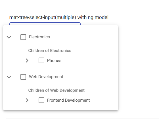
mat-tree-select-input with NgModel(multiple).
            ....
            <ngx-mat-tree-select-input-ngmodel
                    (selectionChanged)="onSelectionChanged()"
                    [(select)]="value"
                    [multiple]= "true"
                    [options]="options"
                    [heading] = "'Sub Categories of'"
                    [placeholder]="'Select Category'"
                    >
            </ngx-mat-tree-select-input-ngmodel>
            ....
Creating options to pass into the component.
In your component import TreeData from mat-tree-select-input via
import { TreeData } from 'mat-tree-select-input';
Declare options property to be of type TreeData[], sample:
options: TreeData[] = []
TreeData is an interface exported from mat-tree-select-input, below is the definition of the interface
interface TreeData {
            name: string
            value: string
            children: TreeData[]
        }
Hence, a sample option will be
 options: TreeData[] = [
    {
      name: 'Electronics',
      value: 'Electronics',
      children: [
        {
          name: 'Phones',
          value: 'Phones',
          children: [
            {
              name: 'Iphones',
              value: 'Iphones',
              children: []

            }
          ]
        }
      ]
    },

    {
      name: 'Web Development',
      value: 'Web Development',
      children: [
        {
          name: 'Frontend Development',
          value: 'Frontend Development',
          children: [
            {
              name: 'Angular',
              value: 'Angular',
              children: []


            },
            {
              name: 'React',
              value: 'React',
              children: []


            }
          ]
        }
      ]
    },
  ]
Finnaly pass it to any one of the examples(code snippet) above
In cases where your data is not exactly the type of Treedata[], below is a sample method you can use to convert it to a TreeData[].
You can modify this method to best suit your use case.
  constructTreeData(data){
    return data.map(
      (item)=>{
        let o = {
          name: item.name,
          value: item.id,
          children: item.Children.length ? this.constructTreeData(item.Children) : []
        }
        return o
      }
    )
  }
To implement filter for our mat-tree-select-input you can project an input into the component for example
    <ngx-mat-tree-select-input
      [options]="options"
      [placeholder]="' Select Category'"
      [controlName]="'customTreeSelect'"
      >

      <input
        #searchInput
        placeholder="Search"
        (keydown)="$event.stopPropagation()"
        (keyup)="filter(original_options,searchInput.value)"
      >

    </ngx-mat-tree-select-input>
And then, implement the filter method. for example:
  filter(array: TreeData[], text: string) {

    const getNodes = (result, object) => {
      if ( object.name.toLowerCase().startsWith(text)) {
          result.push(object);
          return result;
      }
      if (Array.isArray(object.children)) {
        const children = object.children.reduce(getNodes, []);
        if (children.length) result.push({ ...object, children });
      }
      return result;
    };

    this.options = array.reduce(getNodes, []);
  }
To disable the selection of parent nodes, add the property canSelectParentNode and set it to false. For example with ngModel.
  ...
   <ngx-mat-tree-select-input-ngmodel
                    (selectionChanged)="onSelectionChanged()"
                    [(select)]="value"
                    [options]="options"
                    [heading] = "'Sub Categories of'"
                    [canSelectParentNode] = "false"
                    [placeholder]="'Select Category'"
                    >
    </ngx-mat-tree-select-input-ngmodel>
  ...
or with Reactive Form.
            <ngx-mat-tree-select-input
                    [options]="options"
                    [placeholder]="'Select Category'"
                    [heading] = "'Children of'"
                    [canSelectParentNode] = "false"
                    [controlName]="'category'">
            </ngx-mat-tree-select-input>


