Date Picker library for React
Stylish Date Picker with built-in ToDo-list for React
Storybook
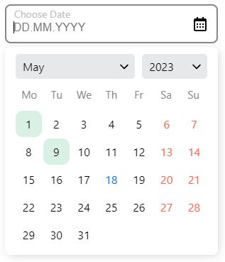
Here you can see the possibilities of date picker library and options for settings.
Installation
$ npm install modsen-datepicker --save
Usage
To get started, you need to import the DatePicker or RangeDatePicker component from the modsen-datepicker library.
import { DatePicker, RangeDatePicker } from 'modsen-datepicker';

const App = () => {
	return (
		<>
			<DatePicker />
			<RangeDatePicker />
		</>
	);
};
Configuration
Getting date from Date Picker:
import { useState } from 'react';
import { DatePicker } from 'modsen-datepicker';

const App = () => {
	const [value, setValue] = useState();

	return <DatePicker onChange={(date) => setValue(date)} />;
};
Props for Date Picker
| type | Sets the calendar view | 'month', 'year' | 'month' |
| weekStart | Sets the day on which the week starts | 'monday', 'sunday' | 'monday' |
| minDateValue | Sets the minimum date that will be available in the calendar | String value in format 'mm.dd.yyyy' | '01.01.1900' |
| maxDateValue | Sets the maximum date that will be available in the calendar | String value in format 'mm.dd.yyyy' | '31.12.2025' |
| onChange | Function called when the user enters date in date input or picks date in calendar | (value) => setVAlue(value) | - |
Additional props for Range Date Picker
| startDateValue | Sets default start date | String value in format 'mm.dd.yyyy' | - |
| endDateValue | Sets default end date | String value in format 'mm.dd.yyyy' | - |
| onRangeInputChange | Function called when the user enters date in date input or picks date in calendar | (value) => setVAlue(value) | - |
Browser Support
The date picker is compatible with the latest versions of Chrome, Firefox, and IE10+.


