mui-feedback-dialog 
A customizeable React feedback form with optional screenshot via screen capture or dom-to-html and a canvas editor based on material-ui.
If you want to use my free fully end-to-end encrypted display service for your recieved feedback, you should use mui-feedback-dialog-connected. That library uses this dialog but already handles the encryption and submission of the recieved feedback. If you already have your own infrastructure feel free to use this un-opinionated library.
API
Installation
You also need to include @material-ui/core, @material-ui/icons, react, and react-dom. IF you have not already done so, you can install them with:
npm install --save @material-ui/core @material-ui/icons react react-dom
Then you can install this library with:
npm install --save mui-feedback-dialog
Usage
import { FeedbackDialog } from 'mui-feedback-dialog'


const FeedbackButton: React.FunctionComponent<{ mobile?: boolean }> = () => {
    const [dialogVisible, setDialogVisible] = useState(false)

    return <>
        <IconButton onClick={() => setDialogVisible(true)}>
            <FeedbackIcon />
        </IconButton>
        <FeedbackDialog open={dialogVisible} onClose={() => setDialogVisible(false)} onSubmit={console.log} />
    </>
}
FeedbackDialog takes following props:
open [boolean]: whether the dialog is shown or notonClose [function]: callback to close the dialoguseScreencapture [boolean=false]: whether to use screencapture or dom-to-html. Also controls whether the screenshotInfo-info box will be displayed.onSubmit [function]: callback on submit with the feedback object:
{
    description: 'Some description.',
    email: 'some@email.com',
    screenshot: 'base64-encoded screenshot in webp format'
}
noScreenshot [boolean]: whether the option to show a screenshot is shown at all.attachScreenshotOnOpen [boolean]: whether the option to show a screenshot is preselected.showSuccessScreen [boolean]: whether to show a progress screen during submit and a success or error screen afterwards.className [string]: className applied to the dialog component.initialEmail [string]: prefill email field.text [object]: possibility to overwrite the default strings:
- title
- cancel
- submit
- successText
- errorText
- contentText
- emailLabel
- emailError
- feedbackLabel
- includeScreenshot
- tooltipPen
- tooltipEraser
- tooltipBlackbox
- tooltipReset
- tooltipSubmit
- screenshotInfo
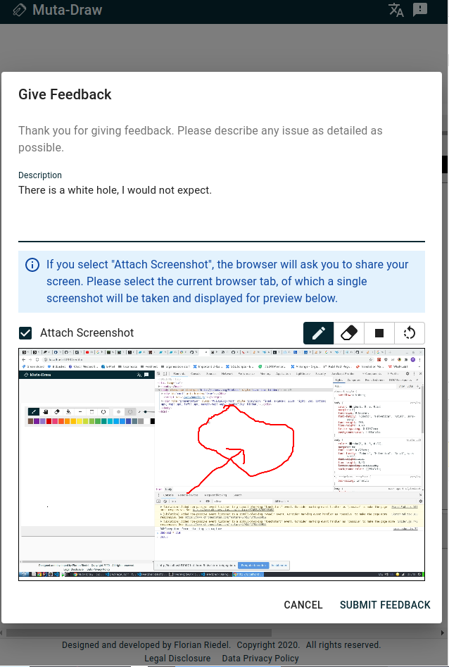
Screenshot
Demo
CodeSandbox - Demo


