Ng2-float-btn
Button group for angular 2 and angular material 2.
Installation
Dependecies:
Install package
npm install ng2-float-btn --save
Usage
Setup
import { NgModule } from '@angular/core';
import { BrowserModule } from '@angular/platform-browser';
import { FormsModule } from "@angular/forms"
import { MaterialModule } from '@angular/material';

import { AppComponent } from './app.component';

import { Ng2FloatBtnModule } from 'ng2-float-btn';

@NgModule({
    imports: [
        MaterialModule.forRoot(),
        Ng2FloatBtnModule
    ],
    declarations: [AppComponent],
    providers: [],
    bootstrap: [AppComponent]
})
export class AppModule { }
Example
import { Component } from '@angular/core';
import { Ng2FloatBtnComponent, Ng2FloatBtn } from 'ng2-float-btn';
@Component({
selector: 'test-app',
template: `
<ng2-float-btn [mainButton]="mainButton" [buttons]="buttons" [isMini]="true" [direction]="'right'">
<div style="z-index:400; position: absolute; bottom: 0;">
<ng2-float-btn [mainButton]="mainButton" [buttons]="buttons" [direction]="'up'">
</ng2-float-btn>
</div>
`
})
export class AppComponent {
mainButton: Ng2FloatBtn;
buttons: Array<Ng2FloatBtn>;
public constructor() {
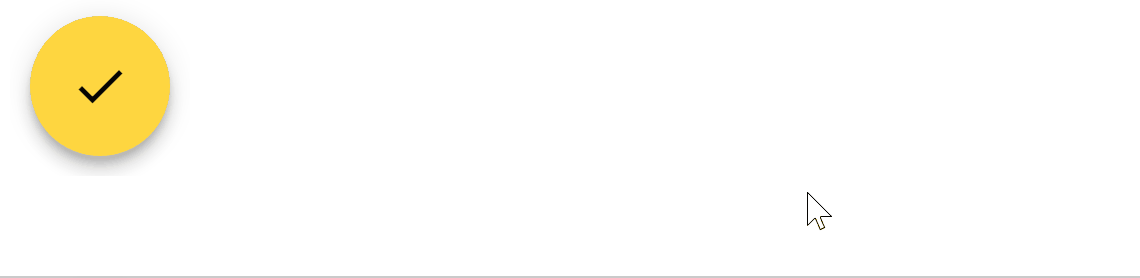
this.mainButton = {
color: "primary",
iconName: "check"
}
this.buttons = [
{
color: "primary",
iconName: "add",
onClick: () => {
alert("buton 1 clicked");
},
label : "button 1"
},
{
color: "primary",
iconName: "remove",
onClick: () => {
alert("buton 2 clicked");
},
label : "button 2"
}
]
}
}
Type Definition
Ng2FloatBtn
| color | string | The color of the button. Can be primary, accent, or warn(Reference) |
| iconName | string | The name of the material icon. Refer to here |
| onClick(optional) | any | The callback function when the button clicked |
| label(optional) | string | The label of the button |
Element Atributes
| mainButton | Ng2FloatBtn | The main button of the button group. label and onClick will be ignored. |
| buttons | Array | The array of button of the collapsed button. |
| direction | string | The direction that the collapsed fab should expand to when the main button get clicked. Can be right, left, up and down |


