ngx-popover
Simple popover control for your angular4 applications using bootstrap3. Does not depend of jquery.
If you don't want to use it without bootstrap - simply create proper css classes. Please star a project if you liked it,
or create an issue if you have problems with it.
see DEMO.
Installation
-
Install npm module:
npm install ngx-popover --save
-
If you are using system.js you may want to add this into map and package config:
{
    "map": {
        "ngx-popover": "node_modules/ngx-popover"
    },
    "packages": {
        "ngx-popover": { "main": "index.js", "defaultExtension": "js" }
    }
}
Usage
Import PopoverModule in your app and start using a component:
<div popover="content to be shown in the popover"
     popoverTitle="Popover header"
     popoverPlacement="top"
     [popoverOnHover]="false"
     [popoverCloseOnClickOutside]="true"
     [popoverCloseOnMouseOutside]="false"
     [popoverDisabled]="false"
     [popoverAnimation]="true"
     [popoverDismissTimeout]="1000">
    element on which this popover is applied.
</div>
Example of usage with dynamic html content:
<popover-content #myPopover
                title="Popover title"
                placement="left"
                [animation]="true"
                [closeOnClickOutside]="true" >
    <b>Very</b> <span style="color: #C21F39">Dynamic</span> <span style="color: #00b3ee">Reusable</span>
    <b><i><span style="color: #ffc520">Popover With</span></i></b> <small>Html support</small>.
</popover-content>

<button [popover]="myPopover">element on which this popover is applied.</button>
<div popover>:
popover="string" The message to be shown in the popover.popoverTitle="string" Popover title text.popoverPlacement="top|bottom|left|right|auto|auto top|auto bottom|auto left|auto right" Indicates where the popover should be placed. When using "auto" modifier, will show in opposite direction if not enough room. Default is "bottom".[popoverDisabled]="true|false" Indicates if popover should be disabled. If popover is disabled then it will not be shown. Default is false[popoverAnimation]="true|false" Indicates if all popover should be shown with animation or not. Default is true.[popoverOnHover]="true|false" If set to true then popover will open on mouse over instead of mouse click. Default is false.[popoverCloseOnMouseOutside]="true|false" Indicates if popover should be closed when user mouse outside of it. Default is false.[popoverCloseOnClickOutside]="true|false" Indicates if popover should be closed when user click outside of it. Default is false.[popoverDismissTimeout]="number" Used to automatically dismiss popover after given amount of time. Default is 0, means disabled.
<popover-content>:
placement="top|bottom|left|right|auto|auto top|auto bottom|auto left|auto right" Indicates where the popover should be placed. When using "auto" modifier, will show in opposite direction if not enough room. Default is "bottom".[animation]="true|false" Indicates if all popover should be shown with animation or not. Default is true.[closeOnMouseOutside]="true|false" Indicates if popover should be closed when user mouse outside of it. Default is false.[closeOnClickOutside]="true|false" Indicates if popover should be closed when you click outside of it. Default is false.
Sample
import {Component} from "@angular/core";
import {PopoverModule} from "ngx-popover";
@Component({
selector: "app",
template: `
<div class="container">
<!-- regular popover -->
<p>
It is a long established <span popover="Hello fact!" popoverTitle="Fact #1"><b>click this fact</b></span> that a reader will be distracted by the readable content of a page when looking at its layout.
The point of using Lorem Ipsum is that it has a more-or-less normal distribution of letters, as opposed to using 'Content here, content here', making it look like readable English.
<span popover="many, but not all" popoverPlacement="left"><b>Many desktop</b></span> publishing packages and web page editors now use Lorem Ipsum as their default model text, and a search for 'lorem ipsum' will uncover many web sites still in their infancy.
<span popover="various, but not all" popoverPlacement="right"><b>Various versions</b></span> have evolved over the years, sometimes by accident, <span popover="another hint" popoverPlacement="top"><b>sometimes on purpose</b></span> (injected humour and the like)
</p>
<br/>
<button popover="Hello popover. Now click outside." [popoverCloseOnClickOutside]="true">
click to open popover that will be closed when you click outside of it.
</button>
<!-- popover with dynamic html content -->
<br/><br/>
<div>
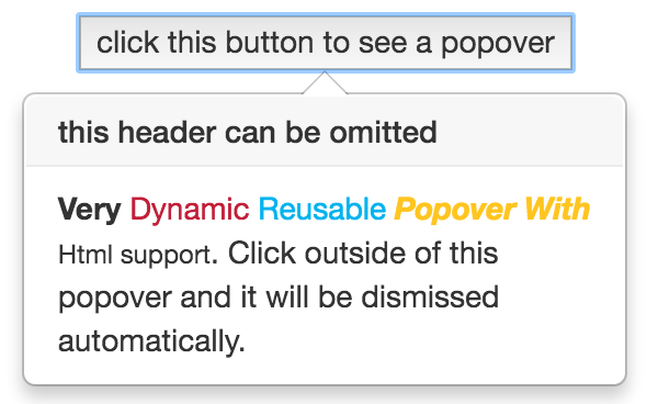
<popover-content #myPopover
title="this header can be omitted"
[closeOnClickOutside]="true">
<b>Very</b> <span style="color: #C21F39">Dynamic</span> <span style="color: #00b3ee">Reusable</span>
<b><i><span style="color: #ffc520">Popover With</span></i></b> <small>Html support</small>.
Click outside of this popover and it will be dismissed automatically.
</popover-content>
<button [popover]="myPopover">click this button to see a popover</button>
</div>
<!-- popover show on hover -->
<br/>
<div>
<button popover="Hello popover" [popoverOnHover]="true">hover this button to see a popover</button>
</div>
<!-- popover show on hover and hide only when mouse over outside of the popover -->
<br/>
<div>
<button popover="Hello popover"
popoverPlacement="right"
[popoverOnHover]="true"
[popoverCloseOnMouseOutside]="true">
hover this button to see a popover, allows to create interactive popovers
</button>
</div>
<!-- popover show on hover -->
<br/>
<div>
<button popover="Hello dismissible popover" [popoverDismissTimeout]="2000">click to see this popover. This popover will be dismissed in two seconds</button>
</div>
</div>
`
})
export class App {
}
@NgModule({
imports: [
PopoverModule
],
declarations: [
App
],
bootstrap: [
App
]
})
export class AppModule {
}
Take a look on samples in ./sample for more examples of
usages.


