Product
Introducing Pull Request Stories to Help Security Teams Track Supply Chain Risks
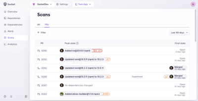
Socket’s new Pull Request Stories give security teams clear visibility into dependency risks and outcomes across scanned pull requests.
ngm-common-dialogs
Advanced tools
A module which provides some common dialogs and a simple to use service for angular material and angular 4
After developing with angularjs material and got used to the simple use of the provided dialogs I thought it will be nice to have them also in the new angular material, so I build the dialogs which were provided then and an extra dialog which I find really necessary and fun to use.
Angular 4.X.X and Angular Material 2.X.X
https://embed.plnkr.co/I6B2JZ/
npm i --save ngm-common-dialogs
In your app.module.ts you need to import the package, don't forget to import all its dependencies before.
import { FormsModule } from '@angular/forms';
import { MdDialogModule, MdButtonModule, MdInputModule, MdProgressSpinnerModule } from '@angular/material';
import { NgmCommonDialogsModule } from 'ngm-common-dialogs';
@NgModule({
  imports: [...,
  FormsModule,
  MdDialogModule,
  MdButtonModule,
  MdInputModule,
  MdProgressSpinnerModule,
  NgmCommonDialogsModule
  ],
  ...
})
export class AppModule {
  ...
}
The service is very simple to use, all you need to do is to inject it to your component and than call the right show dialog function. All the functions returns a simple ES6 Promise.
import { Component } from '@angular/core';

import { CommonDialogService } from 'ngm-common-dialogs';

@Component({
 selector: 'service-example',
 templateUrl: './service-example.html'
})
export class ServiceExampleComponent {
 constructor(private commonDialogService: CommonDialogService) { }

 showAlertDialog () {
   return this.commonDialogService.showAlert({
     title: 'Nice One',
     message: 'You just opened an alert dialog',
     okButton: 'Yay!',
   }).then(() => ...);
 }

 showConfirmDialog () {
   return this.commonDialogService.showConfirm({
     title: 'Caution',
     message: 'Are you sure you want to do this?',
     cancelButton: 'No Way!',
     yesButton: 'Absolutely',
   })
   .then(() => ...)
   .catch(() => ...);
 }

 showPromptDialog () {
   return this.commonDialogService.showPrompt({
     title: 'Personality Test',
     message: 'What is your favorite dish?',
     inputLabel: 'Dish Name',
     cancelButton: 'No',
     okButton: 'Choose',
   })
   .then(dishName => ...);
 }

 showLoadingDialog() {
   return this.commonDialogService.showLoading({
     title: 'Be patient...',
     promise: Promise.resolve()
   })
   .then(() => ...)
   .catch(() => ...); // If the promise you provided will fail it will arrive here
 }
}
showAlert (options)options
title: The titlemessage: The messageokButton: The text of the ok button, default is okreturn an ES6 Promise after the dialog was closedshowConfirm (options)options
title: The titlemessage: The messagecancelButton: The text of the cancel button, default is cancelyesButton: The text of the yes button, default is yesreturn an ES6 Promise after the dialog was closed. It will resolve if yes was clicked or reject with the value false if the cancel button was clickedshowPrompt (options)options
title: The titlemessage: The messageinputLabel: The floating label of the input in the dialogcancelButton: The text of the cancel button, default is cancelokButton: The text of the ok button, default is okreturn an ES6 Promise with result which is the text which was enteredshowLoading (options)options
title: The titlepromise: The Promise that be resolved while the loading dialog will be shownreturn an ES6 Promise with result which is the result of the given promise. If the given promise rejected the promise will also reject (in that case you need to use catch instead of then)When you open the dialog you must supply the right component's data structure, each component has it own class that represents his data structure.
AlertDialogComponentRepresents a basic alert dialog component.
AlertDialogDatatitle: The titlemessage: The messageokButton: The text of the ok button, default is okConfirmDialogComponentWhen the cancel button is clicked the closed value of the dialog is false and when the yes button is clicked its true.
ConfirmDialogDatatitle: The titlemessage: The messagecancelButton: The text of the cancel button, default is cancelyesButton: The text of the yes button, default is yesPromptDialogComponentThe use of this dialog is to get an input from the user, it will show a title, message and an input with the given input label, the result is the input value.
PromptDialogDatatitle: The titlemessage: The messageinputLabel: The floating label of the input in the dialogcancelButton: The text of the cancel button, default is cancelokButton: The text of the ok button, default is okLoadingDialogComponentResolves the given promise, take the result, wrap it with Promise.resolve() and return it as the dialogResult, if the promise was rejected the error value will be wrapped with Promise.reject() and return it as the dialogResult.
LoadingDialogDatatitle: The titlepromise: The Promise that be resolved while the loading dialog will be shownimport { AlertDialogComponent } from 'ngm-common-dialogs';
@Component({
selector: 'components-example',
templateUrl: './components-example.html',
styleUrls: ['./components-example.scss']
})
export class ComponentsExampleComponent {
constructor(private dialogService: MdDialog) { }
showAlertDialog() : void {
this.dialogService.open(AlertDialogComponent, {
data: { // This data needs to be in the AlertDialogData structure
title: 'Nice One',
message: 'You just opened an alert dialog',
okButton: 'Yay!',
}
});
}
}
FAQs
A module which provides some common dialogs and a simple to use service for angular material and angular 4
The npm package ngm-common-dialogs receives a total of 16 weekly downloads. As such, ngm-common-dialogs popularity was classified as not popular.
We found that ngm-common-dialogs demonstrated a not healthy version release cadence and project activity because the last version was released a year ago. It has 1 open source maintainer collaborating on the project.
Did you know?

Socket for GitHub automatically highlights issues in each pull request and monitors the health of all your open source dependencies. Discover the contents of your packages and block harmful activity before you install or update your dependencies.

Product
Socket’s new Pull Request Stories give security teams clear visibility into dependency risks and outcomes across scanned pull requests.

Research
/Security News
npm author Qix’s account was compromised, with malicious versions of popular packages like chalk-template, color-convert, and strip-ansi published.

Research
Four npm packages disguised as cryptographic tools steal developer credentials and send them to attacker-controlled Telegram infrastructure.