ngModal
ngModal is very simple Angular.js modal dialog directive.
Download
You can also install the package using Bower.
bower install ngModal
Or add it to your bower.json file:
dependencies: {
  "ngModal": "~1.2.0"
}
The Basics
To use the library, add the JS file and CSS file, and then include the module in your app:
app = angular.module("myApp", ["ngModal"])
The directive itself is called modal-dialog. The only required attribute is show, which should reference a boolean variable that controls whether or not the dialog is shown. Inside, you can put whatever HTML content you'd like.
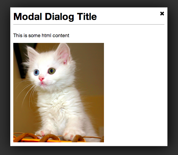
<modal-dialog show='dialogShown' dialog-title='My Dialog'>
  <p>Dialog content goes in here</p>
</modal-dialog>
Inline Options
There are a few options that be configured inline with attributes.
| dialog-title | null | Title placed in the header of the modal dialog. |
| width | 50% | Width of the dialog. Can be specified in px or %. |
| height | 50% | Height of the dialog. Can be specified in px or %. |
| on-close | null | Call a function when the dialog is closed. Ex: on-close='foo()' |
Example:
<modal-dialog show='dialogShown' dialog-title='My Dialog' height='400px' width='75%'>
  <p>Dialog content goes in here</p>
</modal-dialog>
Configuration Options
You can also pre-configure some options during your app's configuration phase.
app.config(function(ngModalDefaultsProvider) {
ngModalDefaultsProvider.set('option', 'value');
ngModalDefaultsProvider.set({option: 'value', option2: 'value2'});
})
| closeButtonHtml | 'X' | By default, the close button is just an X character. But you can set it to any HTML. For example, if you're using font-awesome, you could set it to <i class='fa fa-times'></i> |
Browser Support
So far, it has only been tested in Chrome. There is some CSS that is not compatible with with older browsers, including IE9.
Contributing
Contributions are welcome. Whenever possible, please include test coverage with your contribution.
- Fork it
- Create your feature branch (
git checkout -b my-new-feature)
- Commit your changes (
git commit -am 'Add some feature')
- Push to the branch (
git push origin my-new-feature)
- Create new Pull Request
To get the project running, you'll need NPM and Bower. Run npm install and bower install to install all dependencies. Then run grunt in the project directory to watch and compile changes. And you can run karma start to watch for changes and auto-execute unit tests.
Potential Features Down the Road
- Ability to integrate easily with UI-Router. This may be possible already, but it needs to be explored.


