


☠️ Ngx-Skltn
Easily add skeleton loader to your Angular7+ app
Demo: komock.github.io/ngx-skltn
TLDR
Stackblitz example
Features
- Flexible SVG skeleton based on size & position of HTML elements
- Single animation for all shapes
- Allow use custom shapes as nested SVG element (example below)
Versions
Install
Npm
npm i --save-dev ngx-skltn
Usage
import { NgxSkltnModule, SkltnConfig } from 'ngx-skltn';
const skltnConfig: SkltnConfig = {
rectRadius: 10,
flareWidth: '150px',
bgFill: '#d8d5d1',
flareFill: 'rgba(255,255,255, 0.5)',
};
@NgModule({
declarations: [ AppComponent ],
imports: [
BrowserModule,
NgxSkltnModule.forRoot(skltnConfig),
],
bootstrap: [AppComponent]
})
export class AppModule { }
.skltn-card {
margin: 20px 0 48px;
}
.skltn-card__avatar {
width: 60px;
height: 60px;
margin-bottom: 20px;
}
.skltn-card__title {
height: 32px;
margin-bottom: 20px;
}
.skltn-card__line {
height: 20px;
margin-bottom: 20px;
}
.skltn-card__line:last-child {
width: 60%;
}
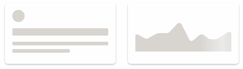
<skltn-root duration="1000" [rectRadius]="10" flareWidth="50%" bgFill="#d8d5d1" flareFill="rgba(255,255,255, 0.5)">
<div class="skltn-card">
<div skltn-bone class="skltn-card__avatar" type="circle"></div>
<div class="skltn-card__body">
<div skltn-bone class="skltn-card__title"></div>
<div skltn-bone class="skltn-card__line"></div>
<div skltn-bone class="skltn-card__line"></div>
</div>
</div>
</skltn-root>
Custom Shape
Important! [pathWidth]="24" [pathHeight]="22" should be same as on <svg> tag, this allow stratch shape with aspect ratio
<h3>Custom Path Template</h3>
<div class="skltn-chart" skltn-bone type="path" [pathWidth]="24" [pathHeight]="22">
<ng-template #boneTemp>
<svg width="24" height="22">
<path d="M0 5.783v-2.783l4 4 5-6 9 7.878 6-3.922v2.437l-6.176 3.989-8.6-7.528-5.09 6.108-4.134-4.179zm18.909 7.279l-1.267.818-1.135-.994-7.058-6.177-3.778 4.534-1.41 1.692-1.548-1.566-2.713-2.743v14.374h24v-13.226l-5.091 3.288z"></path>
</svg>
</ng-template>
</div>


