NgxWeekdayPicker


A lightweight plugin to a pick weekday.
Features
- highly customizable
- very easy to implement
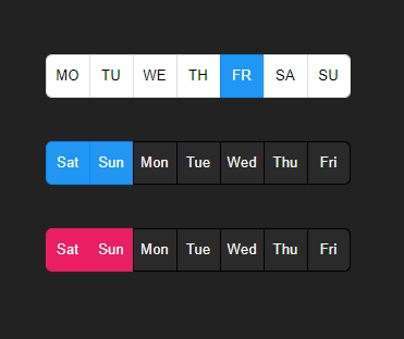
Demo
Get started
Installation
$ npm i ngx-weekday-picker
Example
TS
Module
import { NgxWeekdayPickerModule } from 'ngx-weekday-picker';
@NgModule({
  declarations: [ AppComponent ],
  imports: [BrowserModule, NgxWeekdayPickerModule  ],
  bootstrap: [AppComponent]
})
export class AppModule { }
Component
import { Component } from '@angular/core';
@Component({
 selector: 'app-root',
 templateUrl: './app.component.html',
 styleUrls: ['./app.component.scss']
})
export class AppComponent {
options = {
   weekStart: WeekDay.Saturday,
   inactiveColor: '#f2f2f2',
   inactiveBgColor: '#2a2a2a',
   inactiveBorderColor: '#000',
   daysNames: ['Mon', 'Tue', 'Wed', 'Thu', 'Fri', 'Sat', 'Sun'],
   selected: [WeekDay.Saturday, WeekDay.Sunday],
 };
 options1 = {
   weekStart: WeekDay.Saturday,
   activeBgColor:'#e91e63',
   activeBorderColor:'#e91e63',
   inactiveColor: '#f2f2f2',
   inactiveBgColor: '#2a2a2a',
   inactiveBorderColor: '#000',
   daysNames: ['Mon', 'Tue', 'Wed', 'Thu', 'Fri', 'Sat', 'Sun'],
   selected: [WeekDay.Saturday, WeekDay.Sunday],
 };
}
HTML
 <ngx-weekday-picker></ngx-weekday-picker>
  <ngx-weekday-picker
    [daysNames]="options.daysNames"
    [weekStart]="options.weekStart"
    [selected]="options.selected"
    [inactiveColor]="options.inactiveColor"
    [inactiveBgColor]="options.inactiveBgColor"
    [inactiveBorderColor]="options.inactiveBorderColor"
  ></ngx-weekday-picker>
  <ngx-weekday-picker
    [daysNames]="options1.daysNames"
    [activeBgColor]="options1.activeBgColor"
    [activeBorderColor]="options1.activeBorderColor"
    [weekStart]="options1.weekStart"
    [selected]="options1.selected"
    [inactiveColor]="options1.inactiveColor"
    [inactiveBgColor]="options1.inactiveBgColor"
    [inactiveBorderColor]="options1.inactiveBorderColor"
  ></ngx-weekday-picker>
Options
| weekStart | WeekDay.Monday | Select the first day in the list |
| daysNames | ['MO', 'TU', 'WE', 'TH', 'FR', 'SA', 'SU'] | The labels of the days |
| disabledList | [] | The disabled days list |
| selected | [] | The default selected days |
| dayWidth | 40px | The width of the days |
| fontSize | 14px | The font size of the days |
| borderRadius | 6px | The border radius |
| borderWidth | 1px | The border width |
| activeColor | #fff | The color of the selected days |
| activeBgColor | #2196f3 | The background color of the selected days |
| activeBorderColor | #008eff | The border color of the selected days |
| inactiveColor | #000 | The color of the not selected days |
| inactiveBgColor | #fff | The background color of the not selected days |
| inactiveBorderColor | #ddd | The border color of the not selected days |
Events
selectedChanged - triggered on change the selection
Other Projects
| ngx-i24-circular-progress | Link | A lightweight plugin to render a simple, animated circular progress bar. |
| ngx-i24-progress-bar | Link | A lightweight plugin to render a simple, animated progress bar. |
| ngx-weekday-picker | Link | Lightweight plugin to a pick weekday. |
| ngx-i24-color-picker | Link | A lightweight plugin to pick a color. |
| ngx-i24-checkbox | Link | A lightweight plugin to display a modern checkbox. |
Support

Copyright
Copyright (c) 2022 Yaseen Alrefaee, contributors. Released under the MIT