Product
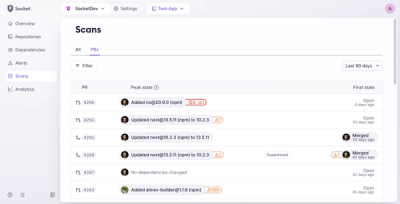
Introducing Pull Request Stories to Help Security Teams Track Supply Chain Risks
Socket’s new Pull Request Stories give security teams clear visibility into dependency risks and outcomes across scanned pull requests.
norwegian-assets-site
Advanced tools
Angular assets for Norwegian ✈️Component library and project base to facilitate setup of new Norwegian projects. The library contains common building blocks for Norwegian sites and services. Like buttons, destination search, calendars and so on.
In order to use components in your project, you have to install @norwegian/norwegian-assets-ng as a dependency of you project.
npm i @norwegian/norwegian-assets-ng
When it's in there, you can start importing the stuff you need. Like this 👇
app.module.ts
import { ButtonModule } from '@norwegian/norwegian-assets-ng';

@NgModule({
  declarations: [AppComponent],
  imports: [BrowserModule, ButtonModule],
  providers: [],
  bootstrap: [AppComponent],
})
export class AppModule {}
app.component.html
<nas-button primary>hipp hopp ostepop</nas-button>
A working [but minimal] example project using @norwegian/norwegian-assets-ng can be found in /examples.
The SCSS files for each component is compiled and injected into the component styles. In addition to this, the variables, mixins and such is included in the distributed package and is available for your project.
If you just want the styles:
@import '~@norwegian/norwegian-assets-ng/scss/index';
If you want the style
@import '~@norwegian/norwegian-assets-ng/scss/index';
Important: Write new css in BEM
The styles refer til asset files like fonts and icons. These files are part of the distributed package and you need to expose them through the angular compiler in order for everything to come together. You do this through defining app assets in your .angular-cli.json file.
Add the following line to the apps.assets array:
{
  "glob": "**/*",
  "input": "./node_modules/@norwegian/norwegian-assets-ng/assets",
  "output": "./assets/"
}
storybook is used for component documentation and is an easy way to preview a component in isolation while developing. Start it by doing an npm run dev in your terminal.
Based on angular-library-seed.
Adding your own component doesn't require much, but there's a few things to be aware of:
src/componentsindex.ts file in the component folder and export the component and modulesrc/components/index.ts by adding export * from './your-component-name'src/services/src/components/index.tsnpm run buildnpm run testnpm run lint.See CHANGELOG for history
FAQs
Unknown package
We found that norwegian-assets-site demonstrated a not healthy version release cadence and project activity because the last version was released a year ago. It has 1 open source maintainer collaborating on the project.
Did you know?

Socket for GitHub automatically highlights issues in each pull request and monitors the health of all your open source dependencies. Discover the contents of your packages and block harmful activity before you install or update your dependencies.

Product
Socket’s new Pull Request Stories give security teams clear visibility into dependency risks and outcomes across scanned pull requests.

Research
/Security News
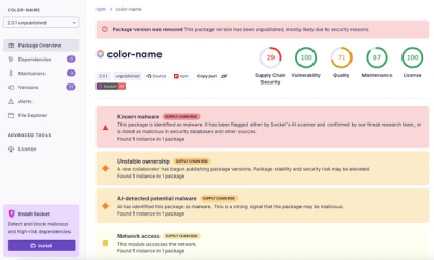
npm author Qix’s account was compromised, with malicious versions of popular packages like chalk-template, color-convert, and strip-ansi published.

Research
Four npm packages disguised as cryptographic tools steal developer credentials and send them to attacker-controlled Telegram infrastructure.