🌠 NuxtRating


Features
- Use whatever you like as a star.
- View or retrieve a note.
- Customizable colors, borders, rounded and spacing.
- Customizable number of stars.
- Create read-only stars.
- SSR Friendly.
- Typescript Friendly.
- Display decimal ratings.
- Inspired by Vue Star Rating.
Quick Setup
- Add
nuxt-rating dependency to your project
pnpm add nuxt-rating
yarn add nuxt-rating
npm install nuxt-rating
- Add
nuxt-rating to the modules section of nuxt.config.ts
export default defineNuxtConfig({
  modules: ["nuxt-rating"],
});
- Use
nuxt-rating component
<NuxtRating :read-only="false" :rating-value="3.5" />

Props Explanation
The following props can be passed to customize the appearance and behavior of the component:
ratingCount (optional, default: 5): The total number of rating levels available.ratingSize (optional, default: 15): The size of the rating meter.ratingSpacing (optional, default: 2): The spacing between the rating levels.ratingStep (optional, default: 0.1): Defines the increment between rating levels. For example, with ratingStep set to 0.5, users can select ratings like 0.5, 1, 1.5, etc.activeColor (optional, default: "#ffc700"): The color of the active rating level.inactiveColor (optional, default: "gray"): The color of the inactive rating levels.skeletonColor (optional, default: "#d8d8d8"): The color of the skeleton loader, which represents the placeholder for the stars during the loading phase.ratingValue (optional, default: 4.5): The initial rating value.ratingContent (optional, default: "[19.8, 2.2, 6.6, 43.56, 39.6, 17.16, 0, 17.16, 33, 43.56]"): The content to be displayed for each rating level, should be polygon points see https://developer.mozilla.org/fr/docs/Web/SVG/Element/polygon.readOnly (optional, default: true): Specifies whether the rating meter is read-only or interactive.borderColor (optional, default: "#db8403"): The border color of the stars.borderWidth (optional, default: 0): The border width of the stars.roundedCorners (optional, default: false): Specifies whether the stars should have rounded corners.inline (optional, default: false): Adds display: inline-flex to the wrapper.clearable (optional, default: false): Specifies whether the rating can be cleared.
Events Explanation
The component emits the following events:
ratingSelected: Triggered when a rating level is selected. The event payload is the selected rating value.ratingHovered: Triggered when the mouse hovers over the rating meter. The event payload is the hovered rating value.
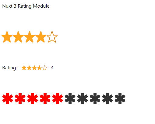
Full example (Nuxt 3)
<template>
  <div class="p-4">
    <h1 style="margin-bottom: 0px">Nuxt 3 Rating Module</h1>

    <br />
    <br />
    <br />

    <NuxtRating
      border-color="#db8403"
      active-color="#ffa41c"
      inactive-color="#fff"
      :rating-step="0.5"
      :rounded-corners="true"
      :border-width="5"
      :rating-size="30"
      :rating-value="4.5"
      @rating-selected="logRating"
      @rating-hovered="event => (rating = event)" />

    <br />
    <br />
    <br />

    <div class="flex items-center">
      <p>Rating :</p>
      <NuxtRating
        class="px-3"
        border-color="#db8403"
        active-color="#ffa41c"
        inactive-color="#fff"
        :rating-step="0.1"
        :rounded-corners="true"
        :border-width="5"
        :rating-size="10"
        :rating-value="3.7"
        @rating-selected="logRating"
        @rating-hovered="event => (rating = event)" />
      <p>{{ rating }}</p>
    </div>

    <br />
    <br />
    <br />

    <NuxtRating
      active-color="red"
      inactive-color="#333"
      :rating-spacing="5"
      :rating-step="1"
      :rating-count="10"
      :rounded-corners="true"
      :rating-content="[
        19.305, 12.611, 25.25, 9.178, 21.9171, 3.4049, 15.9722, 6.8377, 15.9722, 0, 9.30556, 0,
        9.30556, 6.8377, 3.36056, 3.4049, 0.0277222, 9.178, 5.97222, 12.611, 0.0277778, 16.044,
        3.36056, 21.8173, 9.30556, 18.3847, 9.30556, 25.2778, 15.9722, 25.2778, 15.9722, 18.3847,
        21.9171, 21.8173, 25.25, 16.044,
      ]"
      :border-width="0"
      :rating-size="30"
      :rating-value="4.5"
      @rating-selected="logRating" />
  </div>
</template>

<script setup lang="ts">
  import { ref } from 'vue'

  const rating = ref(0)

  const logRating = (event: number) => {
    console.log(event)
  }
</script>