
Product
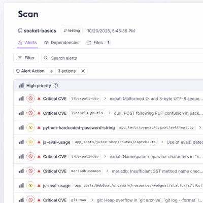
Introducing Webhook Events for Pull Request Scans
Add real-time Socket webhook events to your workflows to automatically receive pull request scan results and security alerts in real time.
By Jeppe Hasseriis - Oct 22, 2025
pcln-autocomplete
Advanced tools
Composable React autocomplete component built with Downshift
npm i pcln-autocomplete
import React from 'react'
import { Autocomplete } from 'pcln-autocomplete'
import { Icon, Text } from 'pcln-design-system'

export default props =>
  <Autocomplete
    match={(item, value) => item.includes(value)}
    onChange={item => {
      props.onChange(item)
    }}>
    <Autocomplete.Label>
      Location
    </Autocomplete.Label>
    <Autocomplete.Input />
    <Autocomplete.Menu>
      {props.locations.map(location => (
        <Autocomplete.Item
          key={location.name}
          item={location}>
          <Icon
            name='pin'
            mr={2}
            color='blue'
          />
          <Text fontSize={0}>
            {location.name}
          </Text>
        </Autocomplete.Item>
      ))
    </Autocomplete.Menu>
  </Autocomplete>
Note: <Autocomplete> relies on values from theme, so it must be a descendent of <ThemeProvider> in order to work properly. Otherwise, you might experience errors like this:
Uncaught TypeError: Cannot read property '3' of undefined
All components can be imported by name and subcomponents are provided as static properties on the Autocomplete component.
Wrapper for Downshift component with additional match prop.
| Prop | Type | Description |
|---|---|---|
match | function | Filters direct children of the Menu component |
itemToString | function | Used to determine the string value for the selected item (shown in the input value) |
onChange | function | Called when the user selects an item and the selected item has changed. Called with the item that was selected and the new state of downshift |
For additional props, see the Downshift documentation.
Design system Label component with additional default props provided by Downshift for accessibility.
Design system Input component with additional default props provided by Downshift for accessibility.
Design system Card component with styles and default props to work with Downshift.
Design system Flex component with styles and default props to work with Downshift.
FormFieldFAQs
React autocomplete component built with Downshift
The npm package pcln-autocomplete receives a total of 4,118 weekly downloads. As such, pcln-autocomplete popularity was classified as popular.
We found that pcln-autocomplete demonstrated a healthy version release cadence and project activity because the last version was released less than a year ago. It has 10 open source maintainers collaborating on the project.
Did you know?

Socket for GitHub automatically highlights issues in each pull request and monitors the health of all your open source dependencies. Discover the contents of your packages and block harmful activity before you install or update your dependencies.
Product
Add real-time Socket webhook events to your workflows to automatically receive pull request scan results and security alerts in real time.

Research
The Socket Threat Research Team uncovered malicious NuGet packages typosquatting the popular Nethereum project to steal wallet keys.
Product
A single platform for static analysis, secrets detection, container scanning, and CVE checks—built on trusted open source tools, ready to run out of the box.